Does optimization ever end? How we grew Crazy Egg’s conversion rate by 363%
The following is from our huge library of client successes—why not discover how we can help grow your business?
Do you suspect that your conversion rate couldn’t be improved upon? In this case study—which we believe is our most useful one yet—you’ll see specific methods for getting win after win from a site that already is an extremely strong performer.
Plus, we’ll tell you how to get a free, annotated PDF of all the persuasion techniques we used to create wins—so you can apply them to your own site.
Overview
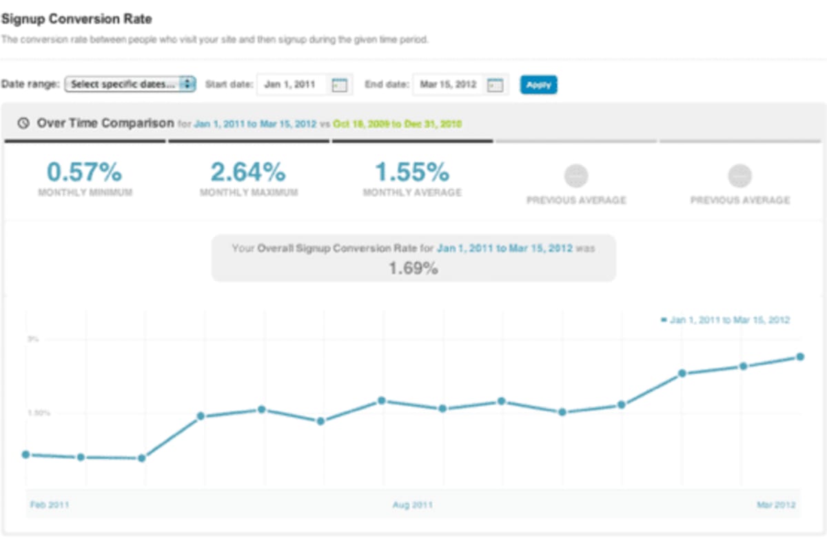
Many people ask us if there’s a point at which conversion rate optimization gives diminishing returns. If that point does exist, Facebook, Amazon and Google don’t appear to have hit it yet. It’s astonishing what you can achieve with a sophisticated conversion strategy and a skilled team.
If you’re serious about conversion, you’ll most likely already know about Crazy Egg, the web-analytics service that allows you to see exactly where your website visitors click. We featured it in our list of tools that reveal why potential customers abandon your website. Crazy Egg came to us even though they already had an extremely strong site. In fact, they had even published case studies about it. They asked us if we could grow their business even further.
We have been able to engineer a long series of wins for them, which have increased their revenue well into the seven figures.
Note that “we” refers to a team effort between Conversion Rate Experts (with our proven system and expertise) and Crazy Egg (with its excellent tool and highly effective team).
In this document we’ll describe four of the wins that we believe can be directly useful to your business.
How we got those improvements
Given that we’ve published a list of 108 of the most effective conversion strategies, you might conclude that it’s difficult to know where to start the process of conversion optimization. We discovered long ago that our recommendations can never be better than our facts, so it’s critical to begin by gathering substantial visitor intelligence. That means:
- Gaining a deep understanding of what makes buyers buy
- Determining what makes some qualified visitors not buy
Here are the four primary objections we identified, and how we addressed them:
1. Some of Crazy Egg’s visitors were unclear about how heatmaps worked and exactly what sort of reports Crazy Egg would generate. If you’re not sure what a heat map is, here’s a good explanation.
To counter this objection, we organized a case-study competition. We asked Crazy Egg’s customers to present particularly good examples of how they used Crazy Egg on their sites. This enabled us to use actual customers’ language on the site to help explain what heatmaps were and how they were used. We also got some great testimonials in the process.
2. As with many products, price was an objection. Prospects said that they weren’t sure whether they could justify paying Crazy Egg’s prices.
The fascinating thing about price is how one’s frame of reference makes all the difference. For example, $2,000 may sound like a lot of money for a shed, but when compared to the price of adding rooms to a home, it suddenly seems cheap.
We identified that Crazy Egg’s price could benefit from the principle of reframing. In order to prove what a bargain it was, we dived into academic research surrounding heatmaps and eye tracking. Though each technology has its champions and detractors, we discovered research from Carnegie Mellon University that indicated an 88 percent correlation between eye movement on a page and subsequent mouse movement in that zone. At the same time, we determined that the cost to conduct a formal eye-tracking study can run into six figures and take months to complete. Armed with this research, we described how Crazy Egg could deliver a great deal of visitor intelligence at a tiny fraction of the cost—and time—of other alternatives.
3. Some visitors thought that Crazy Egg was no different from overlay reports in Google Analytics. After having interviewed Crazy Egg’s customer-support people, we knew that they were experienced in describing the differences between Crazy Egg and Google Analytics, so we incorporated transcripts of their explanations into our new text.
4. A subset of visitors thought that Crazy Egg had fewer features than some competitors’ tools. We countered that objection by pointing out how the sheer number of features does not always translate into more insights. With web-analytics tools it’s easy to become overwhelmed by data overload. Sometimes “less is more.”
How we modified Crazy Egg’s homepage
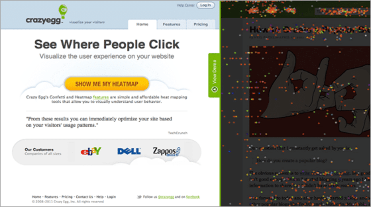
Here is the original page or “control” from Crazy Egg’s site:
Here’s a thumbnail image of our challenger page next to a similarly scaled image of the control:
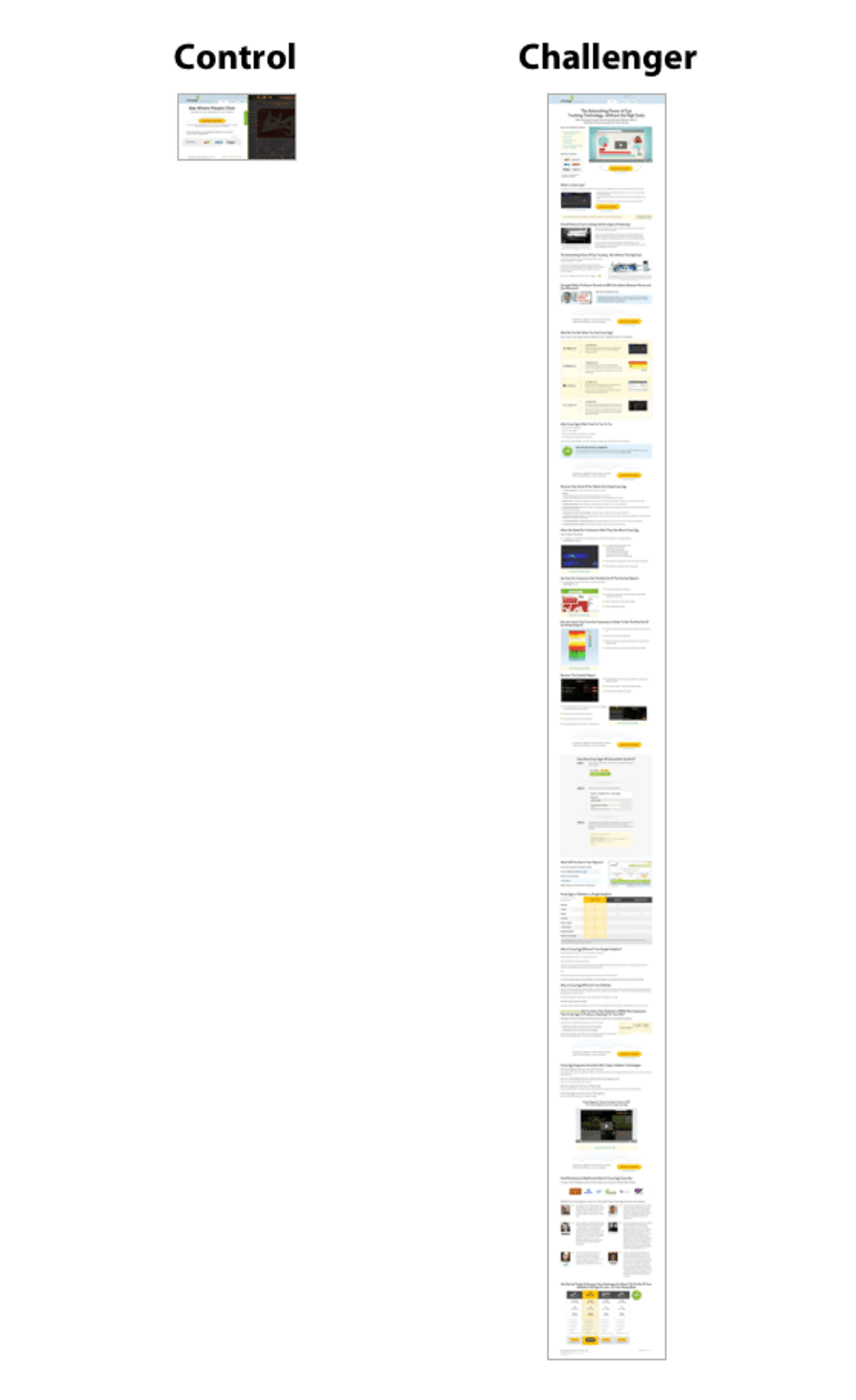
Your eyes are not playing tricks on you: The redesigned page is about 20 times as long as the control.
To identify which of the two versions was most effective at persuading visitors to become customers, we carried out an A/B split-test. We carried out this and all of the other split-tests described on this page using Google’s split-testing tool.
The results: Our new page outperformed the control by 30%.
The media would have us believe that people no longer have any capacity to concentrate. In reality, you cannot have a page that’s too long—only one that’s too boring. In the case of Crazy Egg’s home page, visitors wanted their many questions answered and that’s what we delivered. (If you’d like more people to scroll down your long pages, see the guide we wrote on the topic.)
Same message + different medium = 64% more conversions
People have different learning styles. Though the written word is still the bread-and-butter persuasion medium on the Web, it’s also important to appeal to people who prefer to learn by watching.
We therefore created a video to see if it increased the conversion rate. We wrote a three-minute script that encapsulated the key points of the sales message. Although it’s now possible to “point and shoot” a high-definition video in just minutes, a mediocre video could lose our audience in seconds—so we used the video production company Demo Duck to create the video. And we think they did an excellent job.
We hosted the video with Wistia, which we’d highly recommend.
The result? Even though the video’s message was similar to that of the rest of the page, during the split-test the version of the page with the video in it generated 64% more conversions than the control.
Crazy Egg’s co-founder Neil Patel has published this excellent article, which describes in detail how we made this video. He gives a good argument as to why you should focus most of your efforts on creating an effective script.
How a one-time offer increased the lifetime customer value
A small increase in a company’s average lifetime customer value can result in a huge increase in profit. An effective way of increasing that value is to incentivize customers to commit for a longer period, by offering a discount.
Discounts, however, can be treacherous ground: Some retailers have found out the hard way that when they offer sales too often, they’re training customers to wait for the next sale.
We recommended a different approach: Create a one-time offer to customers who recently signed up for any level of non-trial, paid service. We showed the following offer once to all existing customers:
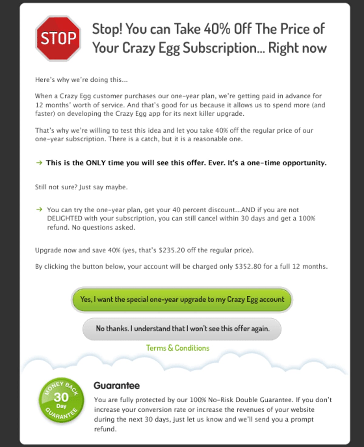
Twenty-five percent of customers accepted this new offer. Because it was effective, we also incorporated it into the checkout process, so it was shown once to each new customer.
When calculating the revenue effect of implementing this offer, we factored in the lost revenue from having some customers take the offer and therefore not pay the higher fees associated with a month-to-month plan. After taking that into account, this one-time offer still considerably increased the company’s annual revenue.
Modifications like this are especially sweet because they don’t involve creating new products or adding to overhead. They’re a win–win because longer-term customers enjoy the price break and the business gets front-loaded revenues.
Optimizing the checkout gave 116% more sign-ups
Occasionally the most straightforward methods can result in astonishing improvements to profits. For example, after we created the previous win we turned our attention to what visitors were thinking during the checkout phase. This is a fruitful effort for many businesses, because prospects can often be spooked by what they see—or don’t see—at the moment they’re finalizing a transaction.
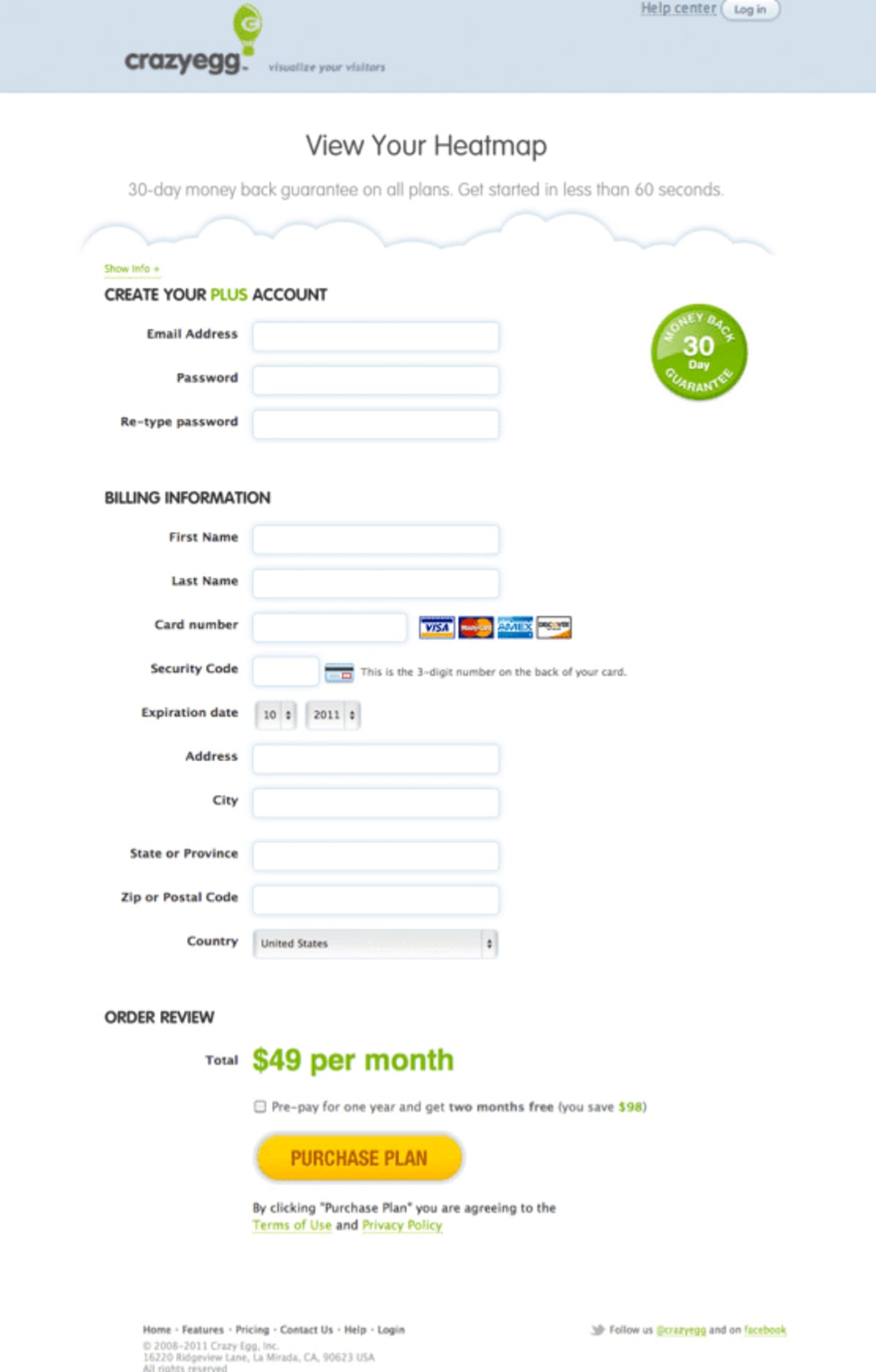
We installed Qualaroo (the survey tool formerly known as KISSinsights) on the page where visitors could sign up for a free trial, so we could understand what was on the minds of visitors right there. We discovered that they didn’t like having to put in a credit-card number for a free trial. They thought it was unnecessary at least, and quite possibly a scam. To counter that objection, we put an explanation box right under the free-trial sign-up button. It conspicuously answered that objection, by explaining how Crazy Egg would not, in fact, charge anything during the free trial, and how having a card on file prevents any one person signing up for multiple free trials.
Qualaroo also revealed that visitors were confused by subscription rates when they were quoted in both monthly and yearly amounts. Knowing that a confused mind hesitates, and that hesitation is the death of a sale, we took pains to clarify how their card would be charged for the yearly rate only after the free trial, but how they could cancel or downgrade at any time.
We also changed several other things, as you’ll see in the following screenshots. Here is the page before our changes:
And here it is after our modifications:
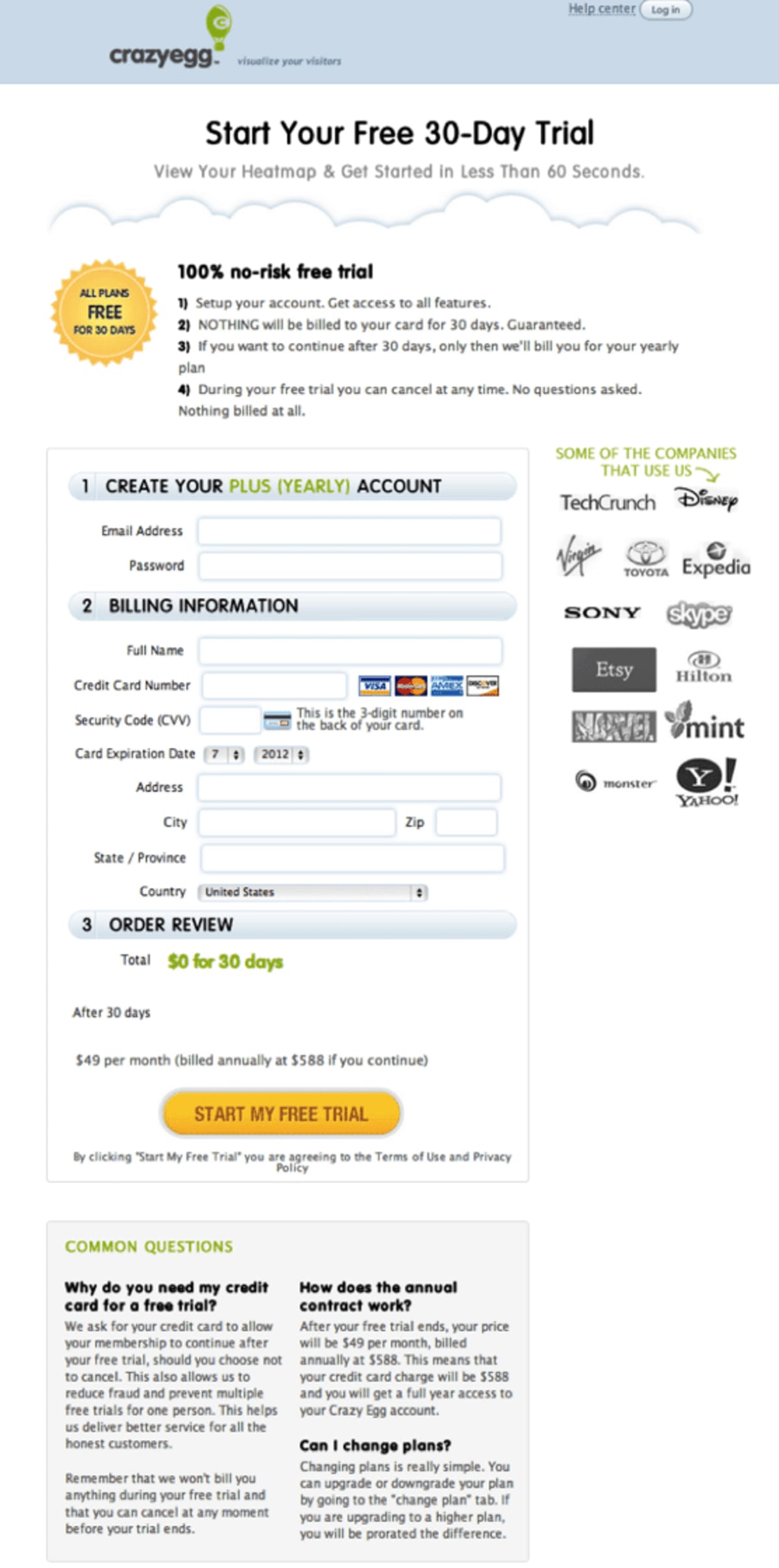
How did this revised page do in our test? It resulted in 116% more signups. (Perhaps we spoiled that surprise by mentioning it in the section heading.)
Handy lessons
- This last win powerfully illustrates our principle of “unblocking arteries”: Many visitors previously were ready but not-quite willing to convert on the free-trial page, and were being blocked by objections that had not been addressed. By overcoming the objections, we eliminated the blockage, and sales flowed.
- The one-time offer test illustrates another important principle of conversion optimization: Don’t let the fear of a short-term loss stand in the way of a long-term gain. For instance, don’t decide that you won’t install a pop-up survey on your homepage because you think it clutters the look. Implement the survey, gather data for a week or so, and then take it down. It’s the same with testing generous offers, like the 40% discount/one-time offer for Crazy Egg; if testing had shown that it was not effective, we would have deleted it from the site.
- Be sure to test different media for serving up the same persuasive content. If your site is text-heavy, then try video, and vice versa. Also, tune your message to the medium. For example, some concepts can be explained much more succinctly by video than by text.
- Don’t believe nonsense “rules” about how “short pages sell better.” The Harry Potter series proved that you can get people to line up at midnight in bookstores to receive the next lengthy book, as long as it’s interesting. If you listen closely to your prospects and then make sure your website addresses what’s on their mind, you can achieve your own mini Harry Potter moment.

- We’re great fans of customer survey tools like SurveyMonkey, but sometimes you need a more targeted way of gathering intelligence. By applying Qualaroo to individual pages, it’s possible to discover what’s on the minds of visitors right then and there, so you can address those issues in precisely the right place.
Our gift to you: a free annotated PDF of the winning Crazy Egg homepage
If you’d like an annotated image of the Crazy Egg winning page, with many detailed callouts explaining the persuasion techniques behind each page element, just sign up to our newsletter.
Thanks to Amee Shah at Crazy Egg
We want to thank Amee Shah for her willingness to share this sensitive data.
Since these first tests, we’ve continued to have substantial wins for Crazy Egg as a result of conversion optimization; in fact, we always are running a test of some sort.
Does every test result in a win? No, but by taking a methodical, analytical approach, our win rate is much higher than it would be otherwise. Plus, every test does give us greater insight into what works, what doesn’t, and how to prioritize future test hypotheses. With Crazy Egg—and with your own business—there are always more tests that can be run to improve the bottom line.
Speaking of your business, we highly recommend Crazy Egg to gain insights into your own customers and would-be customers. We use Crazy Egg often, and we were recommending it long before we were hired by the company, so with a pure heart we can vouch for its effectiveness.
A few words from Crazy Egg’s founders
Could you use more case studies like this?
If you would like to see more of our clients’ results, you can find a long list at our “Clients and Results” page.
How much did you like this article?
What’s your goal today?
1. Hire us to grow your company
We’ve generated hundreds of millions for our clients, using our unique CRE Methodology™. To discover how we can help grow your business:
- Read our case studies, client success stories, and video testimonials.
- Learn about us, and our unique values, beliefs and quirks.
- Visit our “Services” page to see the process by which we assess whether we’re a good fit for each other.
- Schedule your FREE website strategy session with one of our renowned experts.
Schedule your FREE strategy session
2. Learn how to do conversion
Download a free copy of our Amazon #1 best-selling book, Making Websites Win, recommended by Google, Facebook, Microsoft, Moz, Econsultancy, and many more industry leaders. You’ll also be subscribed to our email newsletter and notified whenever we publish new articles or have something interesting to share.
Browse hundreds of articles, containing an amazing number of useful tools and techniques. Many readers tell us they have doubled their sales by following the advice in these articles.
Download a free copy of our best-selling book
3. Join our team
If you want to join our team—or discover why our team members love working with us—then see our “Careers” page.
4. Contact us
We help businesses worldwide, so get in touch!
© 2026 Conversion Rate Experts Limited. All rights reserved.
A Brandwidth Group Company.


