How we doubled the sales of a web app (includes a useful PDF)
The following is from our huge library of client successes—why not discover how we can help grow your business?
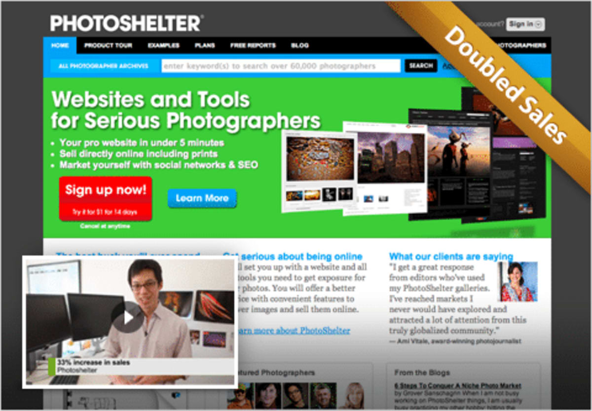
PhotoShelter is a web app that lets photographers easily create highly effective websites, allowing them to sell, market, and store their photography online. By applying our CRE Methodology™ to PhotoShelter’s website, we have helped it to double its annual sales. This is money that will continue to accrue every year.
How we got those improvements
When we started working with PhotoShelter, the company was already well beyond the stage of obtaining product/market fit; it was a successful business operating in a market that was relatively mature (at least in web terms) and competitive. It would never have doubled its sales if it had not aggressively tested its website to find improvements.
(Side note: If your company, product, service, web app, or whatever is still in its embryonic stages, we highly recommend you read the following resources: this article by Paul Buchheit, who created Gmail; this one by venture capitalist Paul Graham; and this slide deck by Dave McClure.
We have run many projects with PhotoShelter. Here are some of the activities that are most likely to apply to your own business:
1. How we improved the offer
Our surveys revealed that PhotoShelter’s visitors were anxious to try out the product. PhotoShelter already had a free version, but it had limited features, and an analysis of the business data revealed that it wasn’t particularly effective at persuading users to upgrade to the paid versions. On the other hand, we found that once users tried the fully functional version of PhotoShelter, they were likely to continue using it.
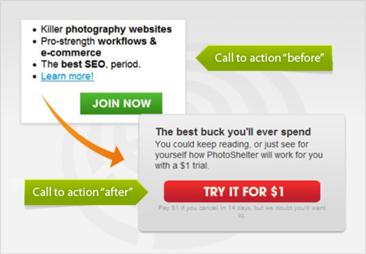
Armed with this insight, we established that our goal was to get as many visitors as possible to try out the fully functional paid version, by offering a no-risk $1 trial of it. The new conversion funnel was more popular with visitors than the “control,” as determined by a split test.
The split test was carried out using Google’s split-testing tool, but we obtained the results by analyzing data from PhotoShelter’s back-end system to compare the lifetime customer value of each group of customers.
2. How we got to understand the value of the service—so we could communicate it better
To better understand PhotoShelter’s service and its customers, we
- Organized discussions with serious photographers.
- Became paying customers of PhotoShelter.
- Surveyed PhotoShelter’s existing clients.
- Surveyed PhotoShelter’s prospects.
The insights gleaned from this research allowed us to better communicate PhotoShelter’s benefits, as seen through the eyes of its prospects.
Throughout the site, we used direct language about how PhotoShelter benefits photographers—based on things we knew they cared about, using language that we knew would resonate with them. Can you see how this stuff is no longer guesswork once you get under your customers’ skin?
For example, we reworded PhotoShelter’s table of benefits, prioritizing features that we knew the customers cared about, and expressing them in words that they would understand.
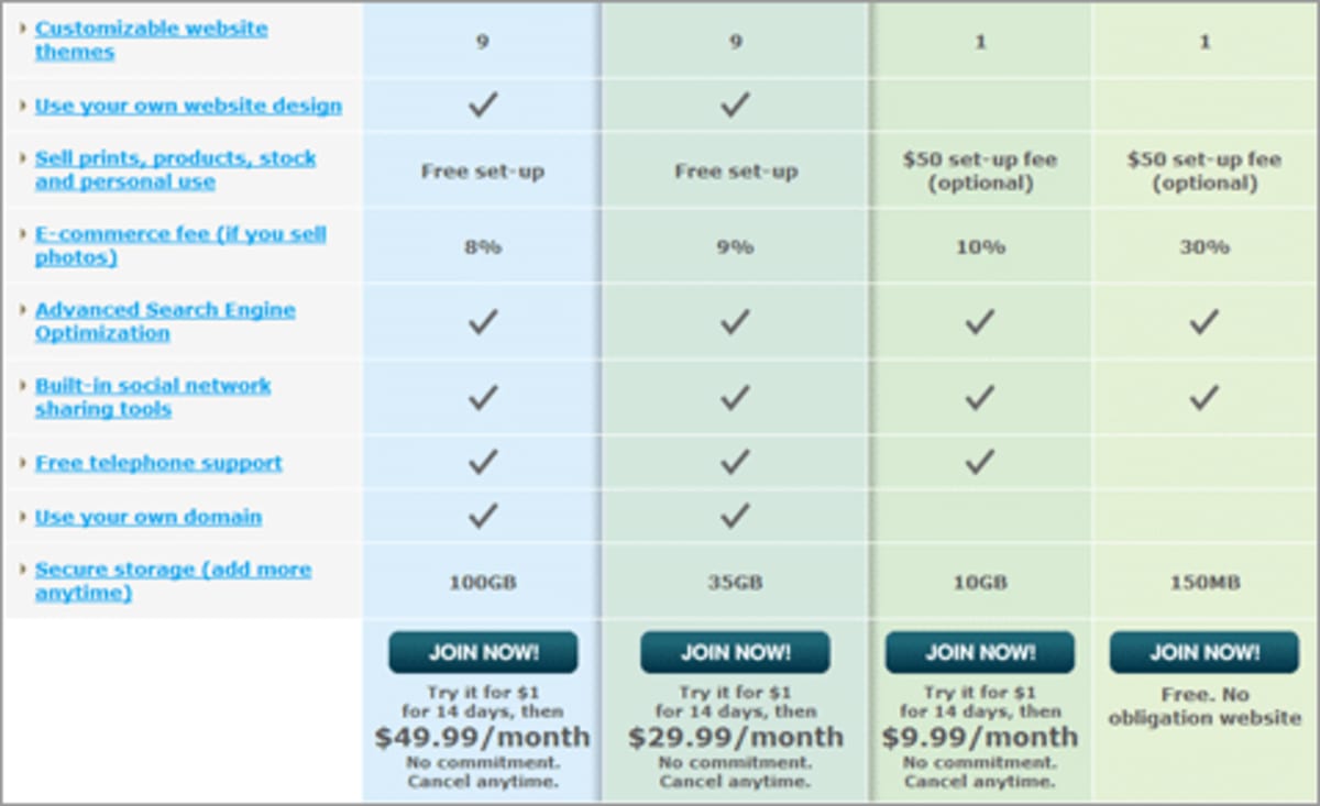
3. How we made a subtle—but effective—change to the architecture of the site
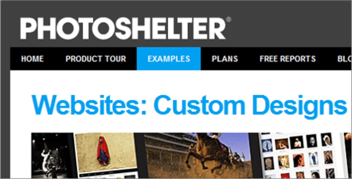
We surveyed the people who converted, to understand what made them different from those who didn’t. They reported that viewing examples of other photographers’ PhotoShelter websites had persuaded them to get their own.
An analysis of Google Analytics data confirmed that people who converted were much more likely to have seen examples of existing PhotoShelter websites.
Interestingly, this vital content was not prominently featured in PhotoShelter’s conversion funnel. We consequently added the Examples page to the global navigation bar. This subtle change may appear to have been trivial, but a split test confirmed it increased the site’s overall sales by 12%.
4. How we got new customers to engage with the product ASAP
With all companies, the conversion funnel extends far beyond the first sale. This is particularly true of web apps, which are usually charged as a monthly payment. We analyzed PhotoShelter’s entire customer journey to identify opportunities for increasing the customers’ satisfaction—and hence the lifetime customer value.
We wanted prospects to start using the product immediately after signing up. We therefore removed all distractions, showing users a linear path towards getting their first site set up. So, for example, we changed the user journey so that customers were encouraged to upload photos immediately after signing up.

Additionally, in response to customer surveys, we worked with PhotoShelter to create more help resources for new customers, to make it easier for them to get value from PhotoShelter.
Important lessons
- Test what matters most! Many people think that CRO involves tweaking different buttons, or following some set of “best practices.” The truth is that you have to identify the critical parts of your conversion funnel—and then be brave enough to test bold changes to them! With PhotoShelter, testing the offer was scary, but the pay-off was large.
- Discover what your customers care about, and then show it to them! PhotoShelter’s customers were happy to give feedback. We just had to ask them for it! We identified the key “persuasion assets” that customers stated as having been important in persuading them to convert. One example was seeing examples of real PhotoShelter-powered sites.
- Urge people to take action. Split testing verified the benefits of adding more calls-to-action. Once prospects converted, our job was not over; we needed to turn them into happy lifelong customers—ones who would recommend PhotoShelter to their friends. To discover another very simple yet extremely valuable change we made to PhotoShelter’s site, subscribe to our newsletter. The odds are your site is not doing this and you are missing out on conversions right now.
Some of the tools and techniques we used
- We spoke with photographers and carried out usability tests with them.
- To learn from visitors, we conducted exit surveys using 4Q.
- We also emailed customers to engage them directly, which proved to be overwhelmingly successful. PhotoShelter is lucky to have such devoted customers. The help they provided was priceless!
- We used Google’s split-testing tool.
- We also became paying customers of PhotoShelter and set up our own sites.
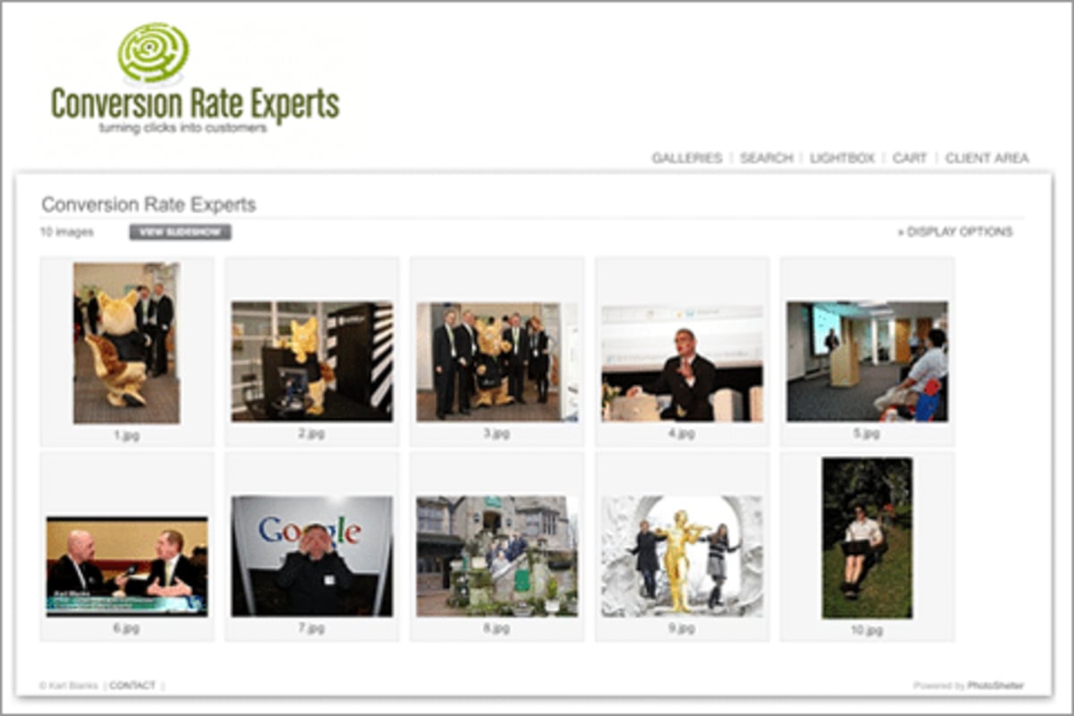
Thank you to PhotoShelter
PhotoShelter’s willingness to move forward with bold changes allowed the company to double sales, and it’s still growing! Successful conversion rate optimization requires a commitment from the consultants and the company; PhotoShelter certainly held up its end of the deal!
PhotoShelter has a great service and is helping over 60,000 photographers show their work. The company is helping many of them make a living from doing what they love.
This will work for your site!
Take one step at a time. The first step is to listen to the people interacting with your site. Give them the opportunity to talk to you, and you’ll discover eye-opening insights!
Based on these insights, make changes to your site, and then use split testing software to test the changes, so you can discover what your visitors prefer.
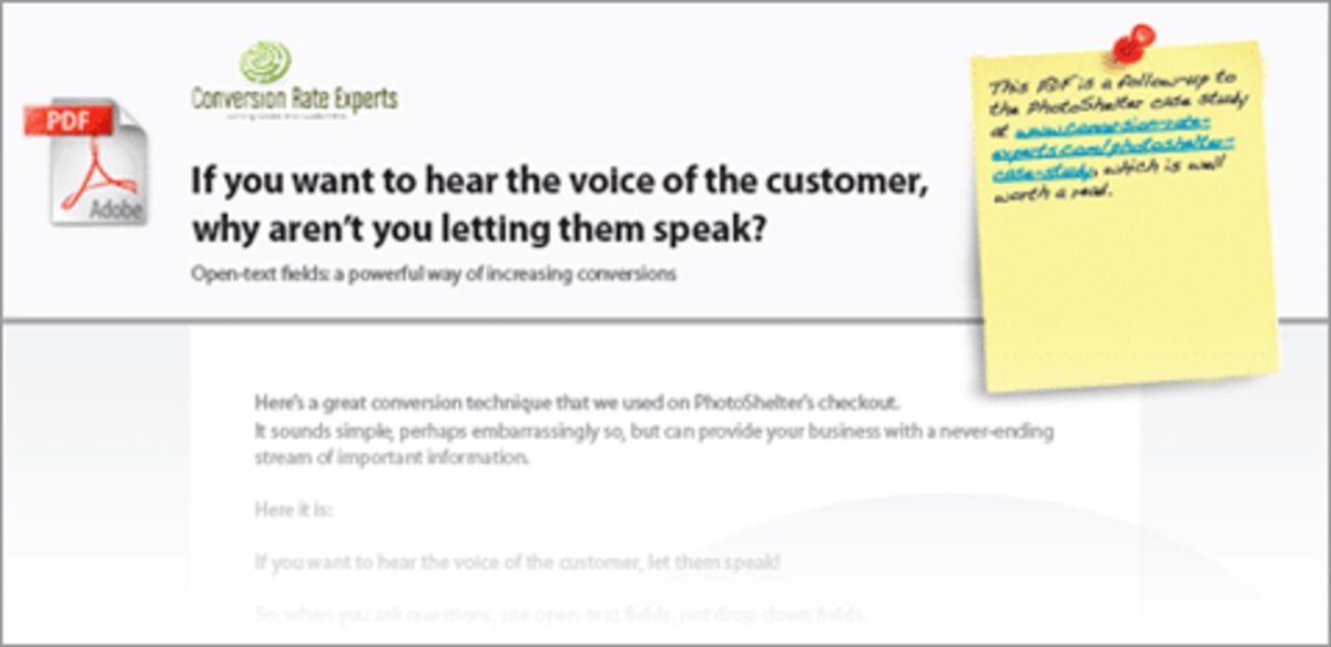
Our gift to you: a free PDF containing a powerful but simple “bonus tip”
To get a great additional tip that was incredibly effective for this project with PhotoShelter, subscribe to our free newsletter. We’ll send you a copy of the PDF straight away. The tip is a simple change to your site, but most companies aren’t using it. It’s applicable to pretty much any website.
To get a free PDF containing a powerful but simple “bonus tip,” subscribe to our free newsletter.
How much did you like this article?
What’s your goal today?
1. Hire us to grow your company
We’ve generated hundreds of millions for our clients, using our unique CRE Methodology™. To discover how we can help grow your business:
- Read our case studies, client success stories, and video testimonials.
- Learn about us, and our unique values, beliefs and quirks.
- Visit our “Services” page to see the process by which we assess whether we’re a good fit for each other.
- Schedule your FREE website strategy session with one of our renowned experts.
Schedule your FREE strategy session
2. Learn how to do conversion
Download a free copy of our Amazon #1 best-selling book, Making Websites Win, recommended by Google, Facebook, Microsoft, Moz, Econsultancy, and many more industry leaders. You’ll also be subscribed to our email newsletter and notified whenever we publish new articles or have something interesting to share.
Browse hundreds of articles, containing an amazing number of useful tools and techniques. Many readers tell us they have doubled their sales by following the advice in these articles.
Download a free copy of our best-selling book
3. Join our team
If you want to join our team—or discover why our team members love working with us—then see our “Careers” page.
4. Contact us
We help businesses worldwide, so get in touch!
© 2024 Conversion Rate Experts Limited. All rights reserved.

