Win Report: How “new” navigation increased sales by 32%
Win Reports help you grow your business by showing our methodology at work. Each Win Report showcases a real-world test, sharing the research, insights, and techniques that led to the win.

Ferplast has been creating innovative pet accessories for over 50 years. From their base in Italy, they manufacture 4,000 products, export to 85 countries, and hold over 100 international patents.
Research: Navigating the products
As part of our research process, we ask non-converting website visitors to list the three main reasons why they didn’t buy. These Exit Surveys allow us to gather data as close to the “decision point” as possible. The most common objection is usually “price,” but others can reveal powerful reasons why visitors aren’t converting.
For Ferplast, the second most common objection came as a surprise:
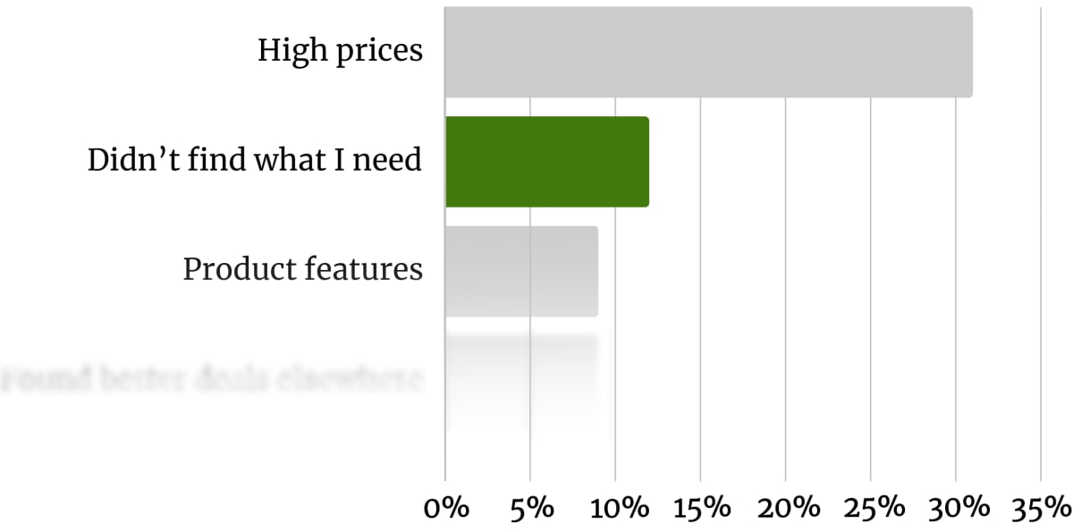
Many visitors were failing to find what they wanted, but not because Ferplast didn’t sell it. When we looked at the website analytics, we got a second surprise. Almost 90% of visitors never reached a product page.
In the great detective game of conversion rate optimization, this is what we live for.
Another piece of the puzzle appears in the heatmaps we recorded during our research. In the following homepage heatmap, the hotspots show the areas that desktop users clicked most.
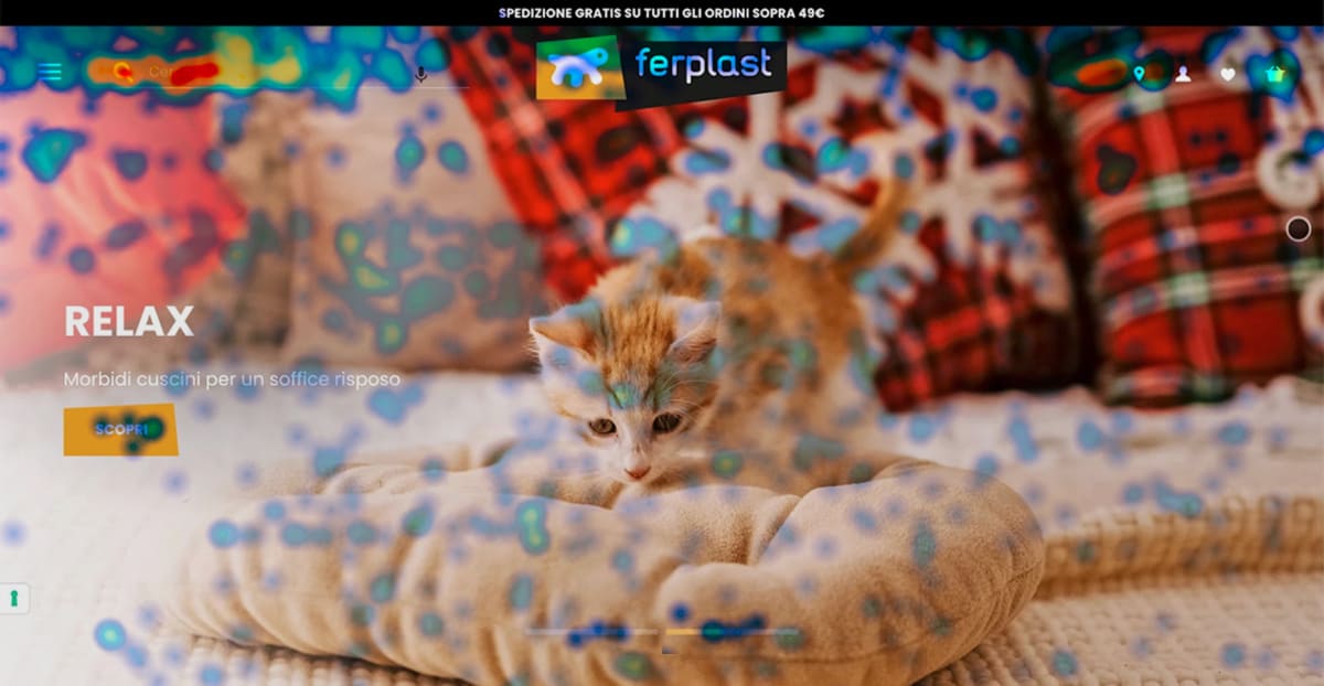
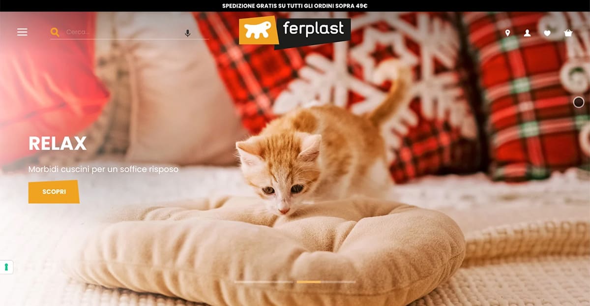
As you can see, the search box was the hottest part of the screen. What’s less obvious—and much less clicked—is the “hamburger” menu icon in the top-left.
User testing confirmed the menu’s lack of use. When we asked participants to find a product they defaulted to the search box. But that was a problem. The search wasn’t always returning all the relevant results.
When one tester searched for a cat bed (“lettino gatto”) on a mobile, they found three results:

But later, when they navigated to the Cat Beds through the hamburger menu, they found almost 20 times the options:
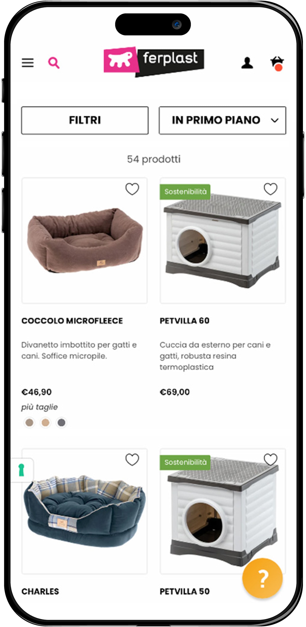
Although the search results were an issue to be investigated, there was also a problem with the navigation. Even our testers resisted using it to explore the website—especially on desktops.
Visitors who missed or avoided the menu saw fewer product pages and were much more likely to abandon the website.
Let’s look at the A/B test this suggested.
The original page (or control)
Here’s the Ferplast homepage. By this time, the design had changed to include a rotating image that sat behind both the menu icon and the search box:
The tested page (or variation)
Here’s what the variation looked like:
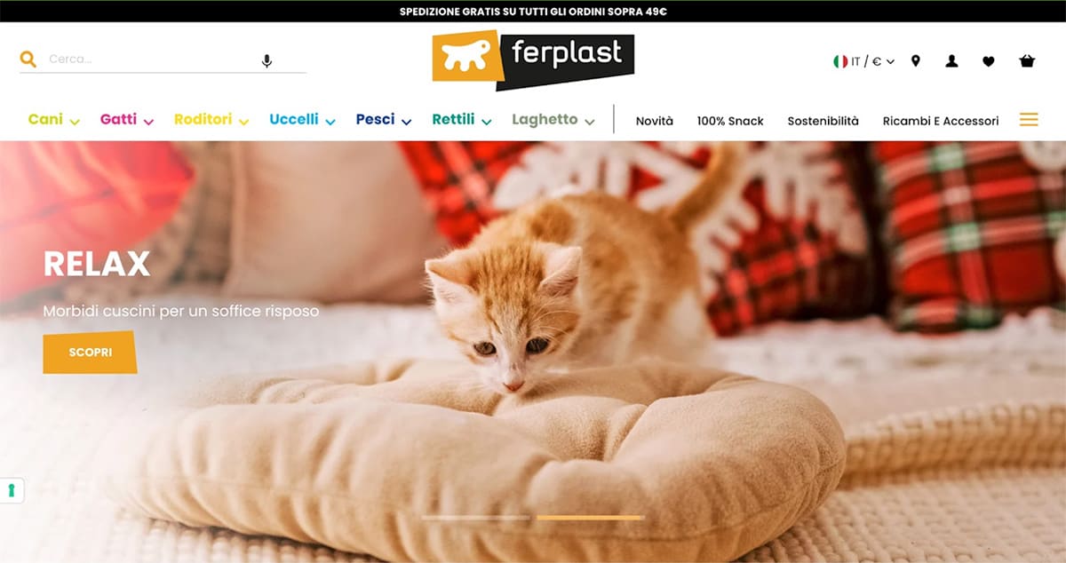
For desktops and wider devices, the navigation appeared as a full horizontal menu. In English, the items read:
- Dogs
- Cats
- Small Pets
- Birds
- Fish
- Pond
- Reptiles
- New Products
- 100% Snack (Dental snack)
- Sustainability
- Spare parts and accessories
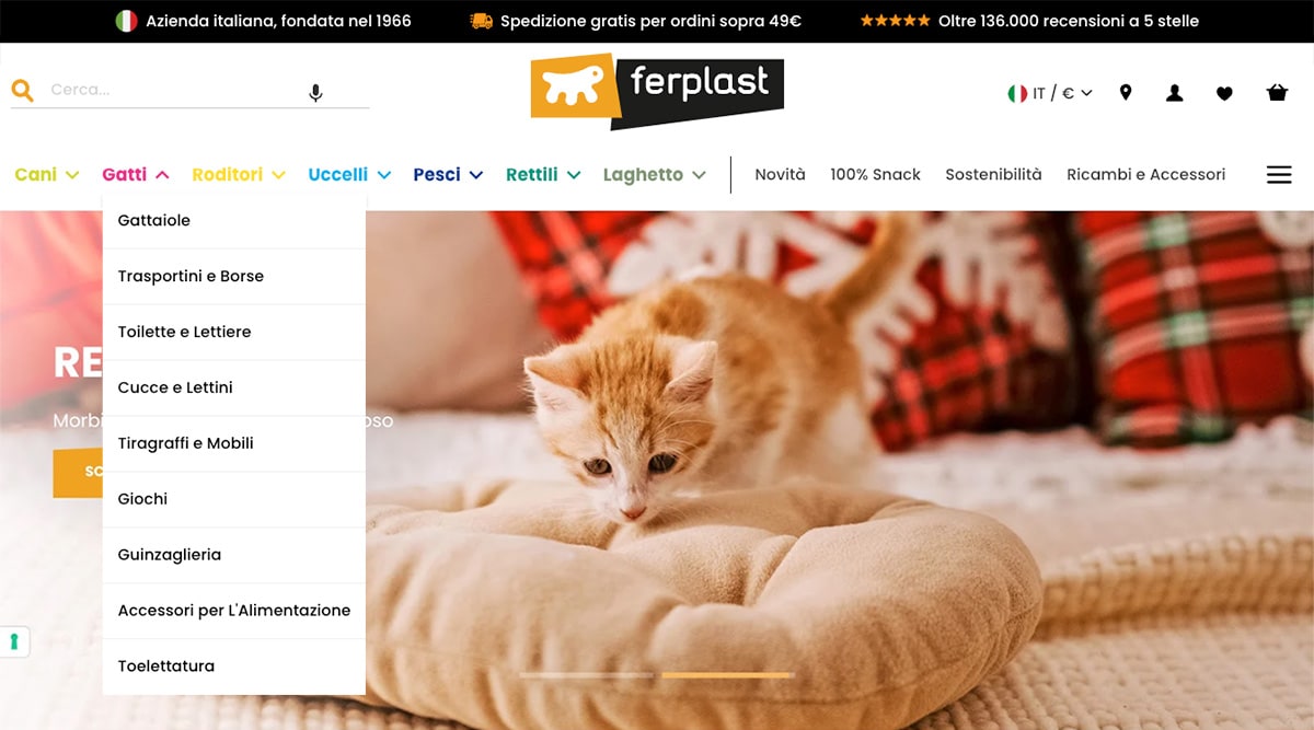
As you’d expect, each menu dropped down to reveal the sub-categories beneath.
Result: Sales increased by 32%
The drop-down menus gave users a clear forward path and exposed the breadth and depth of Ferplast’s product range. During the test, we observed a 32% increase in sales.
Of course, horizontal drop-down menus aren’t new. Quite the opposite. But “new” isn’t always best for conversion. Although many websites have moved to hamburger menus, research, and testing are always important if you want to win.
What next?
As usual, we added the test to our proprietary Wins Database, then looked for ways to apply its lessons to other parts of Ferplast’s business and then to other clients.
If you want us to grow your profits—quickly and efficiently—check if you qualify for a free one-on-one strategy session with one of our CRO consultants.
We’ll only work with you if we believe we can get amazing results together. Our success has come entirely from positive word of mouth, and we plan to keep it that way.
Thanks to Ferplast for letting us share these insights (and for being such a great team to work with).
How much did you like this article?
What’s your goal today?
1. Hire us to grow your company
We’ve generated hundreds of millions for our clients, using our unique CRE Methodology™. To discover how we can help grow your business:
- Read our case studies, client success stories, and video testimonials.
- Learn about us, and our unique values, beliefs and quirks.
- Visit our “Services” page to see the process by which we assess whether we’re a good fit for each other.
- Schedule your FREE website strategy session with one of our renowned experts.
Schedule your FREE strategy session
2. Learn how to do conversion
Download a free copy of our Amazon #1 best-selling book, Making Websites Win, recommended by Google, Facebook, Microsoft, Moz, Econsultancy, and many more industry leaders. You’ll also be subscribed to our email newsletter and notified whenever we publish new articles or have something interesting to share.
Browse hundreds of articles, containing an amazing number of useful tools and techniques. Many readers tell us they have doubled their sales by following the advice in these articles.
Download a free copy of our best-selling book
3. Join our team
If you want to join our team—or discover why our team members love working with us—then see our “Careers” page.
4. Contact us
We help businesses worldwide, so get in touch!
© 2026 Conversion Rate Experts Limited. All rights reserved.
A Brandwidth Group Company.


