Win Report: How usability improvements to a product page grew conversions by 23%
Win Reports help you grow your business by showing our methodology at work. Each Win Report showcases a real-world test, sharing the research, insights, and techniques that led to the win.
Ferplast has been creating innovative pet accessories for over 50 years. From its base in Italy, it exports to 85 countries around the world.
Research: User-testing product pages
Although we user test every part of a client’s funnel, we pay special attention to elements that are “close to the sale”—like product pages.
The product page is a critical decision point in online sales. It’s the place where all the work—the product design, development, production, and marketing–collapses into a single question in the customer’s mind: Yes or no?
In Ferplast’s case, user testing demonstrated why some visitors stalled at the product page. Let’s look at an example to get a sense of what was going on.
The original page (or control)
The top of Ferplast’s product pages looked like this:
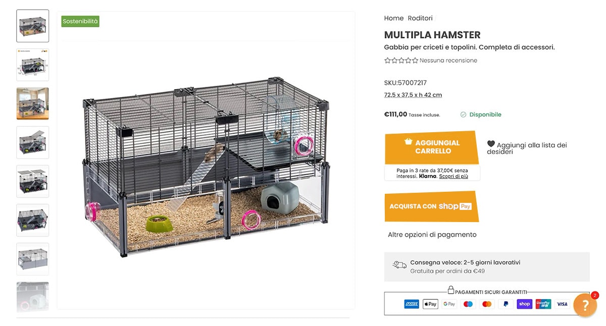
Here’s a list of observations we made during user tests:
- Having two checkout buttons caused confusion. The first added the product to a traditional basket, the second invoked the alternative payment provider, Shop Pay, which required authentication with a mobile phone number. The process worked, but if a user clicked the Shop Pay button by mistake (or simply preferred not to share their number), there was no clear way back to the product page.
- There was no mention of Ferplast’s return policy—which concerned some visitors.
- The SKU code added clutter but was not relevant for most users.
Each of these issues suggested an opportunity to improve the page.
The tested page (or variation)
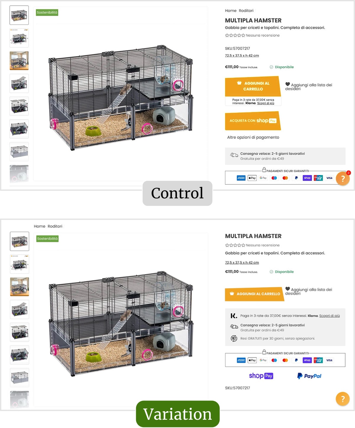
For this test, we subtly reworked the sales page template, making it easier to “read” and resolving the issues mentioned above.
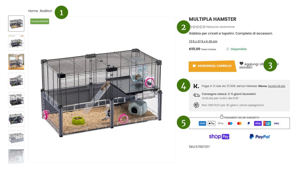
Our full list of changes included:
- Moving the navigation breadcrumbs to the left-hand side to reduce clutter.
- Raising the star rating to beneath the title so more visitors see it.
- Removing the ShopPay button to simplify the checkout journey. (ShopPay remains an option but is available when users check out.)
- Consolidating copy for Klarna, shipping, and returns into a “tidier” shaded box.
- Lifting some persuasive elements (like the PayPal logo) higher up the screen so more visitors see them.
Result: Sales rose by 23%
During the test, we observed a 23% rise in sales and a 42% increase in revenue per visitor.
Although each individual change was simple to implement, in accumulation, they made a big difference to the page’s usability. As we say on page 179 of our book Making Websites Win:
Almost every win has great usability woven into it—just like most successful books have “good grammar” in them. Usability underpins all of conversion. Along with readability, usability is a life skill that’s worth developing. The world has no shortage of things that are infuriatingly confusing to use. If you can make things easy to use, the world will love you.
To learn more, get a FREE copy of Making Websites Win (our Amazon #1 bestseller).
What next?
As usual, we added the test to our proprietary Wins Database, then looked for ways to apply its lessons to other parts of Ferplast’s business and then to other clients.
If you want us to grow your profits—quickly and efficiently—check if you qualify for a free one-on-one strategy session with one of our CRO consultants.
We’ll only work with you if we believe we can get amazing results together. Our success has come entirely from positive word of mouth, and we plan to keep it that way.
Thanks to Ferplast for letting us share these insights (and for being such a great team to work with).
How much did you like this article?
What’s your goal today?
1. Hire us to grow your company
We’ve generated hundreds of millions for our clients, using our unique CRE Methodology™. To discover how we can help grow your business:
- Read our case studies, client success stories, and video testimonials.
- Learn about us, and our unique values, beliefs and quirks.
- Visit our “Services” page to see the process by which we assess whether we’re a good fit for each other.
- Schedule your FREE website strategy session with one of our renowned experts.
Schedule your FREE strategy session
2. Learn how to do conversion
Download a free copy of our Amazon #1 best-selling book, Making Websites Win, recommended by Google, Facebook, Microsoft, Moz, Econsultancy, and many more industry leaders. You’ll also be subscribed to our email newsletter and notified whenever we publish new articles or have something interesting to share.
Browse hundreds of articles, containing an amazing number of useful tools and techniques. Many readers tell us they have doubled their sales by following the advice in these articles.
Download a free copy of our best-selling book
3. Join our team
If you want to join our team—or discover why our team members love working with us—then see our “Careers” page.
4. Contact us
We help businesses worldwide, so get in touch!
© 2026 Conversion Rate Experts Limited. All rights reserved.
A Brandwidth Group Company.


