Win Report: 13% increase in sales with a simple change to a product page
(By the way, to get articles like this free in your inbox, subscribe to our newsletter.)
Win Reports help you grow your business by showing our methodology at work. Each Win Report showcases a real-world test, sharing the research, insights, and techniques that led to the win.
In the next three minutes, we’ll show you how smoothing out an ecommerce product page increased conversions by 13%.

House of Worktops (HoW) is the only UK worktop supplier that manages the entire journey of its products from forest to front door. Specializing in premium oak, beech, ash, and walnut, their end-to-end model delivers superior quality, lower carbon emissions, and exceptional customer service. With over 4,000 reviews, the company has a 4.8/5 rating on Trustpilot.
Research: Hunting down friction
The best product pages are clear, persuasive, and friction-free. As we’ve said before, they are high-leverage opportunities for ecommerce CRO because they sit so close to the critical customer decision point.
When we reviewed House of Worktops’ product pages, one thing stood out. Sitting just above the key call-to-action (“See Sizes & Prices”) was a delivery checker—a short form that let visitors enter their postcode (ZIP code) to see delivery availability and cost.

We knew from our research that delivery times and prices were an important concern for House of Worktop’s customers. But then again, did they matter now, before customers had even seen the worktop pricing? Or was the checker adding friction right at the moment we wanted users to move forward?
It’s easy to see the checker as a small thing, but we know from long experience that small things can disrupt flow at critical moments, creating unnecessary questions, activity, and cognitive load. On the heatmap of the page, you could see that the checker was attracting a fair amount of visitor attention.

How could we reduce the distraction without losing the functionality for users who needed it most?
The original page (or control)
Here’s a closer view of the right-hand section of the product page.

The tested page (or variation)
For the variation, we replaced the postcode form with a simple link. This retained the functionality while making it (implicitly) clear that the checker was optional.

If a user clicked the link, it revealed the checker, which in turn provided an indicative delivery date and price.

As a final change, we added the following link below the form: “Need it sooner? Speak to our delivery team.”
This was a fallback intended to “catch” visitors for whom speedy delivery mattered most.
Result: Sales increased by 13%
During the test, we observed a 13% increase in sales and a 24% increase in revenue.
While the delivery checker wasn’t exactly a rough edge, this test shows the value of sanding product pages to the smoothest finish possible.
What next?
As usual, we added the test to our proprietary Wins Database, then looked for ways to apply its lessons to other parts of House of Worktops’ business and then to other clients.
If you want us to grow your profits—quickly and efficiently—check if you qualify for a free one-on-one strategy session with one of our CRO consultants.
We’ll only work with you if we believe we can get amazing results together. Our success has come entirely from positive word of mouth, and we plan to keep it that way.
Thanks to House of Worktops for letting us share these insights (and for being such a great team to work with).
How much did you like this article?
What’s your goal today?
1. Hire us to grow your company
We’ve generated hundreds of millions for our clients, using our unique CRE Methodology™. To discover how we can help grow your business:
- Read our case studies, client success stories, and video testimonials.
- Learn about us, and our unique values, beliefs and quirks.
- Visit our “Services” page to see the process by which we assess whether we’re a good fit for each other.
- Schedule your FREE website strategy session with one of our renowned experts.
Schedule your FREE strategy session
2. Learn how to do conversion
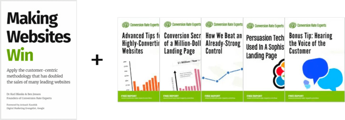
Download a free copy of our Amazon #1 best-selling book, Making Websites Win, recommended by Google, Facebook, Microsoft, Moz, Econsultancy, and many more industry leaders. You’ll also be subscribed to our email newsletter and notified whenever we publish new articles or have something interesting to share.
Browse hundreds of articles, containing an amazing number of useful tools and techniques. Many readers tell us they have doubled their sales by following the advice in these articles.
Download a free copy of our best-selling book
3. Join our team
If you want to join our team—or discover why our team members love working with us—then see our “Careers” page.
4. Contact us
We help businesses worldwide, so get in touch!
© 2026 Conversion Rate Experts Limited. All rights reserved.
A Brandwidth Group Company.