Win Report: How removing content increased conversions by 36%
(By the way, to get articles like this free in your inbox, subscribe to our newsletter.)
Win Reports help you grow your business by showing our methodology at work. Each Win Report showcases a real-world test, sharing the research, insights, and techniques that led to the win.

iFLY offers awesome indoor skydiving experiences at over 80 locations around the world. Their iconic wind tunnels host professional skydivers, national competitions, groups of families and friends who are often experiencing the sport for the first time… and slightly apprehensive team members from CRO agencies conducting Method Marketing.

As part of a wider brief to help grow iFLY’s business, we looked at one of their more important and fun revenue streams—birthday parties 🎉
Research: What your users see
Our Win Reports often mention the value of listening to users, but watching what they do can be just as useful. That’s why scrollmaps are a standard part of our methodology.
Scrollmaps help us understand if people are seeing important content on a webpage. They aggregate the behavior of hundreds or thousands of users, helping identify opportunities to increase conversion and target further research.
Here’s the desktop scrollmap we captured from the Birthday Party page. The “hotter” the content, the more users saw it.

The scrollmap above tells a simple story. Many users never scrolled past the page header or saw the key birthday content. (Mobile users saw even less.)
Let’s take a closer look.
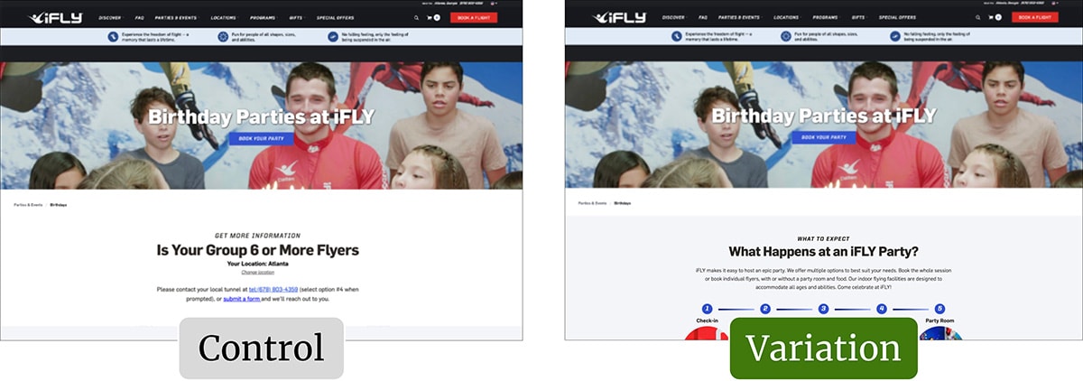
The original page (or control)
Here’s the top of the original page, cropped to show the content that most desktop users saw:

Our research indicated that the visible content:
- Did little to wow parents looking to arrange a special birthday treat.
- Implied that parties with fewer than six guests were in the wrong place.
- Suggested next steps (phone calls or forms) without stating clear benefits.
- Lacked any explanation of what an iFLY birthday party entailed.
The “lack of explanation” issue had come out in our wider user testing. Despite plenty of relevant content, some participants were concerned about what to expect if they booked a visit. “Flying” is new to most people, and some need extra reassurance—a desire likely magnified if you are bringing your children and their friends.
Although many of the issues above were addressed in the deeper page content, few users ever saw it. In the screenshot above, the white design creates a “false bottom.” Some users may not have realized that there was further content beneath.
What could we test—quickly and easily—to validate our hypothesis?
The tested page (or variation)
In the tested variation, we removed the top section of content, allowing all users to see the next section—“What happens at an iFLY Party?”:

The newly revealed copy hinted at the options and flexibility on offer:
iFLY makes it easy to host an epic party. We offer multiple options to best suit your needs. Book the whole session or book individual flyers, with or without a party room and food. Our indoor flying facilities are designed to accommodate all ages and abilities. Come celebrate at iFLY!
By removing the top section, the birthday parties page:
- Became more relevant and inviting.
- Offered clearer benefits—e.g., the ease of hosting an “epic” party.
- Removed a possible confusion around “6 or more flyers.”
- Teased a more engaging visual with the 5-step process.
- Clearly continued below—which made scrolling much more likely.
Result: Conversions increased by 36%
During the test, we observed a 36% increase in conversions and a 47% increase in revenue per customer.
What next?
As usual, we added the test to our proprietary Wins Database, then looked for ways to apply its lessons to other parts of iFLY’s business and then to other clients.
If you want us to grow your profits—quickly and efficiently—check if you qualify for a free one-on-one strategy session with one of our CRO consultants.
We’ll only work with you if we believe we can get amazing results together. Our success has come entirely from positive word of mouth, and we plan to keep it that way.
Thanks to iFLY for letting us share these insights (and for being such an awesome team to work with).
How much did you like this article?
What’s your goal today?
1. Hire us to grow your company
We’ve generated hundreds of millions for our clients, using our unique CRE Methodology™. To discover how we can help grow your business:
- Read our case studies, client success stories, and video testimonials.
- Learn about us, and our unique values, beliefs and quirks.
- Visit our “Services” page to see the process by which we assess whether we’re a good fit for each other.
- Schedule your FREE website strategy session with one of our renowned experts.
Schedule your FREE strategy session
2. Learn how to do conversion
Download a free copy of our Amazon #1 best-selling book, Making Websites Win, recommended by Google, Facebook, Microsoft, Moz, Econsultancy, and many more industry leaders. You’ll also be subscribed to our email newsletter and notified whenever we publish new articles or have something interesting to share.
Browse hundreds of articles, containing an amazing number of useful tools and techniques. Many readers tell us they have doubled their sales by following the advice in these articles.
Download a free copy of our best-selling book
3. Join our team
If you want to join our team—or discover why our team members love working with us—then see our “Careers” page.
4. Contact us
We help businesses worldwide, so get in touch!
© 2026 Conversion Rate Experts Limited. All rights reserved.
A Brandwidth Group Company.


