Copywriting Friday: A masterclass in attention and credibility
(By the way, to get articles like this free in your inbox, subscribe to our newsletter.)
Copywriting Friday highlights the tools and techniques of persuasive content. Some of the examples may seem dated, but the principles are timeless (and critical for conversion rate optimization). Enjoy.
If you’ve read some of our Copywriting Friday articles before, you know we’re fans of ads that have stood the test of time and that contain principles that are applicable to many industries and situations. We have just such an ad for you today, from Ogilvy & Mather. Here it is:
The ad

Six techniques in this ad that you can use right away
1. Create a crystal-clear headline
The first job of any ad is to get attention. The ad above is more than 50 years old, but it contains techniques that are just as effective today as when it came out. It’s refreshing to view these techniques in the hands of a master, because few modern ads knit them together as effectively.

Let’s start by examining the headline. You can’t get more straightforward than “How to advertise travel”. Readers don’t even need five seconds to know if this ad is for them. The vast majority of people will have no interest, but consider the travel executive who needs help and finds this ad; the headline will be a thunderclap that cannot be ignored. First job done.
Many ads, emails, and webpages try to do too much in the headline; they try to both open and close the sale and succeed at neither, with a headline that’s a paragraph long and filled with hyperbole about “what they don’t want you to know” and so on. Here’s an example from the 1920s:
How a Strange Accident Saved Me from Baldness: The Amazing Story of a Bald-Headed Barber who Discovered an Incredibly Simple Way to Quickly Grow More Hair and Keep It for Life-Without Painful Treatments, Expensive Lotions, or Risky Surgery.
There may be nothing incorrect about the headline, but that doesn’t mean it’s effective. Long headlines like that are asking readers to think too hard before they’re motivated to do so. It’s worth seeing how short you can make your headline to attract the exact target audience you have in mind. We discuss headline creation at some length here. (See #34 in that article.)
2. Answer the next two vital questions
Now that Ogilvy has the attention of the busy exec, the next job is to answer “Who are you?” and “Why should I bother reading more?”
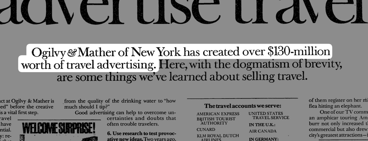
That subhead instantly delivers. The “who” is Ogilvy & Mather New York, and the “why” is that they’ve created over $130 million (in today’s dollars, that’s $990 million) worth of travel advertising.
Notice how much work has been done by just the headline and subhead. It captured the target reader (at least briefly) and built credibility. That work justifies why Ogilvy took the space to set the headline in gigantic font, with a prominent subhead. How succinct can you be at answering the two questions above?
Because you cannot overdo credibility and proof, we wrote a guide to earning it.
3. Imply how deeply you know the subject matter
The subhead handles another task in a clever way: It introduces a giant block of dense text—the entire rest of the ad—by saying:
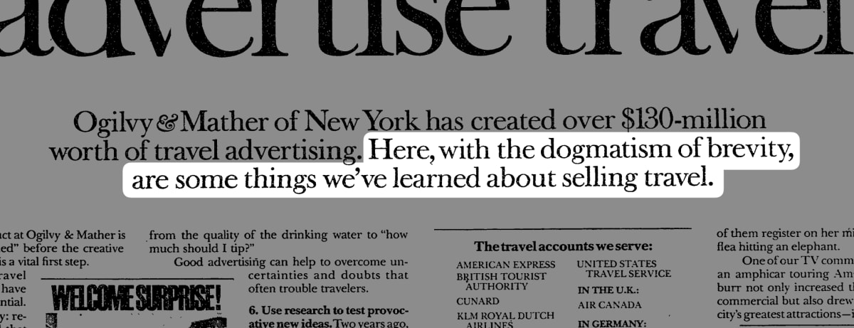
We can hear the exec thinking: So this is brevity? This is just a bit of what you know about selling travel? Well then.
It’s common to hear people say: “Long copy doesn’t work. No one reads anymore.” The legendary copywriter, Gary Halbert, said: “An ad can never be too long—only too boring.” That makes a lot of sense: If I’m tasked with boosting sales for our travel-related company, I’ll gladly hoover up any free advice Ogilvy will give me, and be sorry that the ad was only one dense page. That’s a great example of “message to market match.”
4. Create a path for readers and for scanners

Unless you’re creating a very short ad, it pays to recognize that your prospects come in two flavors—readers and scanners. Our highly motivated exec will read every word, and may even take notes. Other, semi-motivated people may not be in the travel industry, but they may suspect that Ogilvy has advice that also works for their situation. They’ll scan the ad to see if they should slow down and really focus on it. A well laid-out ad caters to both groups.
You can do this by doing three things:
- Keep your line lengths relatively short. The longer the line of text, the harder it is for the eyes to read it. Try to keep line lengths at about 65 characters or less. Even though Ogilvy packs lots of text into a small area, they use four columns to do it.
- Add subheads. They tell people who like to scan just what it is that you’re talking about at any given section. Ogilvy does a good job of this with subheads like: “How to generate more coupon returns” and “Travel layouts: what we’ve learned”.
- Add images to boost engagement. Notice how the images are placed in columns and even across two columns. The fact that those images contain microscopic text is not a problem for the target market. If they really want to read every word, Ogilvy will surely provide them with the original ads. These days it’s even easier: You can show a thumbnail image and allow visitors to click to expand it.
These are just three techniques of many. We discuss other aspects of scientific web design here.
5. Give before you get
Many ads, emails, and landing pages are basically teasers: Here’s a bit of bait; if you really want the goods, sign up or pay up.
In contrast, Ogilvy stuffs 22 lessons into the ad. Note how almost every one of the lessons contains either research, a story, or the results of testing. They’re all forms of proof elements. Ogilvy doesn’t say: “We’re great! Buy here!” but instead engages you with micro stories such as:

We understand why companies may hesitate to spill the beans for free; they’re concerned that people will take the valuable information and simply do it themselves.
When our founders were about to publish their first article about conversion rate optimization, they paused over the “send” key for this same reason. They literally had put everything they knew about conversion rate optimization into that first article—and now were sending it to the world…for free?
We’ve all heard the saying:” Give a man a fish, feed him for a day; teach a man to fish, feed him for a lifetime.” That may be true, but it’s also true that a great many organizations simply want the fish, once you’ve proven that you know how to fish and can do it for them. They’re busy with whatever they sell, and don’t want to become experts at conversion rate optimization or travel advertising. At Conversion Rate Experts, we rediscovered what Ogilvy knew: Giving away loads of useful information really does work, and it helps to put you in a category high above the “teasers”.
6. Don’t make your CTA seem needy
Conventional wisdom is you need to sprinkle your promotional copy with loads of calls-to-action or CTAs. The theory is you need to make it super easy for people to take action when they’re in the mood. After all, “Don’t make them hunt.”
We can assume that Ogilvy knew all about that theory, yet look at how the ad ends. There’s not even a phone number! Nor is there a deadline before some offer goes away, and no language about “Don’t miss this opportunity!”
There’s just a small statement in the bottom corner:

Convenience is fine, but engagement is better. If you have done your job in the copy, people will gladly spend a few seconds looking around for your CTA and they’ll even jump through a hoop or two. How could they not? It’s hard to imagine a prospect thinking: Wow those Ogilvy people sound amazing! We’ve been hunting for an expert at travel advertising to boost our sales. But I only see an address to write to them, and no phone number. Oh well, never mind.
We’re not suggesting that you should leave off your phone number, that deadlines are bad, or you should make people work to reach you. What we like the most about the Ogilvy ad is how they nail the crucial objectives of clarity, credibility, and proof. Get those right, and prospects will gladly seek you out.
A valuable perspective
Every person is unique, and every company is, too. There is a time and place to celebrate our differences. But it’s also useful to recognize persuasion elements that are both effective and timeless—the kind that Ogilvy & Mather uses in its ads. Sometimes the next “new thing” might just be some forgotten approaches that worked long ago, and still work now.
See you next time on Copywriting Friday.
How much did you like this article?
What’s your goal today?
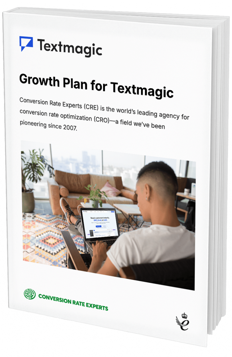
1. Hire us to grow your company
We’ve generated hundreds of millions for our clients, using our unique CRE Methodology™. To discover how we can help grow your business:
- Read our case studies, client success stories, and video testimonials.
- Learn about us, and our unique values, beliefs and quirks.
- Visit our “Services” page to see the process by which we assess whether we’re a good fit for each other.
- Schedule your FREE website strategy session with one of our renowned experts.
Schedule your FREE strategy session
2. Learn how to do conversion
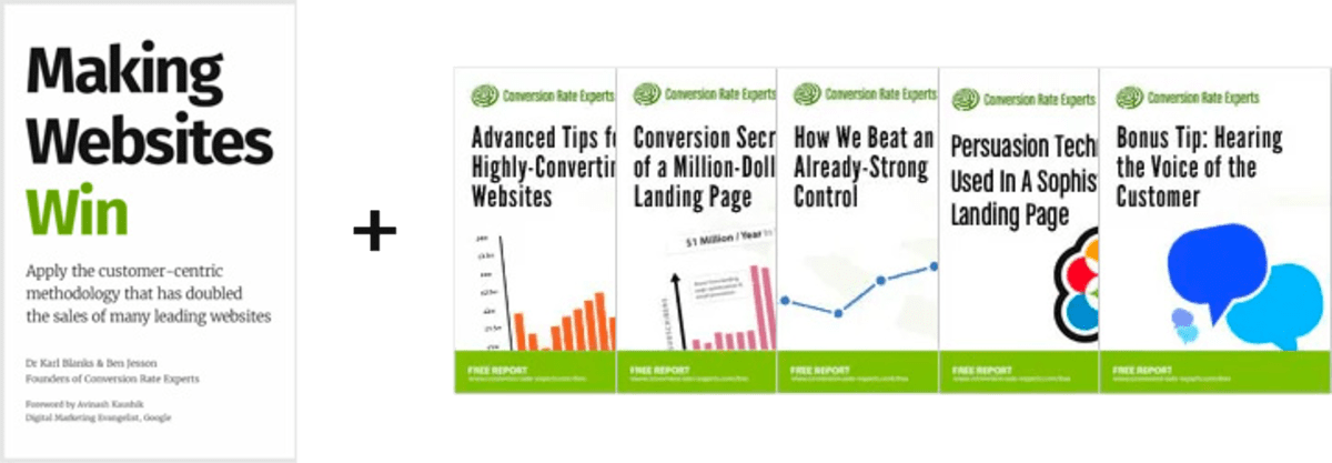
Download a free copy of our Amazon #1 best-selling book, Making Websites Win, recommended by Google, Facebook, Microsoft, Moz, Econsultancy, and many more industry leaders. You’ll also be subscribed to our email newsletter and notified whenever we publish new articles or have something interesting to share.
Browse hundreds of articles, containing an amazing number of useful tools and techniques. Many readers tell us they have doubled their sales by following the advice in these articles.
Download a free copy of our best-selling book
3. Join our team
If you want to join our team—or discover why our team members love working with us—then see our “Careers” page.
4. Contact us
We help businesses worldwide, so get in touch!
© 2026 Conversion Rate Experts Limited. All rights reserved.
A Brandwidth Group Company.