Low-traffic, high-value: A CRO case study on Millbank FX
(By the way, to get articles like this free in your inbox, subscribe to our newsletter.)
When we think about low-traffic websites, it’s easy to imagine small businesses or startups. But of course, that’s not always the case.
Many low-traffic sites simply offer tailored, high-value services. Companies like these may have relatively few conversions, but each can be worth a huge amount.

One such example of a low-traffic, high-value company is our client, Millbank FX. They provide large multinational companies with bespoke and cost-effective foreign exchange solutions, and have managed over £6 billion in transactions.
In this case study, we’ll describe the steps we took to help grow Millbank FX’s business. The techniques we’ve used apply to any low-traffic website, whether it’s a small company, a startup, or a high-value service.
Research: Usability testing
Research is the bedrock of our methodology, and we began the engagement as we would any other, with a full usability study. To learn why these are especially valuable for low-traffic websites, see our article: Why CRO is hard for startups and low‑traffic websites (and how to overcome it).
To set up the study, we assembled a panel of users with annual foreign exchange (FX) requirements ranging from $4 million to $127 million, and assigned them a series of tasks and questions. (Using qualified participants is the gold standard, but you can still get hugely valuable insights from colleagues, friends, and so on. See our article on user testing for more information.)
For our part, we wanted to understand whether:
- The site’s initial impression would encourage our participants to explore further.
- The content effectively communicated the company’s services.
- The testers could easily locate and navigate to key information.
- The content inspired confidence in Millbank FX’s brand and services.
- The industry-savvy testers had any unanswered questions.
We asked each participant to narrate their choices, behavior, and opinions as they progressed through the test. As always, the user test revealed insights that would be hard or impossible to see from “inside the tent.”
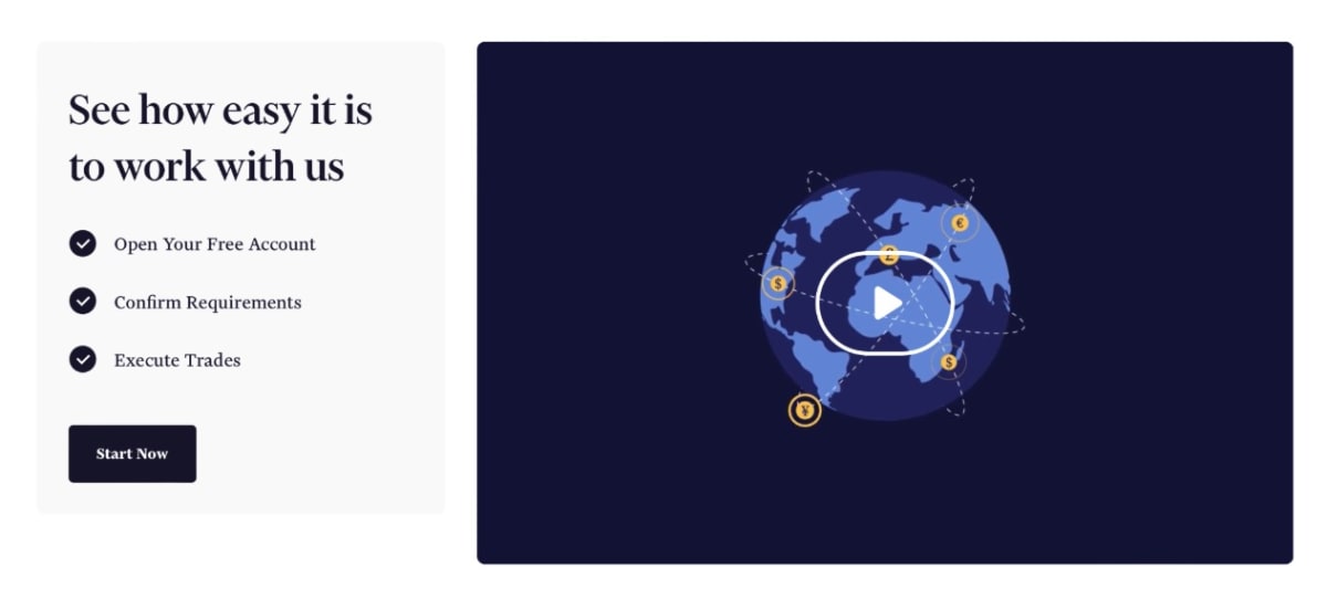
To take one basic example, it was easy to see the homepage video if you knew it was there, but many of our user testers missed it (and the value it conveyed).
As we collated the data, we began to see the patterns emerging across key pages of the site. Our user testers:
- Struggled to understand Millbank FX’s core services.
- Did not recognize the company’s unique value.
- Wanted more information about the background of Millbank FX (and far more testimonials from their clients).
- Did not see a clear benefit to returning or signing up for a consultation.
What a fantastic and useful result. As we say in our article on user testing:
“The best user tests may leave you in tears—and that’s a good thing. The worse a test is, the more A/B testing levers we’ll have to pull to increase the conversion rate. Issues are often easy to fix, and the more you do, the more your mindset will shift to a place of gratitude and opportunity.”
To create meaningful comparisons, we also conducted a competitor study, in which a panel of users from the target market reviewed Millbank FX alongside other key players in the foreign exchange (FX) market. This is a valuable way to benchmark a site against the competition and capture persuasive strategies that others are using. None of the participants knew which company was our client, and they assessed each site on things like:
- Informativeness.
- Trustworthiness.
- Ease of use (and navigation).
- Likelihood of exploring further.
Although Millbank FX scored highly in terms of trustworthiness, it was rated as the least informative site among its competitors.

While our testers were able to articulate some of the information they felt was missing from the website, it’s useful to understand how different areas of research can often come together to generate wins. For example, our Voice of the Customer (VoC) research module collects data from individuals who speak directly with clients and prospects (“VOC Aggregators”). When we spoke with the salespeople and client managers at Millbank FX, they told us about the aspects of the service that surprised and delighted prospects, many of which were not clearly stated on the website.
By triangulating these two research areas, we could both diagnose the problem and understand the solution.
How we optimize low-traffic pages
In a high-traffic engagement, we would normally use our research insights to develop new pages and test them scientifically with traditional A/B testing. Because that’s less feasible with low-traffic websites—the tests would take months or even years to complete—we have to approach the problem in a different way.
But it’s not that different.
A/B Usability Testing is a technique that involves running a closed A/B test, where the “traffic” consists of a group of participants in a usability test.

A/B Usability Testing can often be more effective than straight A/B Testing if you want to:
- Get feedback fast.
- Learn why expert testers like and dislike certain versions.
- Iterate quickly across multiple versions.
- Validate ideas before committing to an A/B test.
A/B Usability Testing was a particularly useful technique for Millbank FX because it allowed us to collect feedback and suggest wireframes for the company’s internal design and development team.
Starting with Millbank FX’s homepage, we:
- Crafted 25 headlines and propositions based on CRE-proven direct response copy, then asked the client to pick the ones they preferred. (This was a fast way to get a feel for their tonal preference and appetite for boldness, and reflect our understanding of the client and its business model.)
- Sent the six preferred versions for A/B usability testing and used the winning version as the basis for a new homepage.
- Drafted a new homepage in Google Docs and sent it for user testing. (It’s best to use easily editable formats for as long as it’s practical to do so.)
- Incorporated the feedback.
- Created a new wireframe and sent it for user testing.
- Incorporated the feedback.
- Worked with the internal development team, who created a design, and sent it for user testing.
- Implemented the new content into Millbank FX’s website and sent the live pages for user testing.
As we worked through the process, getting feedback at each step, we were able to understand the narrative flow that users preferred and move or add sections accordingly.
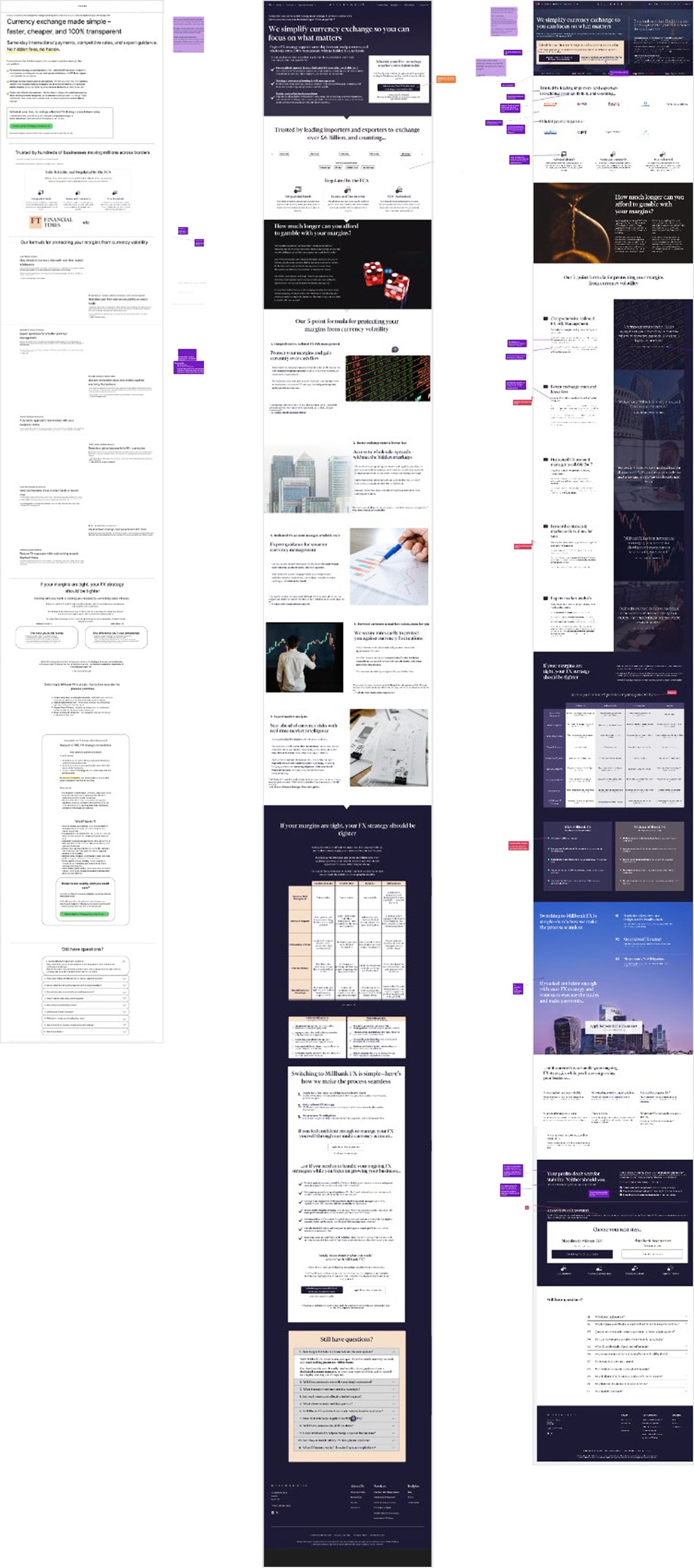
The new homepage
Here’s the top of the final homepage (with the full version shrunk to the right).
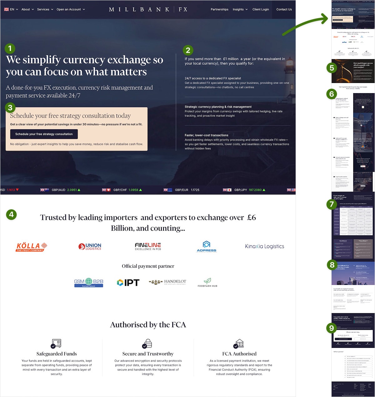
Working with Millbank FX’s internal design and development team, we:
Rewrote the headlines and copy to align with user pain points like profit erosion and FX unpredictability. By focusing on simplification, control, and peace of mind, we positioned Millbank FX as solving real business challenges.
Called out the specific target audience. By making it explicit that Millbank FX is built for businesses moving £1m+ per year, we helped pre-filter leads and build trust with enterprise buyers.
Added context to the hero Call to Action (CTA), making it more actionable and benefit-driven. The enhanced hero design encouraged higher engagement above the fold, where interaction had been historically low.
Boosted trust signals. By adding client logos, credentials from the UK’s financial regulator, and named testimonials throughout the page, we closed credibility gaps and boosted regulatory reassurance. (For more on this, see our article, The ultimate guide to proof.)
Restructured the content to be benefit-led (and easy to scan). We replaced long blocks of copy with scannable content focused on outcomes like protecting margins or speeding settlements. Client quotes and data backed each point to help move visitors through a persuasive information journey.
Highlighted Millbank FX’s benefits over the competition. We created a detailed comparison table to show Millbank FX’s advantages over banks, FX providers, and fintechs, making it easier for first-time visitors to see the service’s unique value. (See our article, How to beat your competitors.)
Explained what would happen next. We clarified the differences between scheduling a strategy session and opening an account, then added a simple onboarding explanation to lower perceived commitment barriers. (We cover this future pacing strategy more deeply in our article: Three techniques to improve your value proposition.)
Added a secondary CTA for low-intent users. In addition to restating the benefits of the strategy session, the in-page CTA offered the choice to “Skip the strategy session” and open a free account immediately. (Offering this backup option helps capture more cautious visitors.)
As an overall approach, our goal was to rebuild the page as a persuasive mini-funnel—moving users from awareness to action through a narrative of pain, solution, proof, and next steps. This approach reduced reliance on secondary navigation and kept users engaged.
We then went through a similar process for four other high-leverage pages, integrating insights from the original user test, opportunities from the competitor analysis, and ongoing feedback from our panel of testers.
What happened next?
Perhaps the biggest disadvantage of low-traffic CRO is that it’s harder to isolate the effects of individual changes. It’s not possible to say with certainty that this or that change led to this or that result. While we were working on these pages, Millbank FX was introducing new programs (and making other changes that came out of the research).
However, since the pages went live, the company has seen:
- A 100% increase in leads.
- A palpable increase in the quality of leads. (The sales team feedback is that prospects are better informed and more excited about the company’s services.)
- A rise in organic traffic likely due to the increased relevance of the content.
- Confirmation (via the final live page user test) that we’ve resolved the key issues identified by our initial research.
Millbank FX has also made gathering testimonials a distinct step in their process, which will help them make their website a powerhouse of credibility and proof.
A 100% increase in leads is a huge win for any business, but we hope this case study shows why low-traffic companies can and should leverage CRO techniques to grow their business. As we say in our Amazon bestselling book, Making Websites Win:
User testing has helped us make hundreds of millions for our clients, and it’s no exaggeration to say that it can change the fortunes of your business.
To learn more about user testing, see: User testing: Learn the techniques we use to make millions for our clients.
Do you have a low-traffic website?
If you take anything away from this article, it should be this: Don’t let low traffic stop you from optimizing your website and improving your conversion rate. See our article: Why CRO is hard for startups and low‑traffic websites (and how to overcome it).
If you want us to grow your profits—quickly and efficiently—check if you qualify for a free one-on-one strategy session with one of our CRO consultants.
We’ll only work with you if we believe we can get amazing results together. Our success has come entirely from positive word of mouth, and we plan to keep it that way.
Thanks to Millbank FX for letting us share these insights (and for being such a fantastic team to work with).
How much did you like this article?
What’s your goal today?
1. Hire us to grow your company
We’ve generated hundreds of millions for our clients, using our unique CRE Methodology™. To discover how we can help grow your business:
- Read our case studies, client success stories, and video testimonials.
- Learn about us, and our unique values, beliefs and quirks.
- Visit our “Services” page to see the process by which we assess whether we’re a good fit for each other.
- Schedule your FREE website strategy session with one of our renowned experts.
Schedule your FREE strategy session
2. Learn how to do conversion
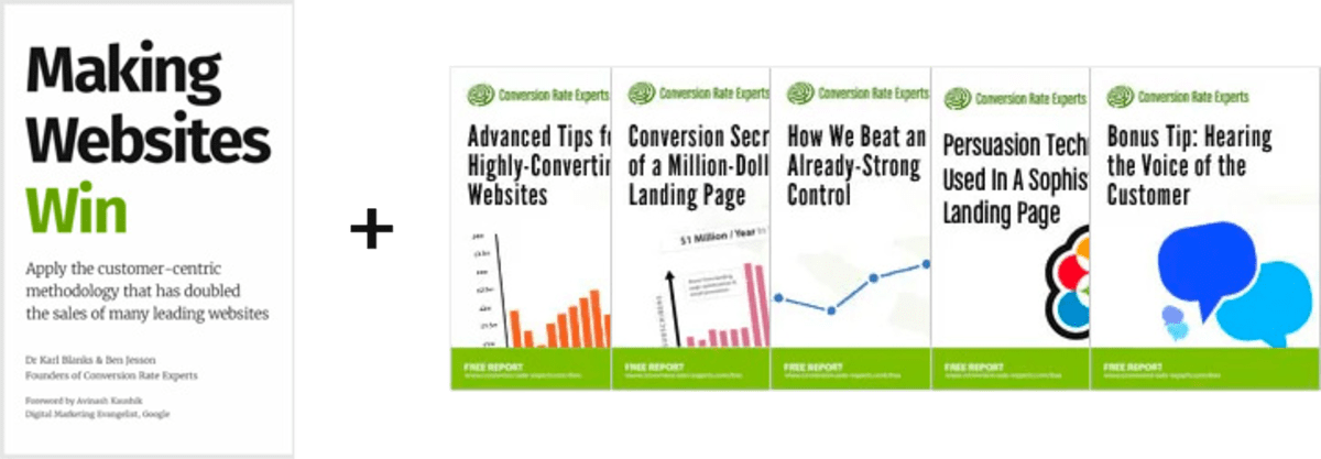
Download a free copy of our Amazon #1 best-selling book, Making Websites Win, recommended by Google, Facebook, Microsoft, Moz, Econsultancy, and many more industry leaders. You’ll also be subscribed to our email newsletter and notified whenever we publish new articles or have something interesting to share.
Browse hundreds of articles, containing an amazing number of useful tools and techniques. Many readers tell us they have doubled their sales by following the advice in these articles.
Download a free copy of our best-selling book
3. Join our team
If you want to join our team—or discover why our team members love working with us—then see our “Careers” page.
4. Contact us
We help businesses worldwide, so get in touch!
© 2026 Conversion Rate Experts Limited. All rights reserved.
A Brandwidth Group Company.