Copywriting Friday: The Sales Prevention Department
(By the way, to get articles like this free in your inbox, subscribe to our newsletter.)
Copywriting Friday highlights the tools and techniques of creating persuasive content. Enjoy.
In this article, we talk about five ways that websites introduce friction or barriers into the sales process. Some of these elements are purely copy-related, and others are not. It’s worth seeing whether your site might benefit from a test where you remove or adjust these elements.

Background
Journalists and copywriters know that attention is as fleeting as a butterfly. Even before we had the Distraction Tsunami—also known as the internet—writers knew that the purpose of a headline was to get people to read the first sentence. Then, the purpose of that sentence was to get them to read the first paragraph and so on. That’s more necessary than ever now, with the phones that many of us have grafted onto our bodies.
Let’s assume that you’ve succeeded in getting your target audience to your website. Let’s further assume that they’re willing to give you a few dozen seconds of attention between meetings, notifications, and social media updates.
What should you do with those precious seconds? Let’s answer that by describing five things that you should strongly consider not doing.
How do I annoy thee? Let me count five ways
1. Going for the close before you’ve even opened the sale
No doubt many visitors to your site are well aware of what you do. Some may have been persuaded by friends and may even be ready to buy. But many other visitors probably have little to no clue what you’re about. They may not even know if they’re on the right site in the first place.
There’s a copywriting principle that says you should try to “Enter the conversation already going on in the mind of your prospect.” The problem is that many sites reverse this principle and expect the prospect to focus on the conversation going on in the mind of the website owner, which can be summarized as, “What are you waiting for? Buy now!”
Look at your site—especially the part above the fold that’s visible without scrolling. How many elements do you see that are trying to close the sale:
- Buy Now buttons
- Countdown timers
- Prompts to call Sales
- Menu items that also say Buy Now, Order, etc.
Now look at the same area again. Do you see any description of what your business is about? If not, you’re hoping that people either know it already, or are willing to scroll down to find out.
When we have a new client engagement, our Research Department conducts user testing to find out what’s on the minds of visitors. Frequently, these users will not have a clear idea what the site is about. Don’t make that mistake; make sure it’s abundantly clear who you are and what your value proposition is before you focus on the close.
Here’s a great example:
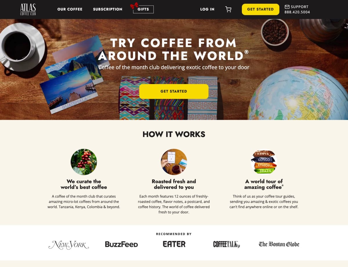
It’s pretty clear that these people sell high-end coffee. They do a good job of turning a commodity into a virtual exotic trip. And if people are ready to buy, they can easily see where to go.
2. Asking visitors to schedule a demo
That sounds innocent enough, but it can be code for one of two things:
- “Our product is complicated, so we need to show you how it works.” Ugh.
- “We want to get you on the phone to sell you hard.” Double Ugh.
No one wakes up in the morning hoping to schedule a demo (unless, perhaps, of a yacht). You can counter this reaction in three ways:
First, think hard whether you can design your product to be intuitive enough that users can demo it themselves. If you’re successful, that’s a powerful proof element in itself.
Second, if there’s no way to get people over the learning curve quickly, then consider creating a video demo. People are much more likely to watch a video than to get on the phone with someone from Sales.
Third, at least explain why a demo is necessary and what it will not involve:
“Our demo is under 15 minutes. It will be a friendly session with someone on salary and not on commission.
“Why don’t we provide self-serve demos? Because we respect your time, and our product is highly customizable. We want to show you the configuration that could work best for you, and we can set that up faster than having you read a manual.”
3. Asking visitors to call for pricing
This also can come across as code for “We’re expensive and need to sell you on it.” It’s often found on the higher-end “enterprise” level plans, and there can be legitimate reasons for not stating a price.
For example, the price could vary greatly, depending on how many users or locations a customer will need. In that case, it’s worth testing a widget that allows visitors to input their variables and see how the price varies.
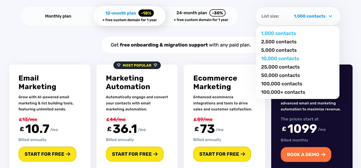
Here’s an example from one of our clients, GetResponse:
If that is not possible, then test explaining the many factors involved. For example, the “Enterprise” pricing option might say:
“Contact us for a quote. We can tailor pricing to your exact needs, taking into account concurrent users, geographic locations, storage requirements, and security protocols, among other factors.”
4. Elements that look suspicious
These take several forms:
- “Trusted by 100,000 users.” Really? You have an even 100,000? What else are you inaccurate about? It’s better to say: “Trusted by 103,500 users and counting.”
- Stock images of the type that are not believable. We’ve all seen images of men in business suits and briefcases jumping over hurdles, or excited people gathered around someone’s laptop, pointing at it. Yawn. The subtext is: We just had to stick something here. That’s no way to engage visitors. We use stock images, like the one at the beginning of this article. But we look for realistic and sometimes funny ones, instead of the type that may generate a mental backlash.
- Boasting without support. “We’re the #1 Choice of Professional Photographers” is a great proof element for a camera company—if it can support the claim. The legendary copywriter, Gary Bencivenga, puts it this way:
- Without belief, nobody buys.
- The higher the belief level, the higher your response.
- Make compelling proof the alpha and omega of your advertising.
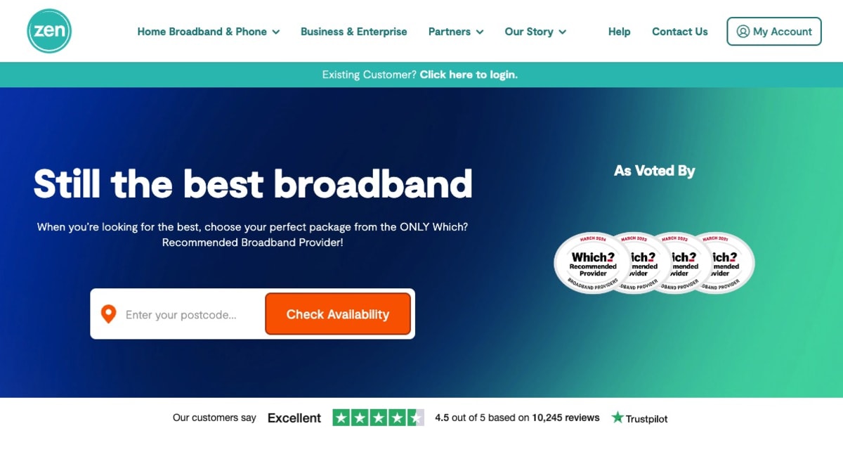
Here’s an example of a company doing it right. Zen Internet, a UK-based internet provider, has won awards for its service for four years in a row and has over 10,000 reviews on Trustpilot.
5. Asking for more information than necessary at the moment
Sometimes your product or service is so in demand that you can be an order taker and not worry about making people jump through hoops. If that does not describe your situation, then test removing some of those hoops.
Here are some elements that may convince visitors to bail out:
- Why are you asking for my cell number and making it a required field? I don’t want to be pestered by calls and texts at all hours.
- Why must I open an account now? I’ll open an account when I buy something.
- I don’t want to tell you how much money I make! You don’t need to know that in order to send me your “Special Report.”
If it’s not obvious why you need a piece of information at the point that you request it, then it’s worth doing some tests: Do you get more form completions when you explain why you need each sensitive piece? Do completions go up when you request some information later in the sales process?
We’ve boosted conversions of many client websites by testing different sequencing of information on forms.
The bar is set low, which means your opportunity is high
As consumers, we unconsciously expect to jump over some hurdles when navigating a website. We may even expect to roll our eyes at what we see or what we’re asked to do, up to a point. Those expectations are an opportunity for you to shine. Be the company that is unusually easy to work with.
Customers can be annoyed but they also can be impressed, and those customers have friends. The time you take to test and improve these factors can pay dividends for years to come.
See you next time on Copywriting Friday.
How much did you like this article?
What’s your goal today?
1. Hire us to grow your company
We’ve generated hundreds of millions for our clients, using our unique CRE Methodology™. To discover how we can help grow your business:
- Read our case studies, client success stories, and video testimonials.
- Learn about us, and our unique values, beliefs and quirks.
- Visit our “Services” page to see the process by which we assess whether we’re a good fit for each other.
- Schedule your FREE website strategy session with one of our renowned experts.
Schedule your FREE strategy session
2. Learn how to do conversion
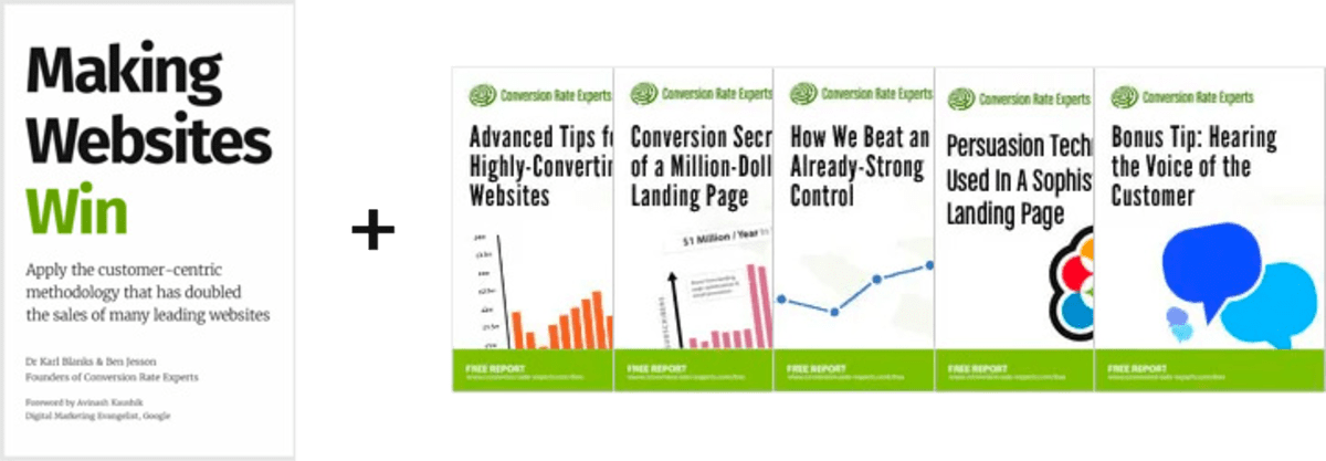
Download a free copy of our Amazon #1 best-selling book, Making Websites Win, recommended by Google, Facebook, Microsoft, Moz, Econsultancy, and many more industry leaders. You’ll also be subscribed to our email newsletter and notified whenever we publish new articles or have something interesting to share.
Browse hundreds of articles, containing an amazing number of useful tools and techniques. Many readers tell us they have doubled their sales by following the advice in these articles.
Download a free copy of our best-selling book
3. Join our team
If you want to join our team—or discover why our team members love working with us—then see our “Careers” page.
4. Contact us
We help businesses worldwide, so get in touch!
© 2026 Conversion Rate Experts Limited. All rights reserved.
A Brandwidth Group Company.