Copywriting Friday: The hard way and the Apple way
Copywriting Friday highlights the tools and techniques of persuasive content. Some of the examples may seem dated, but the principles are timeless (and critical for conversion rate optimization). Enjoy.
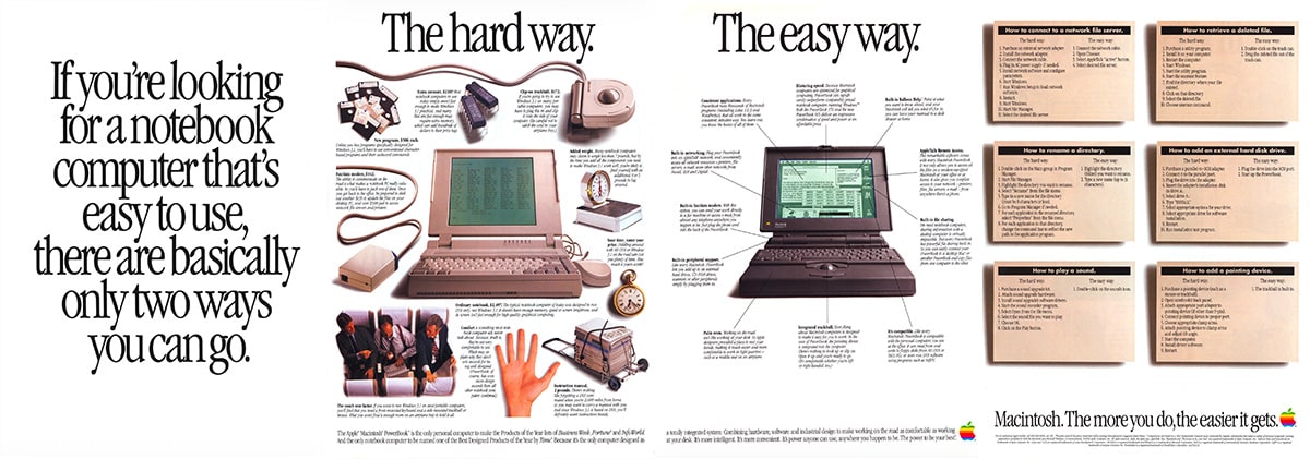
How do you sell a product that almost everyone considers the “wrong” choice?
In 1992, Apple had roughly 12% of the personal computer market. The other 88% ran MS-DOS or Windows on IBM-compatible hardware. If you were a business traveler shopping for a notebook computer, the safe, expected choice was a PC.
So when Apple’s agency sat down to sell the PowerBook, they faced a challenge that many businesses face today: how do you persuade people to switch from the dominant option to yours, when the dominant option has all the momentum?
Their answer was a four-page print ad that’s a masterclass in persuasion and competitive framing (full-size version here). Let’s look at why it works.
Page 1: The headline frames the entire decision

The first page of the ad contains nothing but a single sentence in enormous type:
If you’re looking for a notebook computer that’s easy to use, there are basically only two ways you can go.
There’s a surprising amount happening here, so let’s break it down. First, that opening clause:
“If you’re looking for a notebook computer that’s easy to use…”
This does the job Gary Bencivenga named calling out a hot audience. It filters for laptop shoppers. But it also slips in an assumption: that ease of use is the criterion you should be shopping on. Not speed, not price, not compatibility with what the rest of your office uses. Ease of use. Before you’ve even turned the page, Apple has defined the criteria it believes it can win on.
“… there are basically only two ways you can go.”
This is an intentionally false dichotomy, albeit delivered with a straight face.
In 1992, there were numerous notebook manufacturers. But the ad collapses the entire market into a binary choice: the hard way, and the easy way. It’s a framing technique sometimes called “the crossroads.” Another influential copywriter, Clayton Makepeace, wrote about how powerful it is to present prospects with exactly two paths and make one of them obviously better.
Feel how the word “basically” is doing quiet work here, too. It makes the claim feel like common sense rather than a marketing assertion. Basically, there are two ways. You almost nod along before you realize you’ve accepted the premise.
How you could use this
If your product competes in a crowded market, consider whether you can reframe the decision as a simple binary. Not “here are 15 options to evaluate,” but “there are really two approaches, and here’s the difference.” This works especially well when you’re the challenger brand, and you want to be compared directly with the dominant category. What two paths could you present to your prospects?
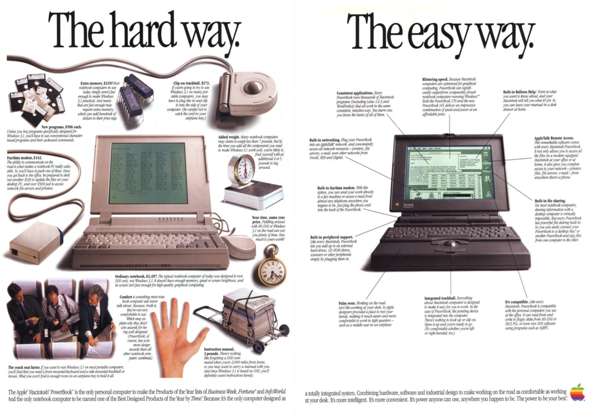
Page 2: “The hard way” uses the competition to sell Apple’s product
Turn the page and you see one of the most effective competitive comparison pages we’ve come across.

The headline is simply “The hard way.” Below it, the page is deliberately cluttered. Accessories, adapters, floppy disks, a bulky clip-on trackball, memory chips, and a thick instruction manual are scattered around a generic beige laptop. Each item has a price tag and a short explanation of why you’ll need it.
This is proof through demonstration—one of the most persuasive forms of evidence. The ad doesn’t just claim that PC notebooks are complicated. It shows you the mess. Every object on the page is another argument, and the visual chaos reinforces the feeling: this is a hassle.
Notice also how the copy handles the price comparison. The base price of the “ordinary notebook” is $2,497. But the real cost is much higher once you add the memory ($210), trackball ($172), programs ($506), modem ($142), and the others. The ad doesn’t add these up for you—it doesn’t need to. Your brain is already doing math. Letting the reader draw their own conclusion is almost always more persuasive than stating it for them.
Then there are the costs that don’t have dollar amounts:
“Your time, name your price.”
“Comfort is something most notebook computer ads never talk about.”
See how the copy expands the comparison beyond money to the things people actually care about when they’re working on a long flight or in a hotel room. (The 1992 laptop market was entirely about business use.)
How you could use this
If your competitor’s product requires extra accessories, add-ons, integration work, or learning time that yours doesn’t, consider making this visible.
Don’t just say “we’re simpler.” Show the full cost—in money, time, and frustration—of the alternative. As we’ve discussed in our ultimate guide to proof, specificity is one of the most powerful forms of credibility. This ad is specific about every dollar and every inconvenience.
Page 3: “The easy way” uses the same structure to opposite effect
Now, let’s turn to page three.

Where “The hard way” was a visual mess, “The easy way” is calm, clean, and spacious.
One laptop. No clutter. Many of the callouts begin with the words “Built-in”—built-in networking, built-in fax/data modem, built-in file sharing, built-in peripheral support. The repetition is deliberate. Each “built-in” is a small hammer blow reinforcing the same message: you don’t need to buy anything else.
The visual contrast between pages two and three is doing most of the persuasion work. You don’t need to read every word of copy to get the point—the feeling of each page tells the story. Page two feels stressful. Page three feels easy. That emotional response is faster and more powerful than any rational argument.
This is the show, don’t tell principle taken to its logical extreme. The ad never says “the PowerBook is simpler.” It doesn’t need to, because the design has already made you experience the simplicity.
There’s a lesson here about how clear value propositions work: the best ones don’t just describe benefits—they make the benefits obvious through structure, layout, and contrast.
How you could use this
Think about how the design of your marketing reinforces (or contradicts) your message. If you’re claiming ease-of-use but your landing page is a mess, the visitor’s emotional experience will read “complicated” no matter what your headline says.
Could you create a visual contrast between the messy “before” and the clean “after” of using your product or service?
Page 4: The comparison tables let the reader prove it to themselves
On its final page, the copywriter is highlighting a different but just as effective aspect of Hard versus Easy… the laptop in use.

Six everyday tasks are presented in side-by-side comparison tables. For each task, “The hard way” lists between 5 and 11 steps. “The easy way” lists between 1 and 3.
The effect is almost comical to modern readers. To add a pointing device the hard way, you need nine steps, including “Attach appropriate clamp arms” and “Adjust tilt angle.” The easy way? “The trackball is built in.”
Apple isn’t making any specific claims here. They don’t need to. The tables simply present the options and let the reader’s own judgment do the rest. By the time the reader has scanned all six tables, they’ve personally verified (again) the ad’s central argument.
This is exactly what we mean when we talk about the importance of demonstrating how something works rather than just claiming it does. A claim can be ignored. A demonstration has to be reckoned with.
How you could use this
Where can you let visitors prove your claims themselves? A side-by-side comparison, an interactive calculator, a “before and after” workflow—anything that invites the prospect to verify rather than just believe. The key is specificity: this ad doesn’t compare in vague terms; it compares step by step.
What specific task could you walk through to show how much easier, faster, or better your approach is?
A closing line that reframes the entire category
The ad ends with a tagline at the bottom of page four:
Macintosh. The more you do, the easier it gets.
This is a quietly ambitious line. It’s not just selling the PowerBook—it’s reframing the entire experience of owning a computer. The implicit contrast is with DOS and Windows, where the more you tried to do, the more complicated things became (anyone who lived through DOS path statements and CONFIG.SYS will feel this in their bones).
But the line also serves a forward-looking purpose: it’s addressing the anxiety of switching platforms. If you’re a PC user considering a Mac for the first time, one of your biggest fears is the learning curve. This tagline says: Don’t worry. It only gets easier from here. That’s objection handling disguised as a tagline, and it works because it feels optimistic rather than defensive.
How you could use this
Your closing line or tagline doesn’t have to be a summary of features. It can reframe the prospect’s relationship with the entire category. What anxiety does your prospect carry about switching to you—and can you address it with a single, confident statement?
If you’re doing it the hard way
This ad was created at a moment when Apple was the underdog. They couldn’t win on market share, software compatibility, or corporate purchasing policies. So instead of competing on those terms, they chose the fight they could win—ease of use—and then made the case so visually and specifically that it was almost impossible to argue with.
If your company is doing it the hard way—competing against bigger or more established alternatives—perhaps the strategy Apple used can work for you. Maybe you don’t have to win every argument. You just have to pick the right argument and put it to work.
See you next time on Copywriting Friday.
How much did you like this article?
What’s your goal today?
1. Hire us to grow your company
We’ve generated hundreds of millions for our clients, using our unique CRE Methodology™. To discover how we can help grow your business:
- Read our case studies, client success stories, and video testimonials.
- Learn about us, and our unique values, beliefs and quirks.
- Visit our “Services” page to see the process by which we assess whether we’re a good fit for each other.
- Schedule your FREE website strategy session with one of our renowned experts.
Schedule your FREE strategy session
2. Learn how to do conversion
Download a free copy of our Amazon #1 best-selling book, Making Websites Win, recommended by Google, Facebook, Microsoft, Moz, Econsultancy, and many more industry leaders. You’ll also be subscribed to our email newsletter and notified whenever we publish new articles or have something interesting to share.
Browse hundreds of articles, containing an amazing number of useful tools and techniques. Many readers tell us they have doubled their sales by following the advice in these articles.
Download a free copy of our best-selling book
3. Join our team
If you want to join our team—or discover why our team members love working with us—then see our “Careers” page.
4. Contact us
We help businesses worldwide, so get in touch!
© 2026 Conversion Rate Experts Limited. All rights reserved.
A Brandwidth Group Company.