The Safe Step Principle: Why “Buy now” hurts conversions
In the early years of conversion rate optimization (CRO), there was a long-running joke that testing was simply about “turning a button green” and hoping for miracles. We still smile politely when it comes up, but that’s because we know the twist.
Buttons do matter. Hugely. Our Wins Database has hundreds of tests that prove it… just not in the way that the joke implies. What matters isn’t just the color, of course, it’s the message.
Buttons (and other types of call to action) represent a moment of commitment. A button’s wording tells users what will happen when they press it, and how big the commitment feels. And in that moment, your visitor is using those two elements to answer an unconscious question:
“Do I feel ready for this?”
If the answer is no, they don’t click, and the funnel fails.
We’ve seen (and solved) this problem across numerous clients and industries, and we’ve coined an informal term to describe our solution—the Safe Step Principle.
In this article, we’ll explain the problem, the principle, and how you can apply what we’ve learned to improve your conversion rate.
The commitment ladder: A simple way to understand readiness
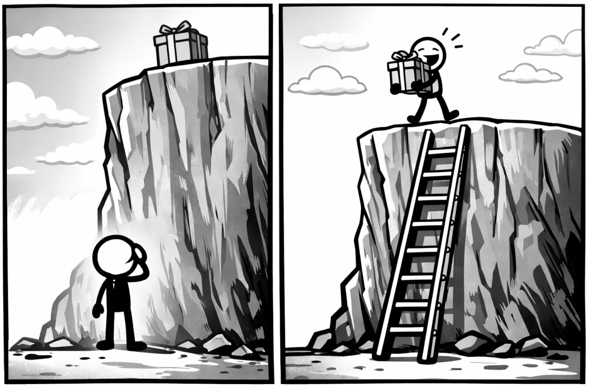
Visitors move through decisions gradually. A useful way to understand this progression is to imagine a ladder, with low-commitment actions at the bottom and high-commitment ones at the top. Here’s a simplified example:
See how it works → View pricing → Start free trial → Buy now
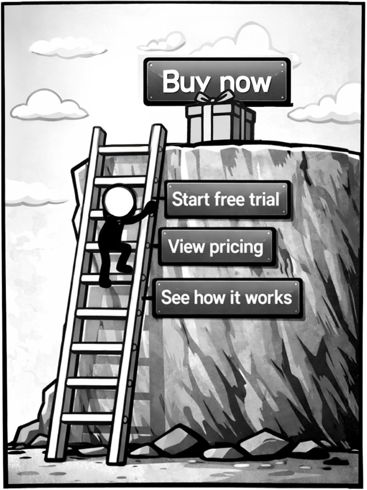
Can you feel how your sense of commitment rises at each step? Marketers and sales teams love the end of the funnel, of course, because it’s closest to what they want. In fact, they love it so much that they often skip any low-commitment steps and jump right to the end.
And in doing so, they break their funnels.
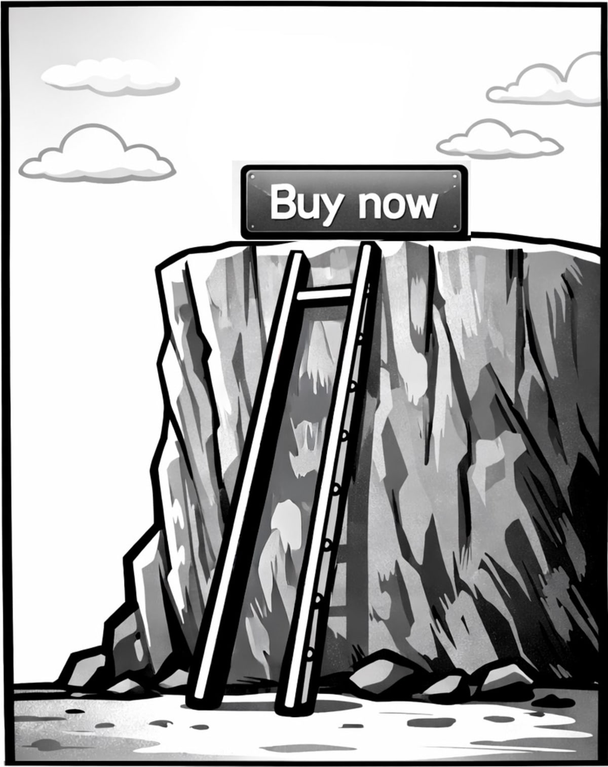
Trouble arises when a page asks for a bigger commitment than the visitor feels ready to make. A “Buy now” button placed early in the journey is asking the visitor to jump straight to the top of the ladder.
The Safe Step Principle expresses a simple truth: visitors are more likely to continue when the next step feels safe, appropriate, and proportionate to what they already know.
Across hundreds of client tests, we’ve found that aligning each CTA with a visitor’s state of readiness consistently increases both movement through the funnel and final conversion.
The Safe Step Principle feels obvious when you lay it out, and there’s no shortage of behavioral and psychological research to back up our real-world results:
- The foot-in-the-door technique shows that people who take a small initial action are far more likely to take a larger one later.
- Loss aversion explains why high-commitment CTAs appear disproportionately risky to visitors who are still uncertain.
- Self-Determination Theory shows that people are more willing to act when they feel in control of the size of the step they’re taking.
For all these reasons, moving commitment deeper into the funnel provides more opportunities to present content that overcomes objections, offers social proof, clarifies benefits, and builds trust.
When the next step towards a goal feels small, safe, and reversible, your visitors are far more likely to continue moving forward.
Choosing the right CTA for the right stage
To be clear, we aren’t saying that funnels should always use low-commitment CTAs.
The goal is to match the commitment level to the step. When you do, users feel the experience is intuitive and friction-free, which increases both movement and sales.
To illustrate the right way to do this, let’s look at effective CTAs for a standard four-step ecommerce funnel.
Step 1: Category page (orienting and exploring)
Visitors on category pages are browsing and learning how the site is organised. They are not ready to buy.
For category pages, the Safe Step Principle suggests low-commitment CTAs such as:
- “View products.”
- “Explore programs.”
- “Browse categories.”
These keep visitors moving without demanding a decision.
Step 2: Product page (evaluating fit)
Once visitors reach a product page, they assess suitability and value, considering factors such as size, features, benefits, and price. They are more engaged but not yet ready for a final decision. CTAs that reflect this stage include:
- “Add to cart.”
- “Select size and continue.”
- “Choose your plan.”
These support forward motion while preserving a sense of reversibility.
Step 3: Cart page (checking and confirming)
In the cart, visitors review their choices and ensure everything looks correct. They want clarity, reassurance, and predictability. CTAs framed as the next step, rather than the final leap, perform well here:
- “Proceed to checkout.”
- “Continue to secure checkout.”
These reinforce the visitor’s sense of control.
Step 4: Checkout page (completing the decision)
By the time visitors reach checkout, they expect to make a final commitment. At this stage, clear, decisive CTAs are appropriate:
- “Complete purchase.”
- “Place order securely.”
These match the visitor’s readiness and bring the journey to a natural conclusion.
A quick word on button color and design
Despite what we said earlier, buttons are visual elements, and color can matter… especially when it affects visibility, consistency, or usability.
Many of the sites we work with have buttons that:
- Lack contrast and are hard to see.
- Clash with the website branding.
- Are inconsistent across the funnel and break the user’s sense of continuity.
If your website suffers from any of these issues, a site-wide button consistency test may be one of the highest ROI “housekeeping” experiments you can run.
To state the obvious, if users can’t see or quickly recognize your buttons, it may not matter what they say… and consistent button styling throughout the funnel helps users recognize the next logical action.
Why you should be testing your funnel CTAs
Because it’s easy and effective.
CTA changes are generally inexpensive, quick to deploy, and easy to reverse, making them an ideal choice for early-stage CRO experiments. They also produce valuable insight into visitor motivation. Standardising button styles, ensuring consistent language, and aligning CTAs with the visitor’s readiness often produce immediate and measurable gains.
CTA copy—whether on a button or otherwise—is part of your persuasion architecture. It guides, reassures, and nudges users along the journey.
We’ve successfully applied the principle to numerous businesses and industries, and now consider it a foundational pattern of effective funnel design.
If you’d like help creating high-impact CTA tests, explore what our free strategy sessions have to offer.
Win Reports that leverage the Safe Step Principle
You can see the principle clearly in many of our Win Reports, including:
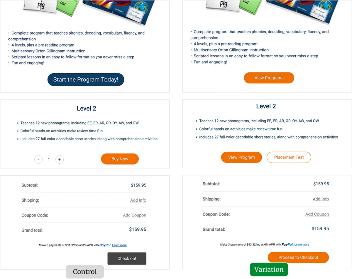
Win Report: Ask for less, get (28%) more
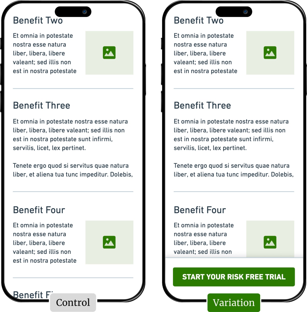
Win Report: How a “sticky” call to action increased sales by 25%
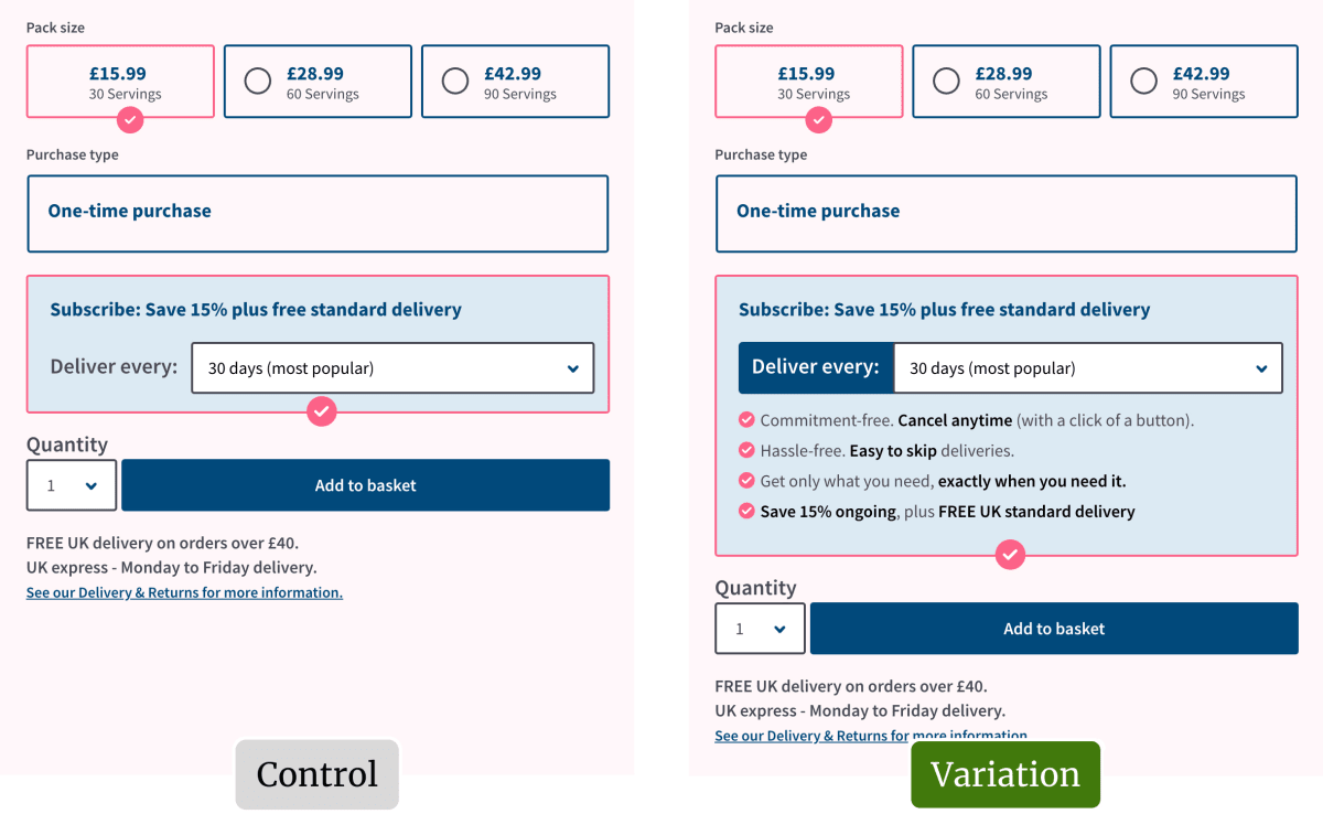
Win Report: How four bullets increased subscriptions by 39%
In the final Win Report, you can also see how the principle can apply to content around the CTA.
How much did you like this article?
What’s your goal today?
1. Hire us to grow your company
We’ve generated hundreds of millions for our clients, using our unique CRE Methodology™. To discover how we can help grow your business:
- Read our case studies, client success stories, and video testimonials.
- Learn about us, and our unique values, beliefs and quirks.
- Visit our “Services” page to see the process by which we assess whether we’re a good fit for each other.
- Schedule your FREE website strategy session with one of our renowned experts.
Schedule your FREE strategy session
2. Learn how to do conversion
Download a free copy of our Amazon #1 best-selling book, Making Websites Win, recommended by Google, Facebook, Microsoft, Moz, Econsultancy, and many more industry leaders. You’ll also be subscribed to our email newsletter and notified whenever we publish new articles or have something interesting to share.
Browse hundreds of articles, containing an amazing number of useful tools and techniques. Many readers tell us they have doubled their sales by following the advice in these articles.
Download a free copy of our best-selling book
3. Join our team
If you want to join our team—or discover why our team members love working with us—then see our “Careers” page.
4. Contact us
We help businesses worldwide, so get in touch!
© 2026 Conversion Rate Experts Limited. All rights reserved.
A Brandwidth Group Company.