User testing: Learn the techniques we use to make millions for our clients
(By the way, to get articles like this free in your inbox, subscribe to our newsletter.)
Of all the techniques we use, user testing is by far the fastest and most effective way of finding the blocked arteries that limit our clients’ conversion rates and profits. That’s why we run them constantly (the user tests, not the clients).
This article explains the immense benefits of user testing, including:
- The reason why user testing beats everything else.
- Where the best companies point the finger of blame.
- How to run a user test.
- Five levels of user testing (and the value of starting small).
- Why the best user tests might leave you in tears.
- Nine common issues you should expect to uncover.
Don’t wait. Your most successful competitors are using these techniques now. The good news is that even the most basic user testing can often deliver quick wins whether you are a well-established business or an early boot-strapped startup.
Why user testing beats everything else
The answer relates to the Japanese phrase Genchi Genbutsu, which translates as “Go to the real place and see for yourself,” an idea popularized by Toyota’s legendary father of lean manufacturing, Taiichi Ohno.
By contrast, many companies have a “boardroom culture,” diagnosing issues and solutions without ever experiencing the problems for themselves. Compare this to Toyota’s approach in this short video.
In Toyota, the “real place” is the factory floor. If there’s a problem, they don’t discuss it in the abstract—the leader of the line goes directly to the car with the issue because that’s where the answer is.
In conversion rate optimization, the “real place” is usually the website. User testing works because that’s where we go, revealing the exact issues, challenges, and frustrations that our users are grappling with. There’s far less abstraction, and the problems are often distressingly obvious.
But before we can truly leverage the value of user testing, we must eliminate a common, profit-killing misconception.
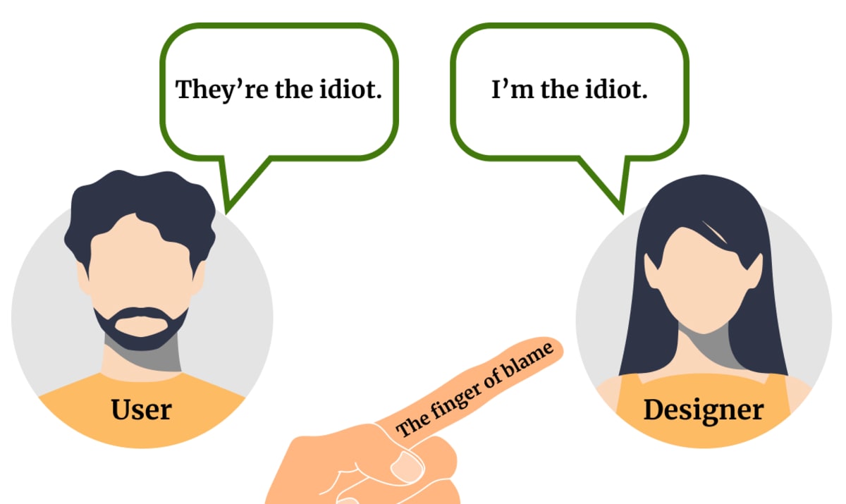
Repointing the finger of blame
Something strange often happens when users struggle to use a website. They blame themselves. And they aren’t alone. Many website developers and designers are also happy to blame users who make mistakes. Thus, the finger of blame points like this:
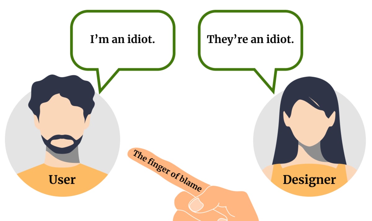
Blaming users may reduce our collective discomfort in the short term, but it’s a Pyrrhic victory. It’s far better—and wildly more profitable—to internalize Steve Jobs’s famous dictum:
“If a user is having a problem, it’s our problem.”
Or, to put it another way:
Businesses that are humble enough to take responsibility for their users’ “mistakes” reap great rewards. It’s nice to feel “superior,” but it’s far more fun to be massively successful.
How to run a user test

Before we get into the types of user testing, let’s distinguish between two different approaches:
Moderated user tests are conducted one-on-one, with you (the moderator) guiding a user through a series of tasks. This type of testing happens in person or via video call. It allows for real-time interaction and follow-up but is more time-intensive.
Unmoderated user tests are run independently—with the user following a written series of tasks. This approach encourages more natural behavior and is easier to scale—especially if you use an online testing service.
The majority of the tests we run are unmoderated—partly because we run a lot of tests and partly because we want the users’ unfiltered opinions. When we use moderated tests, we try to stay silent, speaking only when absolutely necessary.
Whatever approach you choose, each session starts with a brief introduction designed to put the user at ease and emphasize the following:
- It is the website being tested, not them.
- It is impossible for them to make mistakes.
- They should “narrate” their thought processes out loud. What are they thinking? What are they looking for? What do they like, dislike, or find confusing?
- We’ll record their screen so that we can review the test later.
- Nothing that they do or say will be shared outside the project team.
We will then:
- Ask for their general impressions of the website (usually based on their understanding of the landing page or funnel). What is this site? What does it offer? What can you do with it?
- Set them 3-4 key tasks replicating the activities we care about most. For retailers, this might include finding a particular product and adding it to their basket. For SaaS services, it might be researching the right plan for them or creating an account.
This list may sound like a lot to remember, but Steve Krug has an excellent usability test script you can use as a starting point for moderated tests (or as a basis for unmoderated tests). We highly recommend his classic usability books, Don’t Make Me Think and Rocket Surgery Made Easy.
Five types of user testing
User testing doesn’t have to involve hundreds of people or complex software services. The first user test we run for any client is conducted alone by one of our consultants.
Let’s look at five levels of user testing, starting with the simplest.
1. Test on yourself

When was the last time you went through your sales process as if you were a customer? You may think you know your site intimately, but it’s remarkable what you can learn by putting yourself back in your users’ shoes. When you navigate your site, you’ll experience firsthand what your users go through, which can be incredibly (and traumatically) revealing.
Here’s what we recommend:
- Record your session: Use screen-recording tools to capture your journey. This simple practice will help when you want to relive your experience or remember the exact options on a drop-down box. (When we ask new clients about their “Thank you” page, to take one example, it’s remarkable how few aren’t sure what’s on it.)
- Act like a real customer: Start from a search engine, read the ads, visit competitor sites, and complete the entire buying process on your site. If most of your customers use their mobile devices, use your mobile.
- Document your feelings: Don’t just record your session; note any frustrations or confusion you encounter. These could be related to slow load times, confusing layouts, or unclear instructions. (Many screen recorders let you capture your face and voice as well as the screen, helping you remember what you were feeling at the time and prioritize improvements accordingly.)
- Don’t stop at the checkout. You know what you sell, but have you experienced the delivery process? Have you unpacked your products and tried to assemble them or set them up? This is all part of Method Marketing, the process we use to understand the real customer experience.
2. Test on someone with fresh eyes
Being too close to a website or product can often insulate you from the issues that new users encounter. Fresh eyes can provide a new perspective on your site, highlighting areas that need immediate attention.
Here’s how it works:
- Ask friends or family to use your site: Anyone who’s not you might provide valuable feedback, but it’s particularly useful if you know people who match your target demographic.
- Don’t help them unless they absolutely need it. And NEVER tell them what the site is about or the problems you think it might have. You want them to come to it as fresh as possible.
- Iterate quickly: Make changes based on the feedback before you test again. Fast iteration avoids the waste of multiple testers bumping into the same issues and ensures you continually improve your site. Win-win.
For example, feedback from a friend might reveal that your navigation menu is confusing, prompting you to simplify it for a smoother user experience. Then they’ll probably find another thing and another.
These first two stages of user testing can take you a long way in a short time.
3. Test with qualified users
Once you have addressed the issues revealed by levels 1 and 2, it’s time to talk to qualified users. These are prospective customers who are genuinely in the market for the type of products or services that you sell.
Addressing the needs and confusions of qualified users is the shortest route to increased conversion rates and revenue, but it can also require a deeper level of effort. Here are two methods we’ve used to test qualified users.
- Use dedicated user testing platforms: In addition to delivering the technical infrastructure you need, user testing platforms offer a massive pool of potential testers that can filtered by criteria like age, location, education, family status, and many more criteria. You can also set up screening questions, access their social media profiles, and even ask them to record their views on topics of interest—all of which can be hugely valuable if you are testing a niche website. Some platforms also offer valuable extras like automatic transcripts, which make it easy to jump to specific sections of a test.
- In-Person testing: Attend events or locations where your target audience will be and ask them for feedback. Some of our most productive user tests involved running around airports or malls, getting feedback on a website, making changes, and getting more feedback. This direct interaction can provide deeper insights and allow for more back-and-forth discussion.
For example, a user might disbelieve your product claims, indicating the need for stronger proof elements. In our experience, this reaction is far more common than most companies expect.
4. Test with prospects who are on your website right now
You’ve probably seen the alerts that pop up on a website and ask for feedback. These “live intercepts” are typically answered by a small percentage of engaged users but provide real-time insights into user behavior and challenges.
Here are two methods we use:
- Implement Pop-Ups: Use a JavaScript snippet to show a survey invitation to a small percentage of visitors. This process can be triggered using tools like Hotjar, which allows you to recruit participants for live testing.
- Conduct Interviews: Use an alert to offer users an incentive if they agree to participate in a phone interview or screen-sharing session. Real conversations allow you to ask probing questions and understand their experiences more deeply.
- Run “live” A/B comparisons: We sometimes ask live users to critique an alternative version of the page they are browsing. This is a cheap, high-leverage way to get the opinions of pre-qualified users—they are already on the site, after all. It’s also great for sites that don’t have the volume of traffic required for traditional AB usability testing. (If that’s your situation, you might enjoy our article on low-traffic CRO strategies.)
5. Test competitor websites alongside your own
It may sound counterintuitive, but testing competitor websites can be hugely revealing. When we compare our site with others, we mimic how customers research products or services to purchase.
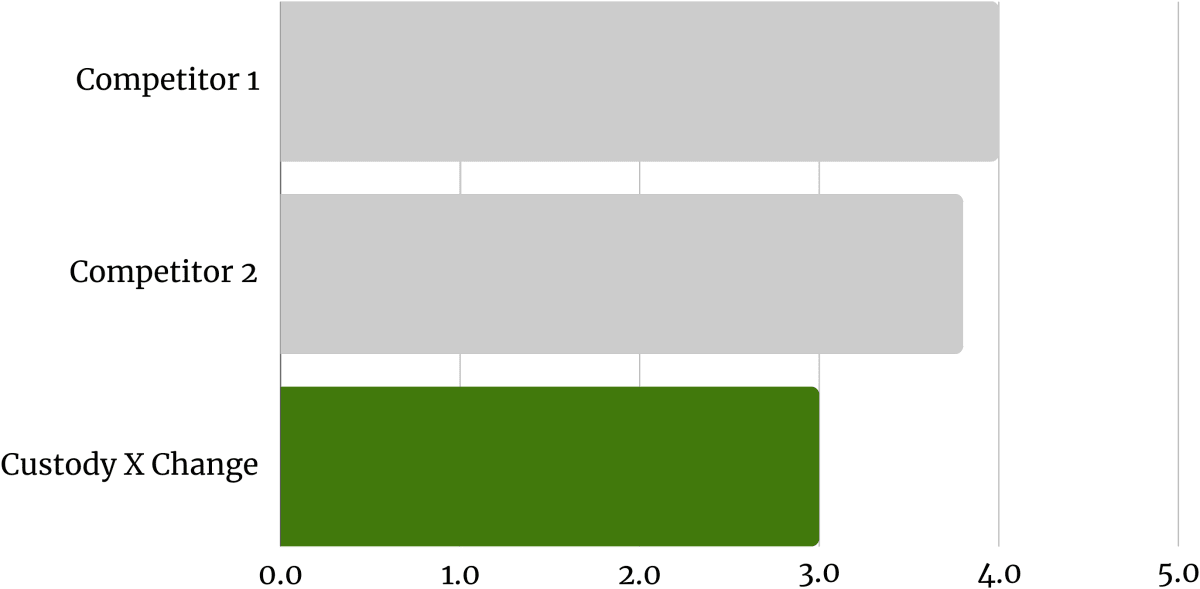
Testing multiple sites allows us to drill down into different aspects of the user experience. For example, when we asked testers to rate the usability of Custody X Change’s website against two of its competitors, the site ranked poorly. Knowing this allowed us to address the issue in a test, ultimately leading to a +20% win.
Here’s how to test competitor websites alongside your own:
Create one test that includes your site and two or three others: Make sure that you choose real competitors, ideally the strongest you have. (There’s nothing to be gained by testing against clearly inferior sites.)
Don’t disclose which site is yours: This ensures unbiased feedback and avoids the natural but unhelpful desire to please.
Set the same questions and tasks for each site: It’s important that the tasks are consistent across sites, but you should also ask your testers to summarise their feelings after the test. Which provider would they choose and why?
Competitor Analysis often uncovers subtly different feedback from single-site testing. We’ve gotten huge insights from testing competitor websites, not to mention numerous ideas to improve our clients’ conversion rates.
The best user tests may leave you in tears—and that’s a good thing

We encourage honest and brutal feedback. The truth can hurt, but before we present our findings to clients, we remind them that:
No site is perfect. User research is a fact-finding mission, and just because they didn’t know some of these facts doesn’t make them bad at their job. In reality, they are way ahead because they are doing the research. Most companies don’t do this… and even fewer ever act on it.
Finding lots of objections is good. The worse a test is, the more A/B testing levers we’ll have to pull to increase their conversion rate. Issues are often easy to fix, and the more you do, the more your mindset will shift to a place of gratitude and opportunity.
They don’t have to tackle everything at once. Even if there is lots of negative feedback, we can triage the most important fixes based on their impact and speed. Some will be Just Do Its—five-minute fixes that can make a big difference.
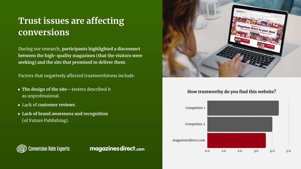
No one enjoys hearing that their website is flawed. But steel yourself and trust in the process. It works. For example, when we user-tested Magazinesdirect.com, the subscription site owned by media giant Future Publishing, we found that some users weren’t convinced by its claims. Once we understood that trust was an issue, we could address it—with one test increasing conversions by 15%.
Despite what some say, few people can create smash-hit, highly converting web pages from scratch. The best and most profitable marketers have the humility to run user tests and learn to love the feedback they receive.
And if that takes a while, console yourself by user-testing competitor sites. You may find they have some ideas you can use, but you’re just as likely to feel much better about yourself (and your website.)
User testing’s greatest hits: Nine common issues you should expect to uncover

The variety of user testing insights amazes us, but some issues come up time and time again. Here are a few that you might expect to see:
- Users make “stupid” mistakes: You may be surprised how many “mistakes” your users make, but remember that the responsibility is yours, not theirs. As we’ve said elsewhere, it’s worth designing your processes for what you perceive to be a busy, lazy, drunk, amnesiac idiot—a “moron in a hurry.” Your users aren’t morons, of course—that’s the whole point—but even geniuses with time on their hands will be grateful when you make things easy.
- Users aren’t clear about your value proposition: Clearly communicate the benefits of your products or services. Use concise, compelling language to highlight what sets you apart from competitors. For more, read our article: Three techniques to improve your value proposition.
- Users don’t trust you (or believe your claims): Build credibility with clear, honest messaging, proof, and user reviews. Display customer testimonials, secure payment icons, and privacy assurances.
- Users get lost in your navigation: This can be a serious problem because confused visitors are far less likely to spend any money. If this is an issue in your user tests, read our article on card sorting.
- Users don’t scroll: It can be upsetting to see how little of our amazing content users actually read. Make sure that your most important content sits near the top of the page, or read our article: How to make users scroll down your page.
- Users don’t read instructions: Too many websites try to fix poor design by adding instructions that users barely see, let alone read. A classic example would be the checkout form that displays its “error” messages at the top of the screen, far above the frustrated user who’s added a space in her phone number and doesn’t understand why the submit button doesn’t work. Far better to improve the form itself
- Users totally miss the point of a page: It’s surprising how often this happens, but less so once you see how quickly users move between pages. If you want to get a new appreciation of clarity, ask your user what they’ve seen five seconds after they land on a page. It will likely be far less than you expect.
- Users hit a sticking point and stall (or leave): These are fantastic, useful problems to find. Was the user confused by your process or content, or were they looking for something that you don’t yet (but could easily) provide? Exit surveys, heatmaps, and form tracking can also help diagnose these issues.
- Users are worried about risk: Look for ways you might reduce your customers’ initial investment, or follow our 9-step checklist for implementing guarantees safely.
If this list feels overwhelming, remember that just one thing will likely be your biggest issue. Focus on fixing that first, then do the next most important thing, and so on.
Highly converting websites are rarely created from whole cloth; they grow through perpetual improvement.
It’s easy to start, so start today…
User testing can transform your business by revealing hidden opportunities for improvement. We know this because we’ve used it to generate hundreds of millions for our clients.
Start by being your own customer, then gradually incorporate more advanced techniques. Remember, any user testing is better than none. The key is to embrace the feedback—hard as that may be—and make iterative changes that relentlessly improve your website.
If you want help or need to accelerate your progress, you may qualify for a free Strategy Session.
Start today. Your users (and CFO) will love you for it.
How much did you like this article?
What’s your goal today?
1. Hire us to grow your company
We’ve generated hundreds of millions for our clients, using our unique CRE Methodology™. To discover how we can help grow your business:
- Read our case studies, client success stories, and video testimonials.
- Learn about us, and our unique values, beliefs and quirks.
- Visit our “Services” page to see the process by which we assess whether we’re a good fit for each other.
- Schedule your FREE website strategy session with one of our renowned experts.
Schedule your FREE strategy session
2. Learn how to do conversion
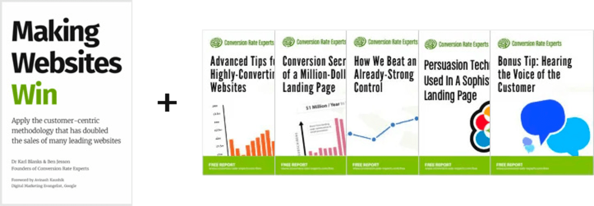
Download a free copy of our Amazon #1 best-selling book, Making Websites Win, recommended by Google, Facebook, Microsoft, Moz, Econsultancy, and many more industry leaders. You’ll also be subscribed to our email newsletter and notified whenever we publish new articles or have something interesting to share.
Browse hundreds of articles, containing an amazing number of useful tools and techniques. Many readers tell us they have doubled their sales by following the advice in these articles.
Download a free copy of our best-selling book
3. Join our team
If you want to join our team—or discover why our team members love working with us—then see our “Careers” page.
4. Contact us
We help businesses worldwide, so get in touch!
© 2026 Conversion Rate Experts Limited. All rights reserved.
A Brandwidth Group Company.