Three techniques to improve your value proposition
(By the way, to get articles like this free in your inbox, subscribe to our newsletter.)

(This is one of a series of articles, the first of which is here.)
Even if your visitors can understand your writing … even if they can use your website … and even if you offer what they came for … they may not understand—or like—your value proposition.
This article describes the three most common problems with value propositions (and how to fix them). The problems are:
- Failing to make it clear what the product or service does.
- Forgetting to mention valuable benefits.
- Neglecting to tell your prospect what will happen if they buy.
What is a value proposition?
The seller’s perspective
Your value proposition can be defined as the benefits of your product or service minus its costs.
Value Proposition = Benefits − Costs
The costs aren’t limited to the financials; they also include economic risk and the cost of time and resources.
The buyer’s perspective
To aid clear thinking, we also find it useful to view the value proposition from the buyer’s perspective, better reflecting how purchases actually happen:
- The decision is made in the mind of the buyer.
- The value of each feature will be different for each buyer. For example, some car buyers will find value in rear seat cup holders; others won’t. Either way, it’s clear that the “value” being discussed is the value to each buyer. Thus, from the customer’s perspective, the value proposition is different for each buyer.
- Buyers’ reasoning tends to be in terms of pros and cons rather than benefits and costs. Just listen to your own reasoning next time you buy something. If you create mental “pros and cons” lists and not “benefits and costs” lists, then it seems a shame to switch to the benefits-and-costs view when you’re being a marketer, thus abandoning your lifetime of intuition.
Value Proposition = Pros − Cons
We find it useful to view a value proposition both ways—through the seller’s eyes and the buyer’s eyes—as two sides of the same coin.
Three ways companies fail to communicate their benefits (the pros)—and several ways to fix the problems
We’ve grown many businesses by diagnosing and fixing the following:
1. Many companies don’t make it clear what the product or service does
Plain language almost always beats branding waffle. Some products or services—particularly those that are complex—can be hard to describe. When such products are sold using vague language, the results can be disastrous. The visitors don’t understand what they’ll get. For example:
- Branding waffle: “Music, Meet Home.”
- Plain: “The world’s leading speaker system: Play any song in any room from any phone.”
Another example:
- Branding waffle: “Introducing the oases of freshness: The Aquaris, the Tritona, the Anapos.”
- Plain: “Drink pure, freshly-filtered water every day (and avoid single-use plastic).”
Let’s have one more:
- Branding waffle: “Express yourself. Impress yourself.”
- Plain: “The ultimate suite of cloud-based tools for all your marketing communications.”
To see this contrast in video, compare these competing AI-powered phone ads from Samsung and Google. Samsung promotes vague AI benefits under the slogan, The next big thing is you:
Whereas Google demonstrates specific AI-powered features:
You get the idea. Google’s prospects have a far clearer picture of what the phone can do for them.
If you are asked to improve the website of a technical product that is currently being sold with a brand-marketing approach, here’s a useful tip: see if the product has a Wikipedia page. The Wikipedia page is likely to contain valuable plain-language descriptions that are absent from the manufacturer’s landing page. Plain language almost always beats branding waffle.
Many marketers aren’t aware that their website has this problem. The problem goes beneath the radar because visitors seldom report that they are “struggling to understand the value proposition.” Instead, they say things like, “I’m still researching.” Also, most unclear descriptions aren’t as obviously bad as the ones above. The best way to identify unclear benefits is through user testing. During user tests, listen for clues that the users haven’t understood the product or service. For example, you may find that a user’s objections to buying don’t make sense. Or that the user has gone quiet.
Unclear product descriptions are guaranteed to kill conversions. So whenever we spot them, we know that a big win is just around the corner. Clarifying the benefits of complex products has led to many of our biggest wins.
2. Some companies forget to mention valuable benefits
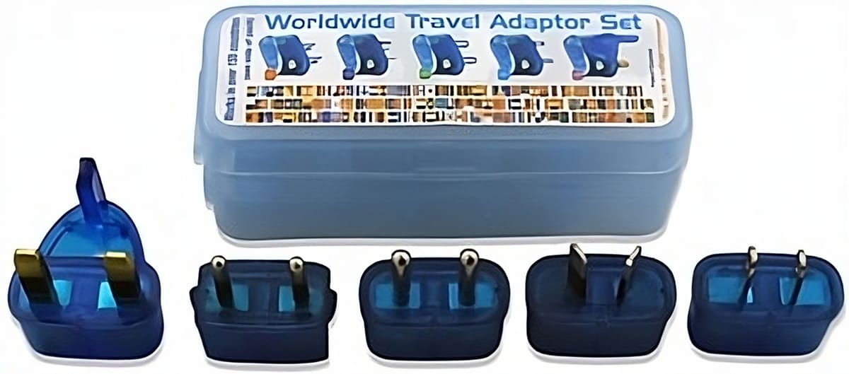
One of our earliest clients, Mobal, gave away a high-quality travel adapter with every travel phone they sold—but never mentioned it. When we added the adapter to the website, sales increased. So we added it to the offline marketing campaigns too. This was one of the many factors that allowed us to triple Mobal’s sales in one year.

We used this technique to great effect when we added more than $1 million to the bottom line of Moz. In this case study, we describe how we added to Moz’s landing page many features that previously went unmentioned.
To ensure that you aren’t making this mistake, list all of the elements of value that your visitors get, and then check that your website communicates them all clearly. It can help to order the product yourself, so you see the whole package with your own eyes. Also, ask your customers why they bought, and then ensure that all of their reasons are featured in your marketing materials with appropriate prominence.
3. Many companies don’t make it clear what happens once the visitor says yes
Many websites—particularly those that sell services—don’t help their visitors to envisage the postorder experience. There are many ways of overcoming this problem. The following method, common in Japan, is rarely seen in the Western world. Japanese consumers expect to be shown what they are going to get. All Japanese restaurants, for example, have plastic food in their windows, showing what each meal looks like.
(Yes, the “food” in the image at the top of this page is plastic—despite looking better than most of the meals we cook at home.)
Similarly, many Japanese companies display cartoon flow charts that show what will happen once a visitor orders the product or service. We created the following flow chart to show Mobal’s Japanese customers what to expect once they ordered a phone.

The flowchart makes it clear how the process works: the order is placed, the phone is delivered, the phone is charged, the person flies abroad, calls are made, Mobal sends an itemized bill, the person returns home, and then the whole process is repeated for subsequent trips. The cartoon was so effective on the Japanese website that we transferred it to Mobal’s US website, to similar success.
Such flowcharts are an example of what the hypnotism world calls future pacing: The buyer is told what they are going to experience over the next few moments, hours, days, weeks, or months. (This is closely related to the sales technique of making the prospect “think beyond the sale.”) Even though future-pacing diagrams are less common in the West, they are extremely effective here because:
- They answer the questions that the visitors are asking: “If I order this product or service, what will happen next? What will be the process I follow?”
- They allow the visitors to rehearse mentally the process of using the service, visualizing it as being part of their lives.
So if your product or service has an unclear post-sale experience, then a future-pacing flowchart may help to increase your sales. We frequently get wins by adding them. (For an alternative use of future pacing, see this Win Report for a utility comparison website.)
What happens next?
At the top of this article, we clearly communicated the value it would deliver:
This article describes the three most common problems with value propositions (and how to fix them).
Then, we wrote down every valuable insight that related to the topic. Now, it’s time for some future-pacing… describing what will happen next. Here it is.
Many visitors abandon their purchase journey because they don’t understand what they’ll get or what will happen. To guard against this, ask three questions about each of your products or services.
- Have we clearly communicated what the product or service actually does?
- Have we included every valuable benefit?
- Have we explained what will happen after the purchase?
Asking these questions—and filling the gaps they reveal—can go a long way to stacking the “pros” in your favor and reducing visitor abandonment.
The food may sometimes be fake, but the benefits are very real.
Bonus: How we create future-pacing videos

The Google ad we mentioned above is full of future pacing—showing how the phone will fit into (and benefit) users’ lives.
Once you have created a future-pacing diagram, you may find that it would benefit from being turned into a video. If so, remember that the process of creating a video should be no different from the process of creating a webpage. To begin, create the video in a quick, editable format, which you can test on users—just as you would with a webpage wireframe. Here’s what we do:
- Create a presentation in Google Slides or PowerPoint.
- Record a basic video of the presentation with a screen recording app or service, adding a voiceover if necessary.
- Iteratively test the draft video on users until we are confident that it communicates the message clearly.
- Produce a high-quality version.
This process will ensure that our final video will help convert visitors.
How much did you like this article?
What’s your goal today?
1. Hire us to grow your company
We’ve generated hundreds of millions for our clients, using our unique CRE Methodology™. To discover how we can help grow your business:
- Read our case studies, client success stories, and video testimonials.
- Learn about us, and our unique values, beliefs and quirks.
- Visit our “Services” page to see the process by which we assess whether we’re a good fit for each other.
- Schedule your FREE website strategy session with one of our renowned experts.
Schedule your FREE strategy session
2. Learn how to do conversion
Download a free copy of our Amazon #1 best-selling book, Making Websites Win, recommended by Google, Facebook, Microsoft, Moz, Econsultancy, and many more industry leaders. You’ll also be subscribed to our email newsletter and notified whenever we publish new articles or have something interesting to share.
Browse hundreds of articles, containing an amazing number of useful tools and techniques. Many readers tell us they have doubled their sales by following the advice in these articles.
Download a free copy of our best-selling book
3. Join our team
If you want to join our team—or discover why our team members love working with us—then see our “Careers” page.
4. Contact us
We help businesses worldwide, so get in touch!
© 2026 Conversion Rate Experts Limited. All rights reserved.
A Brandwidth Group Company.


