Win Report: Learn how streamlining subscriptions increased sales by 18%
Win Reports help you grow your business by showing our methodology at work. Each Win Report showcases a real-world test, sharing the research, insights, and techniques that led to the win.
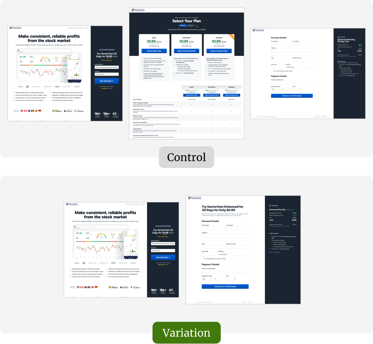
VectorVest is a US-based award-winning stock portfolio management system for the independent investor. It analyzes 16,000+ stocks daily and provides a simple buy, sell, or hold rating for each.
Research: Locating roadblocks
Part of the scope of our engagement was to increase the number of users signing up for the free trial, so we asked our Research Team to identify the roadblocks in the funnel.
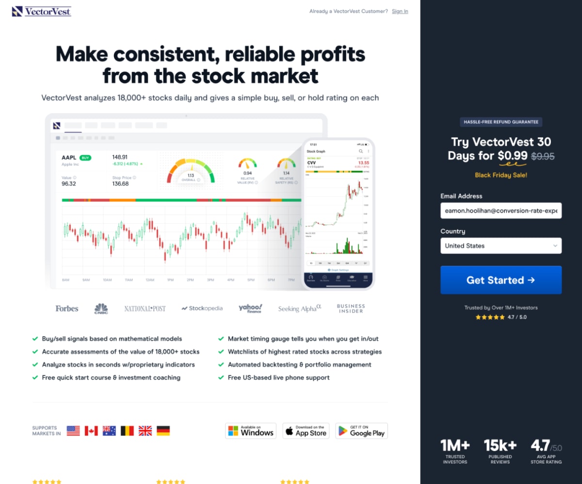
The original sign-up journey comprised three steps across three webpages:
- Start: Enter your email address and country.
- Select a subscription plan: Choose between Basic, Enhanced, or Premium plans.
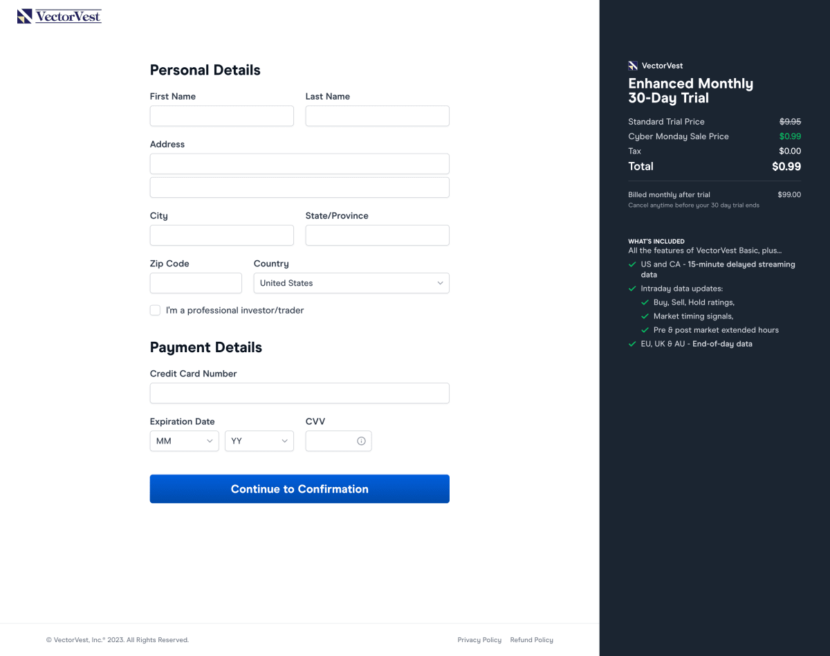
- Checkout: Enter personal and payment details.
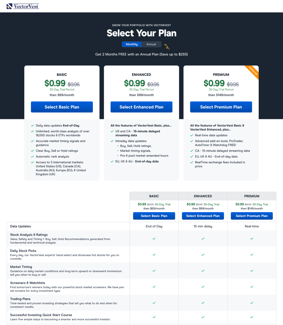
While studying how traffic flowed through this funnel, we saw that many users stalled at the second step—Selecting a subscription plan. The dropout rate was substantially higher than steps 1 or 3. In addition, test participants sometimes struggled to recognize the features that would matter most to them, leading to a sense of information overload.
Decisions require mental effort, and Step 2 asked users to choose between three plans based on an extensive list of features that were either included or excluded. This added to the funnel’s cognitive load and probably triggered analysis paralysis in some users.
How could we reduce this roadblock and bring more users into the 30-day trial?
The original pages (or control)
Here are the three pages in the original onboarding flow.
The tested page (or variation)
What would the funnel look like if we removed step 2 entirely? This might seem extreme, but it’s an example of the thinking we discuss in our article, what would definitely work if only you were allowed to do it?

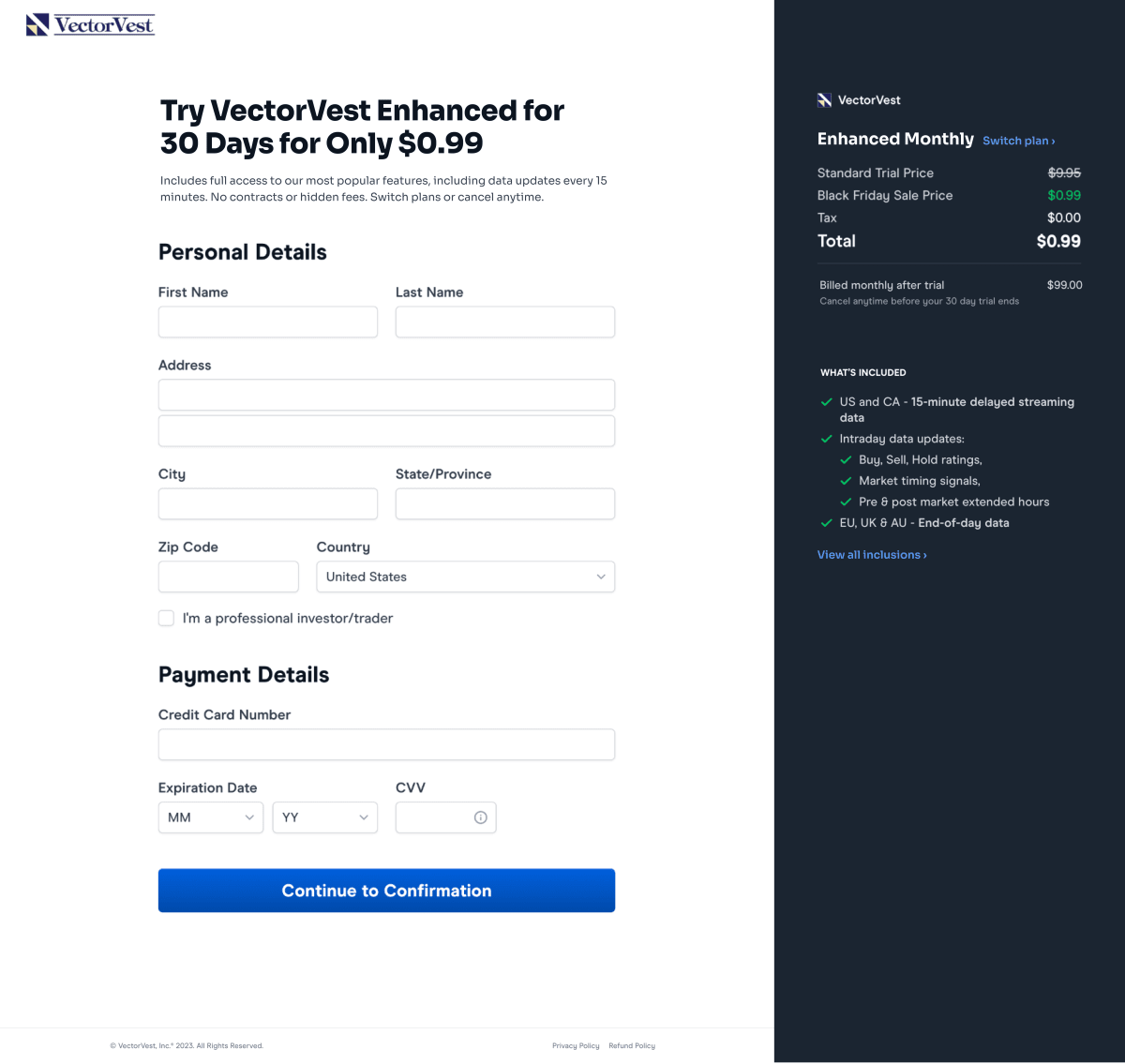
Unsurprisingly, shorter forms with fewer decisions tend to perform better than long, complex ones—but it was important to frame the decision we were making on the customers’ behalf. To increase clarity for users, we added the following copy to the checkout page:
Try VectorVest Enhanced for 30 Days for Only $0.99
Includes full access to our most popular features, including data updates every 15 minutes. No contracts or hidden fees. Switch plans or cancel anytime.
In addition, the variation provided:
- An onscreen list of the Enhanced Plan’s key features, with a linked overlay that detailed everything it included.
- A link to the full Plans page—for those who wanted to compare the other options.
Result: Sales increased by 18%
Removing Step 2 reduced cognitive load and turned a complex choice into a “yes or no” decision. During the test, we observed an 18% increase in sales.
What next?
As usual, we added the test to our proprietary Wins Database and looked for ways to apply its lessons to other parts of VectorVest’s business and to other clients.
If you want us to grow your profits—quickly and efficiently—check if you qualify for a free one-on-one strategy session with one of our CRO consultants.
We’ll only work with you if we believe we can get amazing results together. Our success has come entirely from positive word of mouth, and we plan to keep it that way.
Thanks to VectorVest for letting us share these insights (and for being such a great team to work with).
How much did you like this article?
What’s your goal today?
1. Hire us to grow your company
We’ve generated hundreds of millions for our clients, using our unique CRE Methodology™. To discover how we can help grow your business:
- Read our case studies, client success stories, and video testimonials.
- Learn about us, and our unique values, beliefs and quirks.
- Visit our “Services” page to see the process by which we assess whether we’re a good fit for each other.
- Schedule your FREE website strategy session with one of our renowned experts.
Schedule your FREE strategy session
2. Learn how to do conversion
Download a free copy of our Amazon #1 best-selling book, Making Websites Win, recommended by Google, Facebook, Microsoft, Moz, Econsultancy, and many more industry leaders. You’ll also be subscribed to our email newsletter and notified whenever we publish new articles or have something interesting to share.
Browse hundreds of articles, containing an amazing number of useful tools and techniques. Many readers tell us they have doubled their sales by following the advice in these articles.
Download a free copy of our best-selling book
3. Join our team
If you want to join our team—or discover why our team members love working with us—then see our “Careers” page.
4. Contact us
We help businesses worldwide, so get in touch!
© 2026 Conversion Rate Experts Limited. All rights reserved.
A Brandwidth Group Company.


