Win Report: 30x more leads by replacing four pages with one great offer
Win Reports help you grow your business by showing our methodology at work. Each Win Report showcases a real-world test, sharing the research, insights, and techniques that led to the win.
In the next five minutes, we’ll show you how streamlining a lead generation mechanic increased form submissions by more than 30x.
The Association for Financial Professionals (AFP) supports finance and treasury professionals through every stage of their careers. In addition to practitioner-informed certifications, it offers education and professional development that reflect real-world experience.
The organization recently invested in a media campaign to increase brand awareness, but early results converting that awareness into leads were underwhelming.
Research: Diagnosing blockages in the lead gen funnel
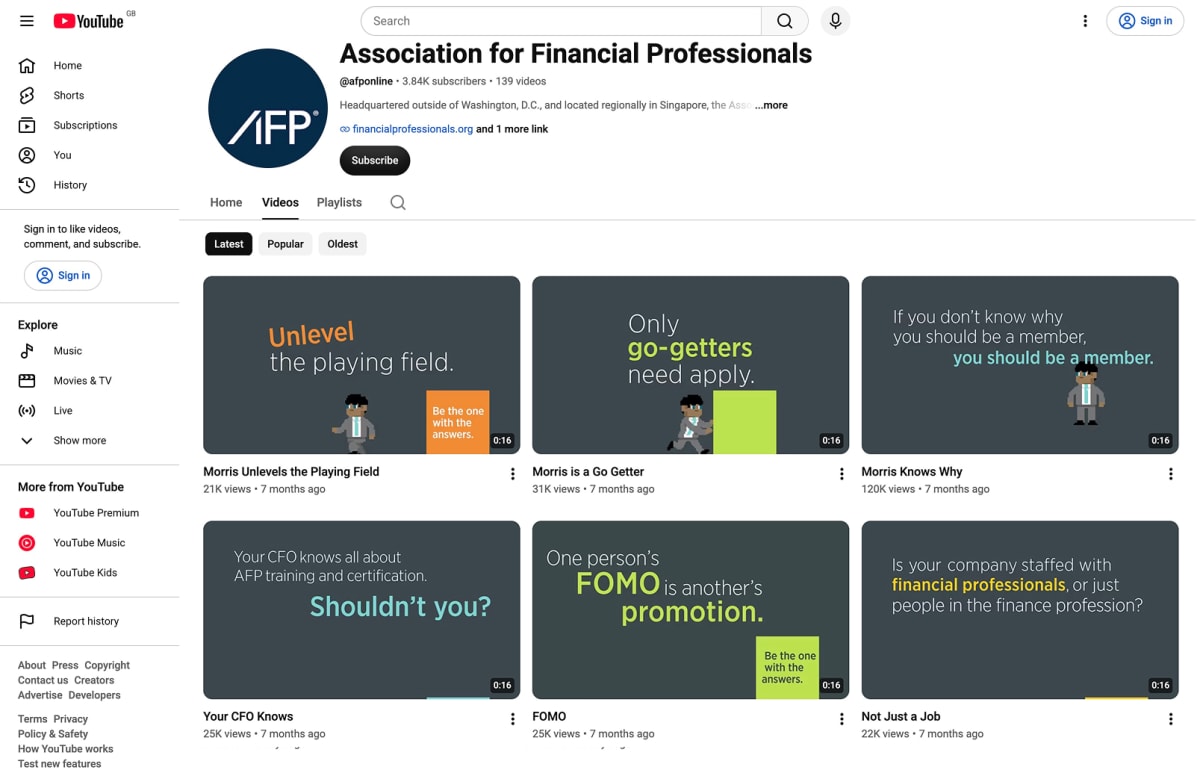
The campaign used short video clips to build awareness of AFP among finance professionals at various stages of their careers. The videos were fast, stylized, and built around a consistent brand promise:
“Be the one with the answers."
Here’s an example of the consistent style on YouTube.
The campaign targeted finance professionals outside the AFP’s existing audience, and subtly prompted questions about where they stood professionally in comparison to others. Visitors were driven to four separate landing pages:
- General page (as a catch-all).
- Early-career.
- Mid-career.
- Executive/C-Suite career.
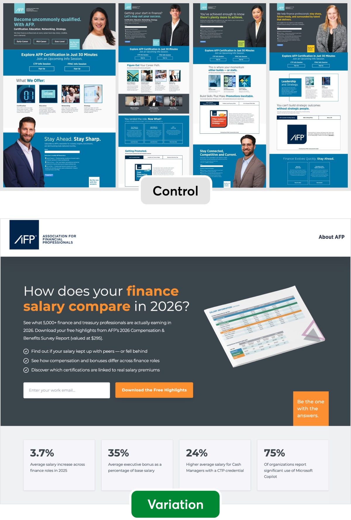
Each page led with a variation of the brand promise, then offered content and CTAs for a wide range of use cases. For example, the general page offered three career-stage buttons, two certification info-session sign-ups, four content tiles, and, at the bottom, the lead-capture email form.
The other pages showed the email form at the top, but then asked visitors to choose between three potential newsletters.
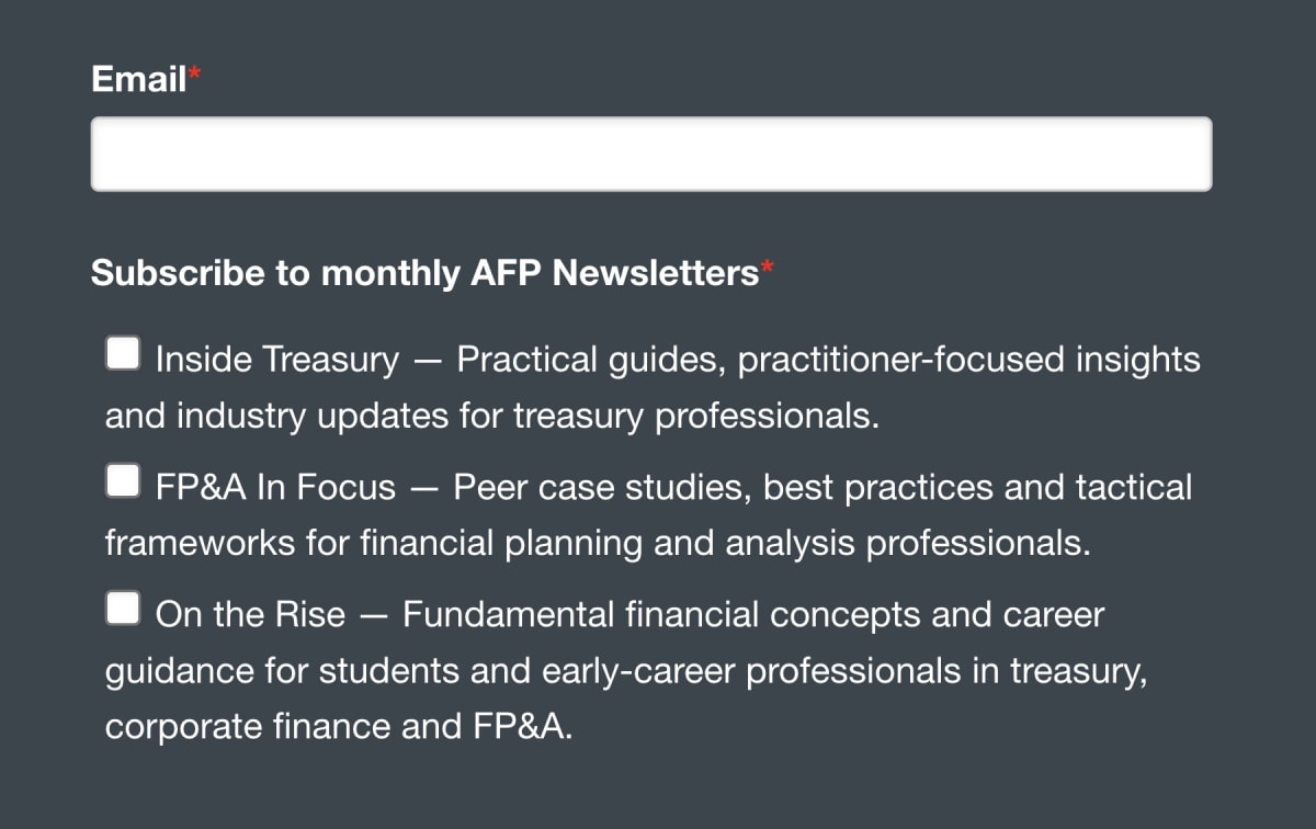
To put this into context, many of the visitors might only have consumed 16 seconds of video. Having done that, they were asked to pick between career stages, certifications, and/or newsletters.
It’s easy to judge in the abstract, but CTA overwhelm is such a common problem, especially for organizations with a lot of moving parts and stakeholders.
What’s simpler to understand is AFP’s actual measure of success—leads. And there weren’t many. The campaign drove people to the landing pages with that subtle “where do I stand?” question, but only a small percentage were choosing to leave their email address.
In fact, few were engaging with any of the opportunities offered. Some of these required more commitment than the user was ready to give; others lacked clarity or relevance.
How could we give those professionals something easier to say yes to?
The original pages (or controls)
Here’s an overview of the four original landing pages, the general one and the three distinct career stages. As you can see, they each carry between six and twelve competing CTAs.
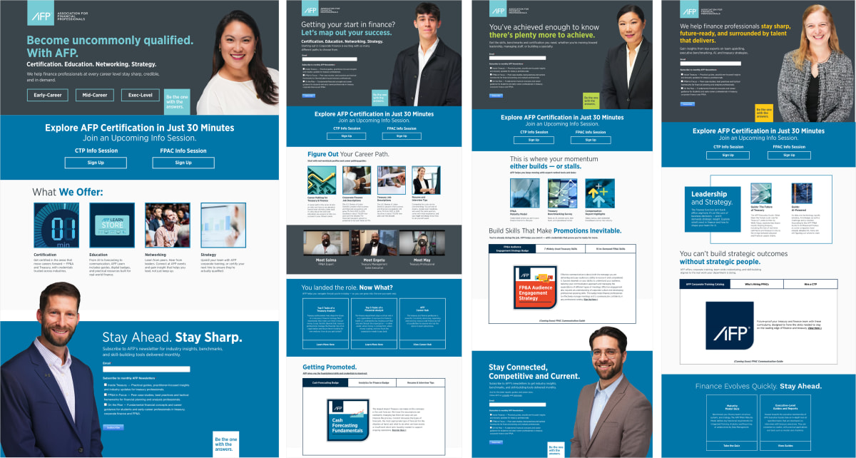
While having different landing pages for different audiences might seem sensible in one respect, it increases the design and technical debt across the website. Multiple pages also split the audience and slows the speed of A/B testing. One of our first recommendations was to combine all the landing pages into one so we could A/B test our ideas faster, and any optimization would benefit all audiences at once. The simplicity of this approach would outweigh the potential value of tailored pages (which weren’t really delivering anyway due to the broad traffic).
We could always re-personalize the process in the future once we had a more compelling offer.
The test page (or variation)
The original landing pages asked visitors to give AFP something: attention, time, information, and so on. We hypothesized that conversions would increase if we gave visitors something of genuine value instead… an offer that would resonate across a broad audience.
The question was what.
Step 5 of our methodology is called Spotting the hidden wealth in your business:
Each of our clients has had elements within its business that would have been highly persuasive to its prospects but that the prospects never saw. The key is to identify all of these persuasion assets and then present them to the prospects at the right time in the buying process. Sometimes, the challenge lies in creating a wish list of persuasive assets that the company needs to acquire.
In line with the methodology, we took some time to search through AFP’s assets looking for treasure, and hit gold with their Compensation and Benefits Survey. This annual survey draws on more than 5,000 finance and treasury professionals, and it literally helps people see where they stand in comparison to their peers.
Although the full report sells for $295, we suggested extracting some key findings that we could build a landing page offer around.
Lead magnets are usually thought of as things you have to create from scratch, but it is often possible to build on something else. (Regular readers may recognize this as a technique that’s worked for us before.)
Unlike the four original pages, the variation was highly focused.
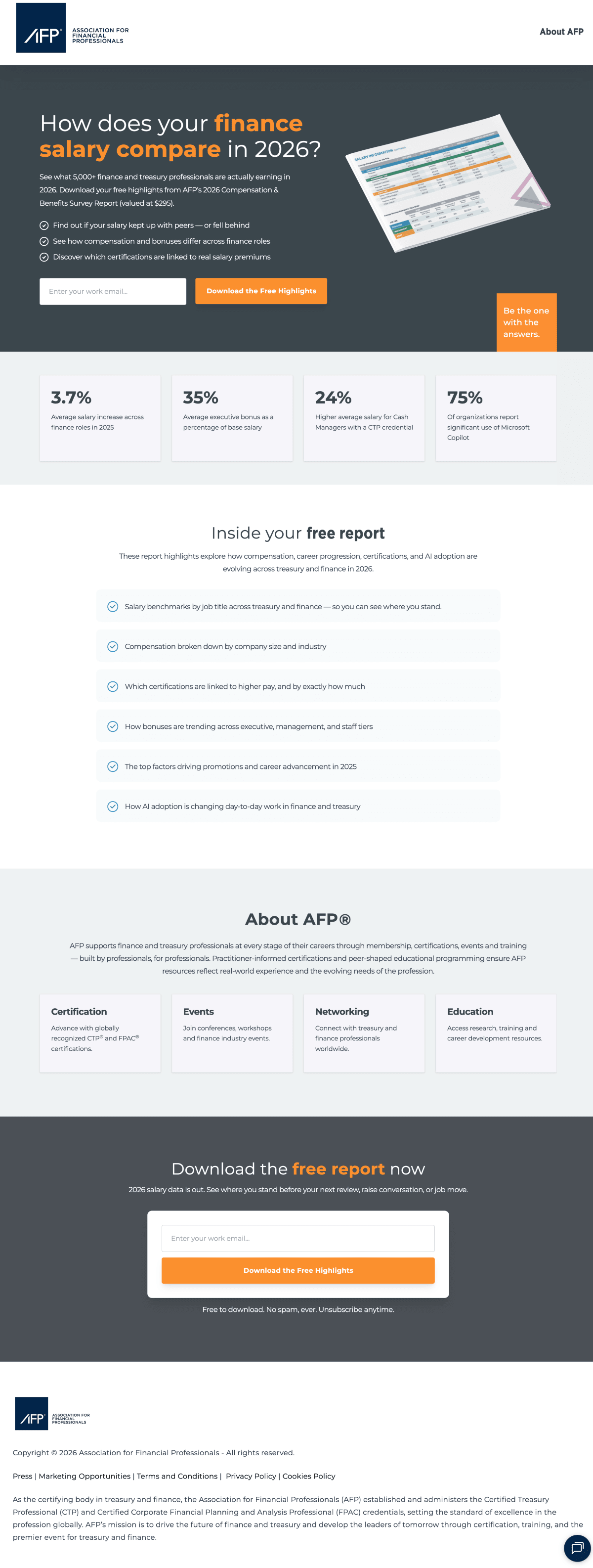
We designed the page to match the color scheme of the YouTube videos, and included:
- One offer, one action. Every call to action on the page submits the same form for the same free report. There’s nothing else to click and nothing else to decide.
- A clear saving. The subhead names the report as “valued at $295” before the price becomes zero, so free reads as a saving rather than a cheap giveaway.
- Specific proof: We included four statistics drawn from the report itself, including that cash managers holding AFP’s Certified Treasury Professional credential earn 24% more than those without it.
- A Johnson box. The “Inside your free report” section lists six things the reader will learn, so the exchange is concrete rather than speculative.
- Risk reversal at the point of commitment. “Free to download. No spam, ever. Unsubscribe anytime." sits directly beneath the second form.
Although this is the page that the users saw, AFP didn’t need to build it themselves. We used an A/B testing tool and a HubSpot form to rapidly build (and iterate through) the page.
Result: Leads increased by 30x
During the test, the variation generated more than 30 times as many leads as the original four pages. While the scale of the improvement might seem surprising, it shows what’s possible when research uncovers a major barrier to conversion—and you find the right way to remove it.
Big wins are also common when we replace confusion and overwhelm with clarity and desire. The new page smashed the original four because it better answered the question that the videos had prompted in the visitors… and answered it with a simple, relevant offer.
As a bonus, the new page reduced maintenance and technical debt and gave us a great platform for further testing.
Here’s what our client had to say

Joe Hodanich, Senior Director, Digital Strategy & Content, Association for Financial Professional
“Working with our CRE team quickly gave us insight into the fact that visitors wanted a focused experience once clicking through a campaign. We’ve taken this philosophy and are applying it across all our digital efforts.”
What’s next
This result gives us plenty of opportunities to help AFP further, not least to nurture the long and growing list of finance professionals who’ve just said they care about their own compensation.
Another is the ability to return to personalized pages, properly validated, and improve the conversions for different stages of their career… and add that data to HubSpot. This could be one page, improved for everyone, with a single line that changes. That’s an efficient version of segmentation because every improvement compounds across all the pages.
As usual, we added the test to our proprietary Wins Database, then looked for ways to apply its lessons to other parts of AFP’s business and then to other clients.
If you want us to grow your profits, quickly and efficiently, check if you qualify for a free one-on-one strategy session with one of our conversion rate optimization (CRO) consultants.
We’ll only work with you if we believe we can get amazing results together. Our success has come entirely from positive word of mouth, and we plan to keep it that way.
Thanks to AFP for letting us share these insights (and for being such a great team to work with).
How much did you like this article?
What’s your goal today?
1. Hire us to grow your company
We’ve generated hundreds of millions for our clients, using our unique CRE Methodology™. To discover how we can help grow your business:
- Read our case studies, client success stories, and video testimonials.
- Learn about us, and our unique values, beliefs and quirks.
- Visit our “Services” page to see the process by which we assess whether we’re a good fit for each other.
- Schedule your FREE website strategy session with one of our renowned experts.
Schedule your FREE strategy session
2. Learn how to do conversion
Download a free copy of our Amazon #1 best-selling book, Making Websites Win, recommended by Google, Facebook, Microsoft, Moz, Econsultancy, and many more industry leaders. You’ll also be subscribed to our email newsletter and notified whenever we publish new articles or have something interesting to share.
Browse hundreds of articles, containing an amazing number of useful tools and techniques. Many readers tell us they have doubled their sales by following the advice in these articles.
Download a free copy of our best-selling book
3. Join our team
If you want to join our team—or discover why our team members love working with us—then see our “Careers” page.
4. Contact us
We help businesses worldwide, so get in touch!
© 2026 Conversion Rate Experts Limited. All rights reserved.
A Brandwidth Group Company.