Case Study: How a website redesign delivered the best year ever for Churnet Valley Railway
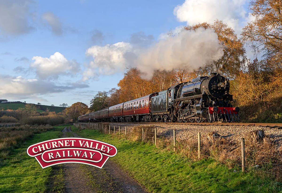
In this website redesign case study, you’ll learn how we helped one of the UK’s leading heritage railways:
- Have its best year ever by leveraging research, not guesswork.
- Turn its website’s design into its biggest growth lever, one page at a time.
- Modernize its website without ever risking the bookings it depended on.
- Sell out Christmas… the most profitable event of the year.
Whatever market you are in, there’s a lot to learn here.
Churnet Valley Railway is a heritage steam railway running through the Staffordshire Moorlands in the UK. The attraction welcomes tens of thousands of visitors each year, and is genuinely loved. It holds a 4.8-star rating on Trustpilot and has thousands of glowing reviews about the trains, the dining experiences, and the team.
Operating Director Greg Wilson wanted to grow bookings on the railway, and was aware that the website had fallen behind the state of the art. It felt like an obvious opportunity, but a full redesign is often a huge gamble. A site can look better and convert worse, and you usually don’t find out which until it’s live.
Greg, an engineer at heart (and a kindred spirit of CRE), wanted to know what was actually wrong before changing anything. And, just as importantly, he needed to protect his existing sales.
Fortunately, at CRE, we always start with research.
Our data-driven strategy
The reason is simple. A big redesign project turns a series of small, knowable decisions into one enormous, unknowable bet.
Our approach lets us do the opposite—break that one big bet into controlled, testable steps, each proven before it ships. When we met with Greg, we proposed exactly that.
Instead of:
- Big decision → big risk → irreversible consequences.
…you get:
- Focused test → low-risk learning → confident rollout.
Our data-driven redesign strategy has three parts:
- Research first. Before we touch a pixel, our research tells us what is wrong and where the biggest opportunities lie. We don’t want to redesign pages because they look old; we want to redesign them because the evidence says a change will grow the business.
- A controlled test validates. Every redesign runs as an A/B test against the existing page. The winner is kept; the loser is learned from and discarded. As we tell every new client, you get to keep the winners and throw away the losers.
- The results signal where to go next. Each result is data about the next move—which page to tackle, which idea to reuse, where the leverage is.
Done this way, a redesign stops being a leap of faith. Every step is a fresh chance to grow conversion, proven before you commit—so you capture the full upside of each win while your downside stays capped. Growth and insurance, in the same motion.
Research: Before you fire up the boiler, lay down the tracks!
In Churnet Valley Railway’s case, we had two clear questions to answer for Greg and his team:
- Is a website redesign actually warranted?
- If so, where do the website’s biggest problems lie?
On the first question, the verdict was clear. During user testing, real visitors described the site as “outdated,” “boring,” and “poor design,” while direct competitors were called “modern,” “fresh,” and “family friendly.” Asked which of three similar websites they’d be most likely to explore, participants put Churnet Valley Railway last.

The team’s instinct was right. The website’s design was holding the railway back. Research had found the lever—now it had to find exactly where to pull it.
On the second question, our research turned a vague “the site looks old” criticism into a list of specific, fixable problems. By leveraging our proprietary research tools and methodology, we found a treasure chest of opportunities for improvement.
Here are just a few of them (that we’ll cover in this case study):
- Aside from the “boring look”, the homepage led with a premium Whisky Experience add-on that confused visitor impressions of who the railway was for.
- The dining listing page asked visitors to compare a long stack of similar options, and a scrollmap showed fewer than one in four reached the bottom—a textbook case of the Paradox of Choice.
- In exit surveys, an unusual 23% of non-converting visitors said they were “researching options”—often a polite way of saying the page hadn’t convinced them. Understanding availability and dates came up again and again.
- The customer-service team heard the same handful of questions on every call—what’s included? Can I book for two? What if I’m gluten-free?—questions the website was answering too quietly and too late.
Each of these findings—and many more—became a hypothesis about what to change, and how to test it. Rather than redesign everything at once, we’d prove each change one page at a time, starting with the biggest opportunity on the site.
How to plan a website redesign project
The homepage was the site’s highest-traffic page. By developing and testing a new page there, we’d have a template for every page that followed.
The goal with any data-driven redesign is to develop a template with design patterns that you can reuse or adapt for other pages. Here’s how we planned the redesign project for Churnet Valley Railway:
- Redesign and test a high-traffic, high-value page. (E.g. The homepage.)
- Use the winning design as a template for another high-value page such as the Breakfast Train booking page. Test that too.
- Add new design patterns to the template library as needed, testing each new page as we go.
- Cascade winning design patterns through all high-value pages, testing and refining.
- Apply winning insights to other parts of the website to drive continual growth.
By focusing on developing a proven template first, we can maximize opportunity for growth and learning.

The homepage test
The original homepage gave the book tickets CTA the same visual weight as everything else, and led with a niche event rather than a family-friendly offering. (How easy is it to find the ‘Book your tickets’ CTA?)
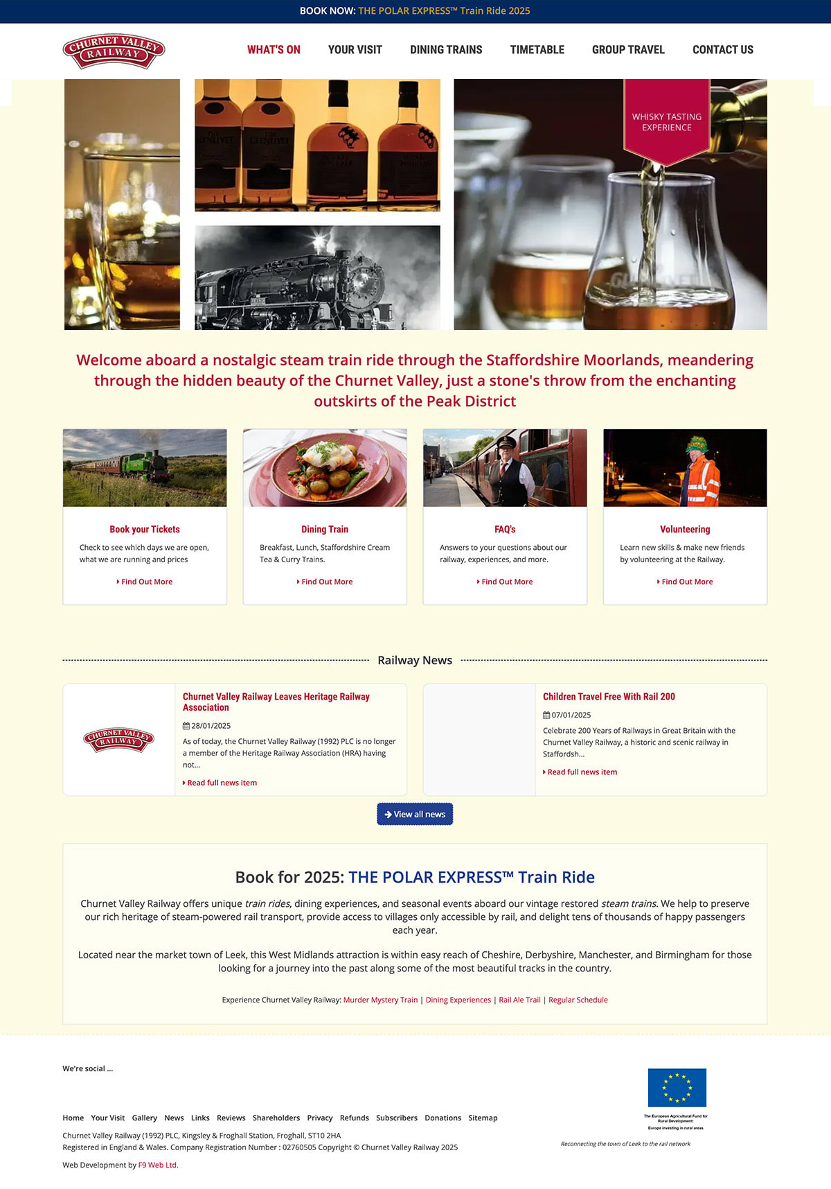
The variation put the railway (and booking decision) front and center.
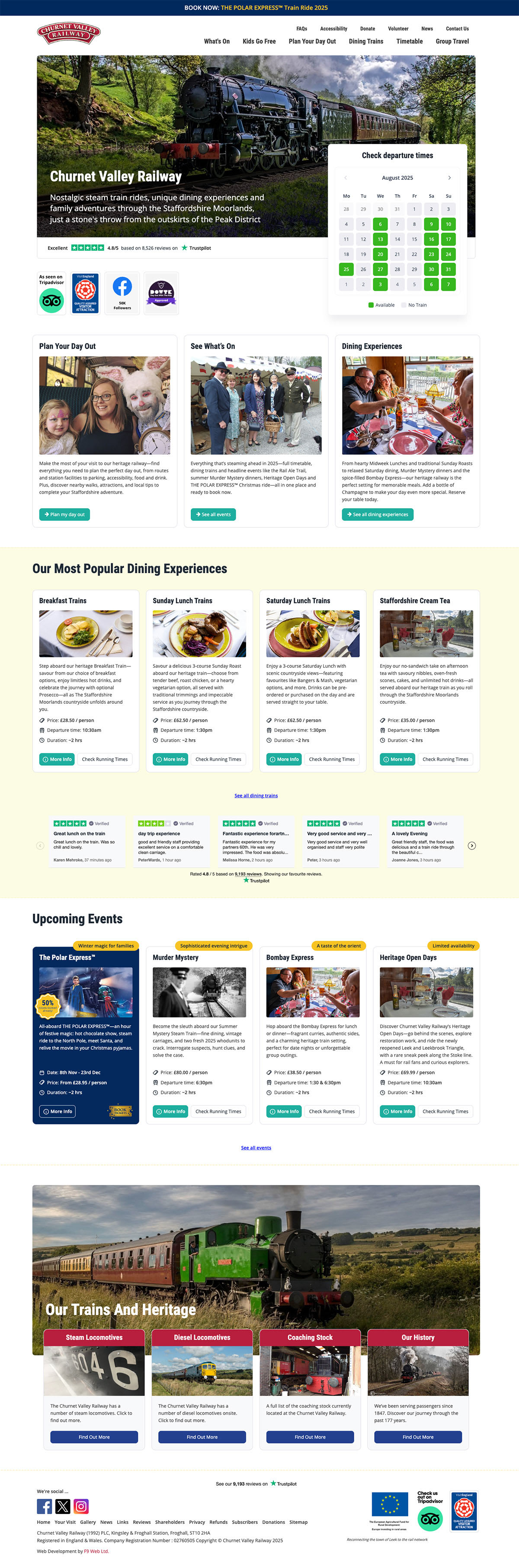
The key changes were:
- A new hero with an embedded calendar, so visitors could see available dates and start booking without scrolling.
- Updated navigation panels that flagged what people actually came for. (Rides, dining, and what’s on.)
- Updated the menu to make key items friendlier and more visible.
- Removal of redundant sections that crowded the page rather than driving bookings.
- Steam-and-railway imagery in pole position, so the first thing visitors saw was the experience they’d arrived for.
The result: A 5% increase in conversions.
As well as a substantial lift in sales, a research-led redesign had grown bookings from the railway’s busiest page and proved the whole approach. The question changed from “should we redesign?” to “where do we focus next?”
When a lever works, pull it again
With the homepage proven, we had something more valuable than a single win—the beginnings of a new design pattern. The homepage included the modern design layout, the hero-with-live-calendar, and the clearer path to booking. These were components we could carry to the pages where the money was made.
The dining experiences were the obvious next target. Like the railway itself, the dining trains were wildly popular with people who’d been on them, but far less convincing to prospective bookers online.
The Breakfast Train (+10%)
The original Breakfast Train page sent visitors to a separate website to check operating dates. It had a fairly workmanlike menu, and used photography that felt disconnected from the offer.
We rebuilt it using elements from the homepage win, and added more:
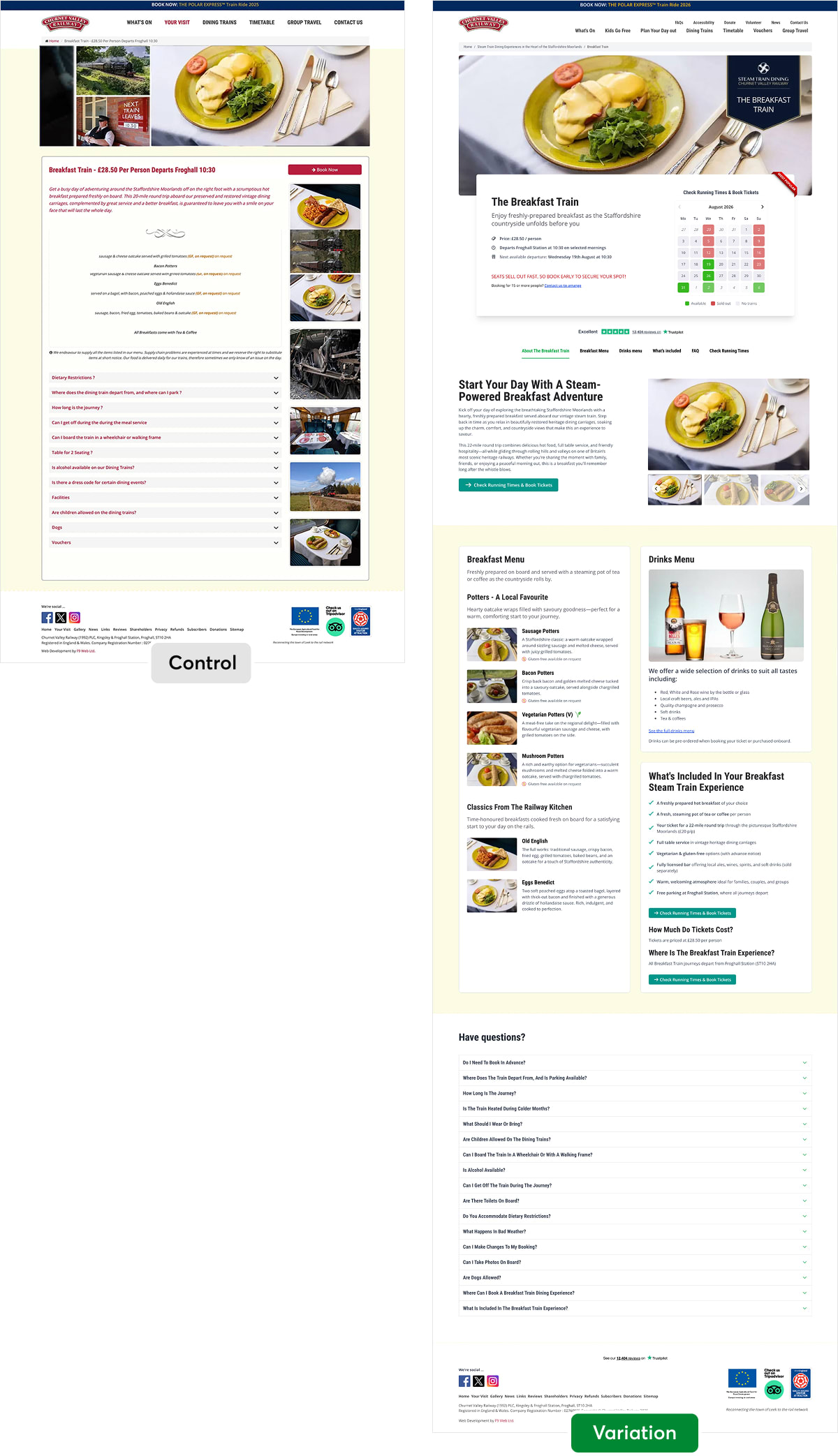
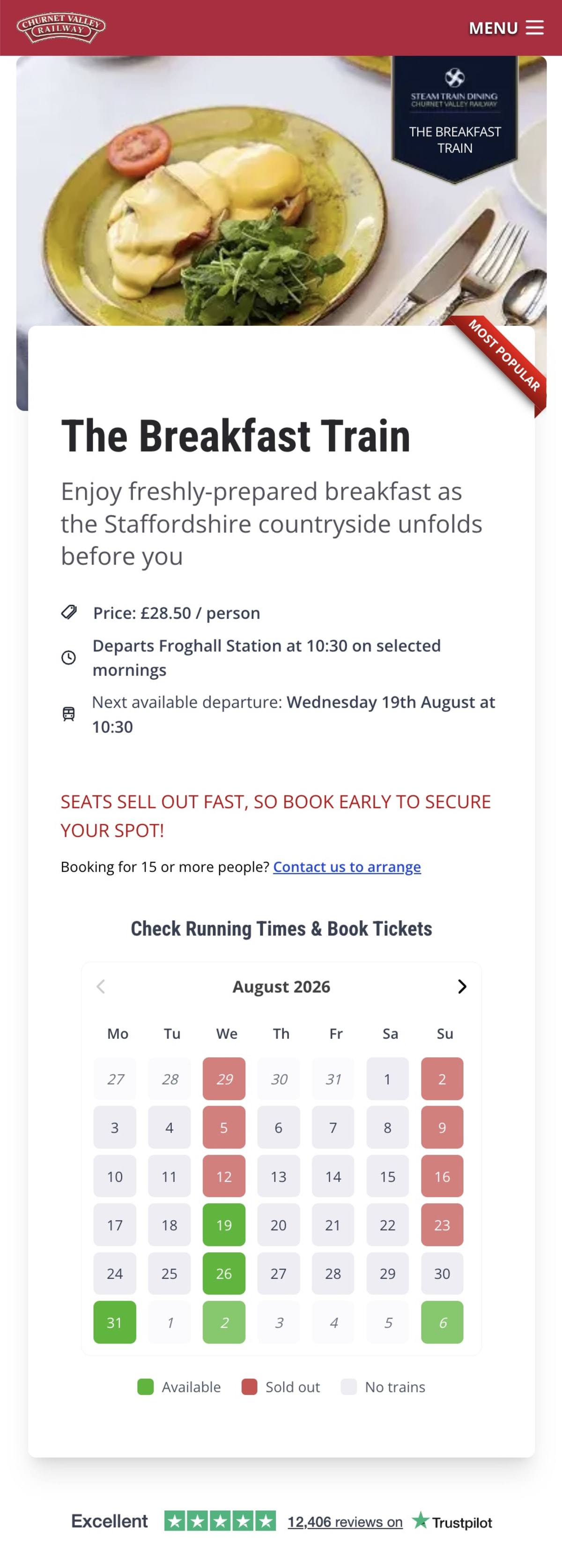
- A “live” calendar and key information at the top—price, departure time, the next available date, and a calendar that visibly marks sold-out and no-service dates, with the Trustpilot widget right below.
- Photography that sells the experience—a single close-up of the breakfast instead of an old collage banner.
- A detailed menu with descriptions, photographs, and clear dietary marks, plus a drinks menu that had been missing entirely.
- A “What’s Included” checklist that built the value into the price.
- Clearer paths to booking, with sticky tab navigation and a repeated Check Running Times & Book Tickets button. Leading with “check running times” rather than “book now” is a textbook use of The Safe Step Principle. (A smaller mental commitment that still leads straight into the booking flow.)
Here’s how the top of the page looked on mobile:
The result: A 10% increase in Breakfast Train bookings.
By making the practical information easy to find, we increased the page’s cognitive fluency—the principle that information which is easier to process is also easier to trust and act on.
The Midweek Lunch Train (+48%)
Here’s where compounding earns its name. Following the principle that when a lever works, you pull it again, we applied the proven template—adapted only for the content—to a more expensive, less-booked experience—the Midweek Lunch Train.
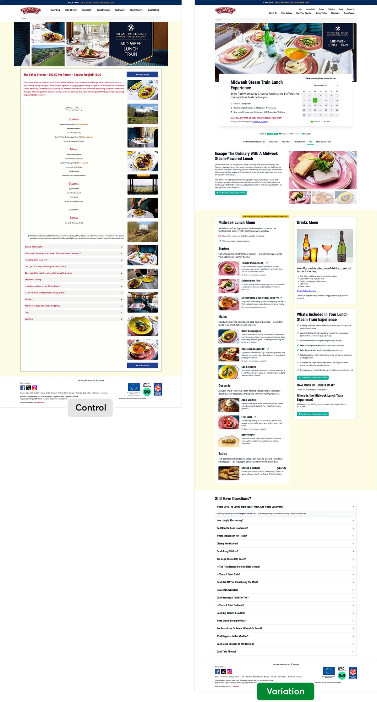
We had good reason to expect a result. When we asked the railway’s customers why they’d booked, a huge proportion were tied to a specific date, day, or occasion—often far in the future. The old page made visitors jump to a separate site to check dates; the new template put a live calendar front and center.
The result: A 48% increase in bookings—almost five times the lift of the original template.
Why so much bigger? Because the stakes were higher. The Midweek Lunch Train costs around twice as much as The Breakfast Train, so knowing everything they are getting matters more to visitors. This is one aspect of what behavioral scientists call loss aversion. The larger the potential loss, the more weight a buyer gives to anything that reduces the risk of regret.
The same template that helped a little on a cheap page helped enormously on an expensive one.
CRO is never done
The dining listing page—where visitors compare every option, from cream teas to Indian dining—was the page our research had flagged for the Paradox of Choice. We improved it twice.
The dining listing page (+13%)
The original dining listing page contained a stack of eight very similar experiences, and fewer than half of visitors scrolled past the fifth option.
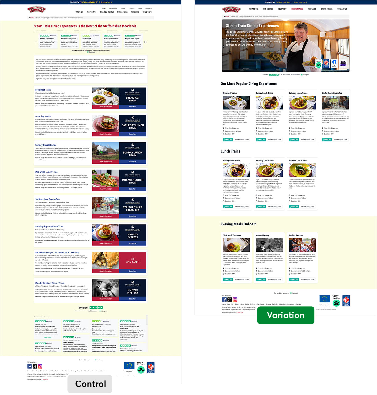
Drawing on designs that had won before, we replaced the stack with categorized sections and smaller cards that highlighted price, departure time, and duration.
We also reduced the size of the Trustpilot widgets, opening up more space. Visitors could now weigh three or four options side by side instead of scrolling endlessly. We also swapped “Book Now” for the safer step of “Check Running Times,” a smaller mental commitment that still leads straight into the booking flow.
A dining FAQ (+9%)
Having delivered big wins during the redesign phase, we moved to an ongoing optimization phase. For example, our interviews with the customer-service team told us that people called with the same questions time and time again. The individual dining pages already had well-used FAQs, but the listing page had none.
So we added a “Have Questions?” FAQ block at the bottom of the page.
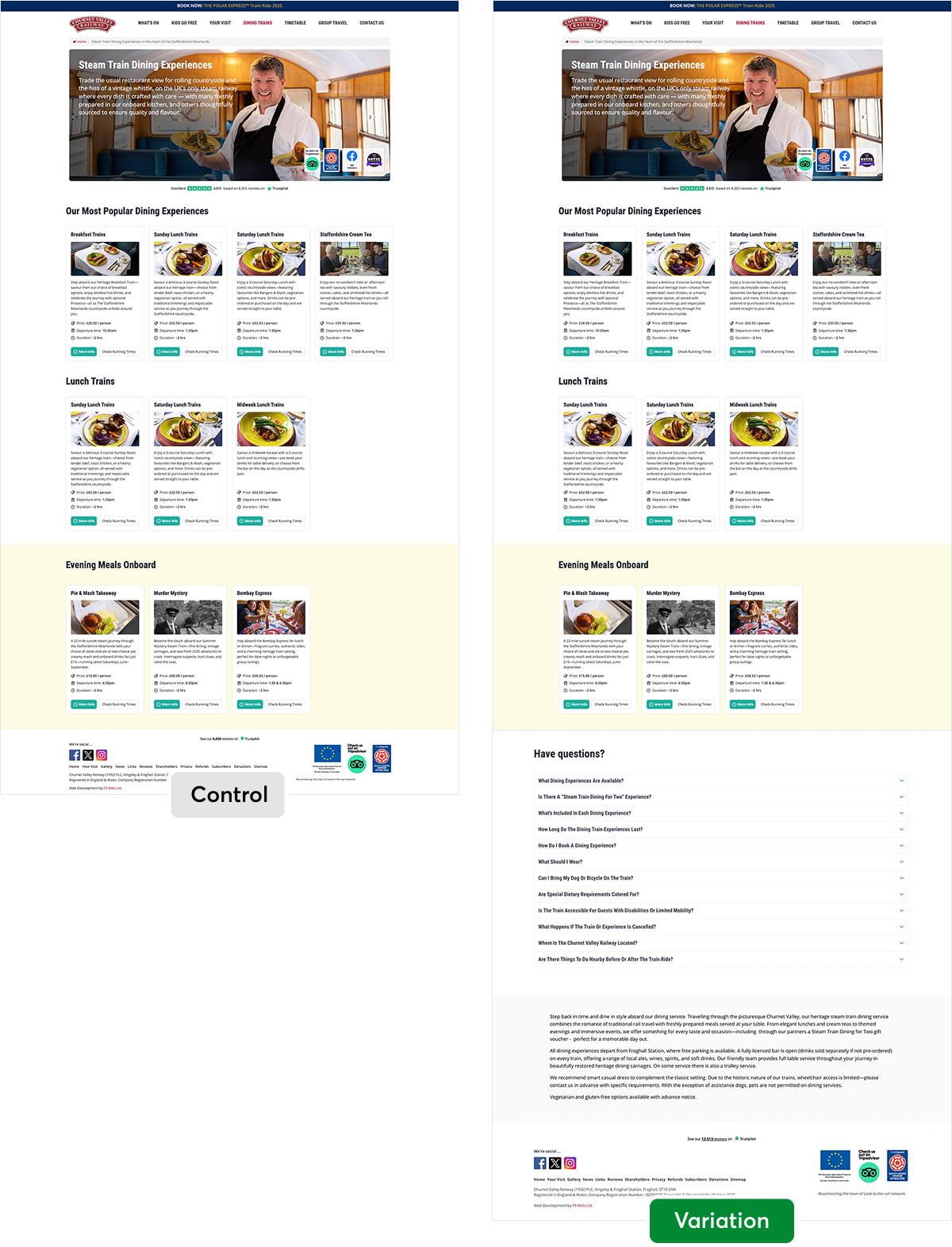
The questions were drawn straight from the call logs, with answers written the way the support team explained them on the phone.
The result: A 9% increase in dining bookings.
One of the easiest lifts in the program, leaning almost entirely on design work and customer knowledge we already had. Sometimes the conversion improvement you need is already sitting in your support team’s inbox.
The “show” that sold out Christmas
The Polar Express is the railway’s most-visited booking page and one of its highest-priced experiences—a make-or-break event. Yet its hero was, in effect, a poster that showed nothing of what the experience actually delivered.
Meanwhile, our research kept surfacing the same thing—visitors were being persuaded by video, just not on the page. “Little videos on Facebook,” one customer said, “other people’s TikToks.” If video was selling the experience on social, why wasn’t the page using the same tool?
We replaced the static hero with existing footage of the cast, the train, and the nighttime journey, with the title and “Book Tickets” CTA overlaid.
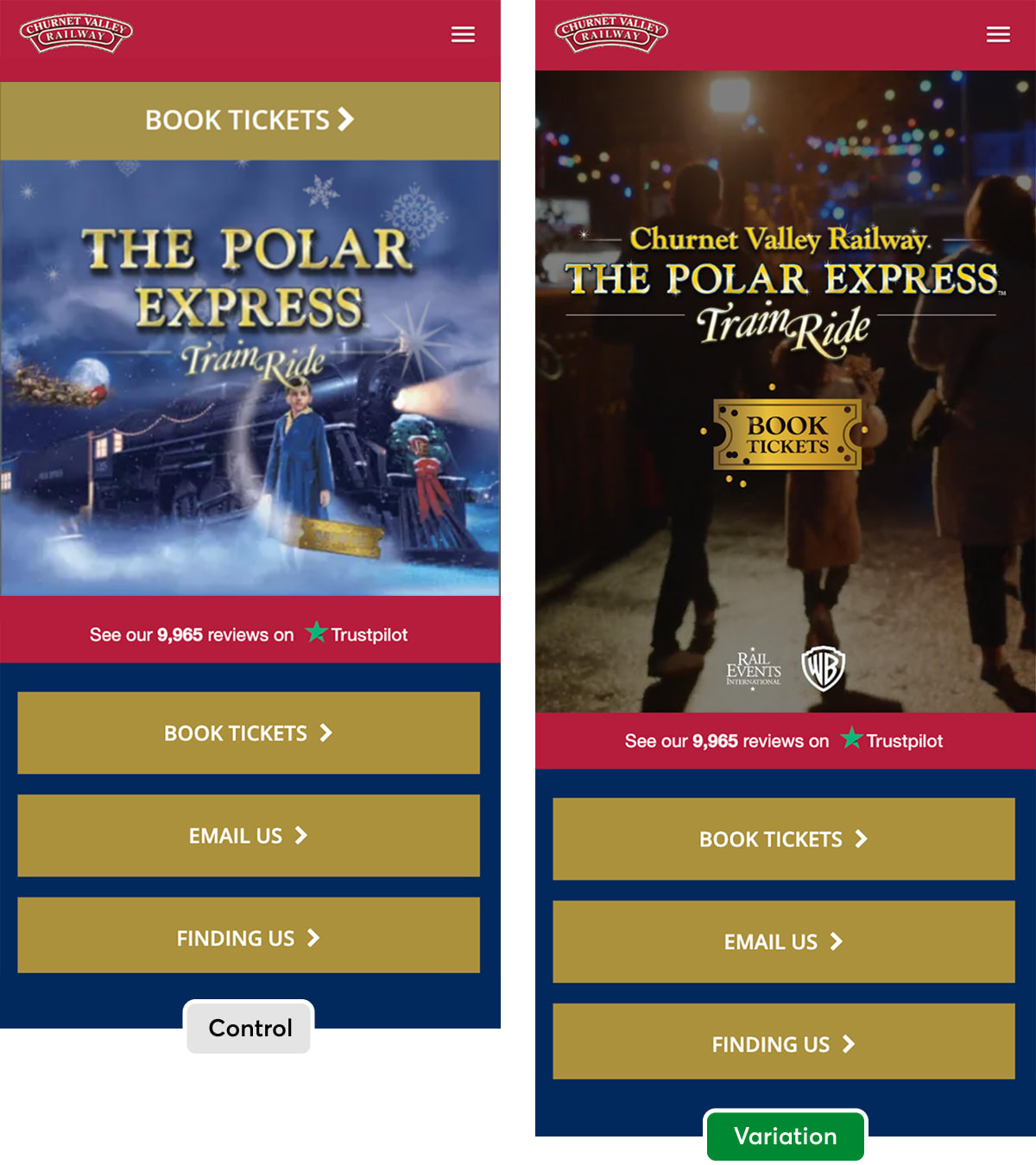
Of course it helps to see the actual video too. Here’s the version from the desktop view of the page (so you can see more):
Quite a difference in feel from the poster, isn’t there?
Perhaps that’s why we couldn’t resist going back to do a second round of method marketing.
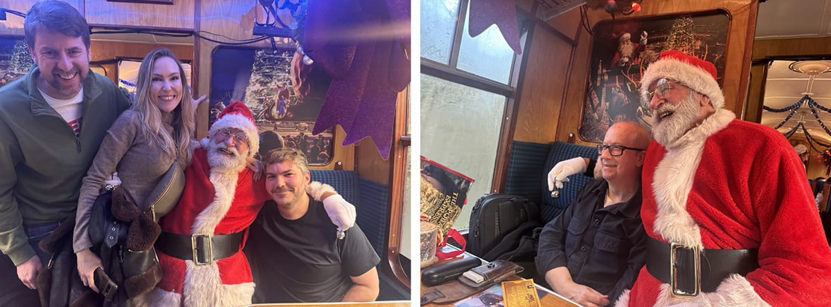
The result: A 7% increase in bookings on an already high-converting page… and a SELL OUT Christmas that required extra carriages to meet demand!
Letting visitors see the experience triggered what behavioral scientists call mental simulation. The more vividly people can rehearse a future experience in their heads, the more likely they are to commit to it. On the highest-traffic, highest-value page of the season, even a 7% lift compounds into a very significant number.
What compounding actually looks like
The headline percentages are satisfying, but they’re not the only interesting part of this story.
Another kind of value built up in the spaces between the tests—in the assets, the knowledge, and the momentum that each win handed to the next.
Here’s what genuinely compounded aside from the percentage wins:
- The template. A homepage idea became a product-page template, which then deployed across page after page—getting faster and cheaper to roll out each time.
- The visual assets. A growing library of components, photography treatments, and layouts that each new test could draw on.
- The learnings. Every result—including the ones not shown here—taught us where to look next. Research instigated each test; each result signaled the following move.
- The confidence. Each validated win made the next decision easier to back, and the next idea bolder. Programs like this often get faster and more ambitious as they go along.
The real lesson: You can engineer your way to growth
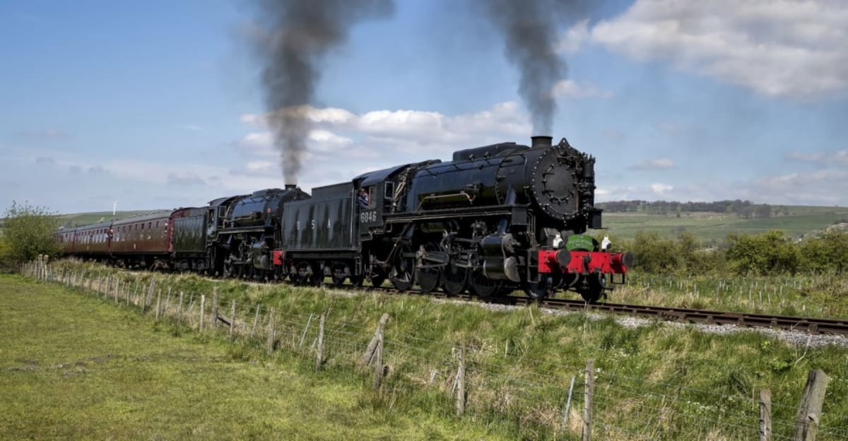
Step back, and Churnet Valley Railway isn’t really a story about steam trains… although we love them. It’s a story about how you can systematically engineer your way to growth, without betting the business.
The decisions with the most at stake are often the least tested, precisely because they feel so obvious that everyone’s already certain. But confidence isn’t evidence. In a parallel universe, Greg could have approached a design and build agency and experienced a 30% drop in conversions like RealEstateU. Testing is how you capture the full upside of a redesign while keeping that downside off the table—as one of the world’s smartest investors put it:
“It is remarkable how much long-term advantage people like us have gotten by trying to be consistently not stupid, instead of trying to be very intelligent.”
—Charlie Munger
So whether you’re about to redesign your website, hoping a prettier site will convert better—or you’ve already redesigned and watched conversion fall with no idea why—the path forward is the same one we took with Churnet Valley Railway.
No sweeping redesigns. Instead:
- Research what’s actually wrong.
- Test before you commit.
- Keep the winners.
Do this, and a redesign stops being a leap of faith. It becomes what it was for Churnet Valley Railway, the most profitable—and most reliable—growth decision of the year.
What’s next for Churnet Valley Railway?
The conversion rate optimization continues. As usual, every test was added to our proprietary Wins Database, and we continue to look for ways to apply its lessons to other parts of Churnet Valley Railway’s business.
This is just one example of a research-led redesign program—a way of modernizing a website without betting the business on a guess.
**If you’d like to talk about redesigning your website in this way, book a free one-on-one strategy session with one of our team.
We’ll only work with you if we believe we can get amazing results together. Our success has come entirely from positive word of mouth, and we plan to keep it that way.
Thanks to Greg and the Churnet Valley Railway team for letting us share these insights (and for being such a great team to work with).
How much did you like this article?
What’s your goal today?
1. Hire us to grow your company
We’ve generated hundreds of millions for our clients, using our unique CRE Methodology™. To discover how we can help grow your business:
- Read our case studies, client success stories, and video testimonials.
- Learn about us, and our unique values, beliefs and quirks.
- Visit our “Services” page to see the process by which we assess whether we’re a good fit for each other.
- Schedule your FREE website strategy session with one of our renowned experts.
Schedule your FREE strategy session
2. Learn how to do conversion
Download a free copy of our Amazon #1 best-selling book, Making Websites Win, recommended by Google, Facebook, Microsoft, Moz, Econsultancy, and many more industry leaders. You’ll also be subscribed to our email newsletter and notified whenever we publish new articles or have something interesting to share.
Browse hundreds of articles, containing an amazing number of useful tools and techniques. Many readers tell us they have doubled their sales by following the advice in these articles.
Download a free copy of our best-selling book
3. Join our team
If you want to join our team—or discover why our team members love working with us—then see our “Careers” page.
4. Contact us
We help businesses worldwide, so get in touch!
© 2026 Conversion Rate Experts Limited. All rights reserved.
A Brandwidth Group Company.