Optimizing for user value: How we helped to grow a crowdsourced learning platform
(By the way, to get articles like this free in your inbox, subscribe to our newsletter.)
The following is from our huge library of client successes—why not discover how we can help grow your business?

—Includes before-and-after images of winning A/B-tests
Platforms and marketplaces are interesting to optimize, because they have to juggle multiple distinct conversion goals. For example:
- If eBay had no sellers, there’d be nothing for the buyers. And if it had no buyers, there’d be nothing for the sellers. So it must optimize for both.
- If Monster.com had no jobs, there’d be nothing for the job seekers. And if it had no job seekers, there’d be nothing for the employers. So it must optimize for both.
- If Facebook had no visitors, there’d be nothing for the advertisers. And if it had no advertisers, there’d be no way of monetizing the visitors. So it must optimize for both.
Platforms are also interesting because they are heavily dependent on network effects: the value of a platform depends on the number of people using it. If YouTube had just one user, the value to that user would be almost zero.
This article describes how we helped to grow a crowdsourced learning platform called Course Hero. Course Hero is a platform where students and educators can share and access learning materials like flashcards, homework help, and course-specific study documents. The company hired us to apply our unique methodology to its business:
- It wanted to encourage more users to upload study resources they had created—thus expanding Course Hero’s library, broadening its community, and making it more valuable to current and future users.
- It also wanted more users to sign up, to help realize its vision of being “the world’s largest learning community”—a valuable resource for both students and teachers.
“Our ability to get people to convert and sign up with us and contribute more content … that’s our entire business.”—Charlie Hazlehurst, VP of Product and Marketing at Course Hero
This article describes how we helped to improve both sides of Course Hero’s two-sided business model. Note that “we” refers to a team effort between Conversion Rate Experts (with our expertise and proven processes) and Course Hero (with its great team and experimental culture).
The need for speed: why it’s important for many web businesses to grow quickly
Before you start A/B-testing, you should design an experimental strategy that aligns with your strategic goals. For a platform like Course Hero, speed, scalability, and increasing market share were critical, for three reasons:
- For many types of online businesses, the winner takes all (or at least most). This is particularly true for platforms, marketplaces and communities. The winning strategy for a platform is to first become the biggest and best of its type. Of course, such companies need money to run, but delighting users must always take first priority.
- Success depends on the speed at which you can (i) learn and iterate, (ii) improve your website’s conversion rate, and (iii) reinvest the additional profits to acquire even more traffic.
- There’s an enormous advantage to being in the lead rather than lagging behind. Once you’re ahead, you tend to gain market share merely by being ahead; if you’re always playing catch-up, on the other hand, many forces conspire to slow your progress.
We created an experimental strategy that focused on speed
- We designed only experiments that had research-driven hypotheses. In our experience, evidence-based experiments are much more likely to give breakthrough results. This article will help ensure that your tests have a high likelihood of winning.
- We focused on key pages (or page elements) in Course Hero’s conversion funnel. We identified the pages—and the site-wide page elements—that were seen by most qualified visitors.
- We prioritized tests that were easy to implement. Where possible, we created test pages within Optimizely’s editor. This streamlined the process and massively cut down on design and development resources. If you’d like to learn more about working quickly, read this article.
Rather than describing all the improvements we made—many of which will be relevant only to Course Hero’s business—we’ll now describe three experiments that are likely to be applicable to other businesses. Each involved a quick change to the website that significantly, measurably improved the business.
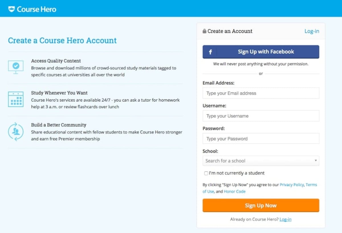
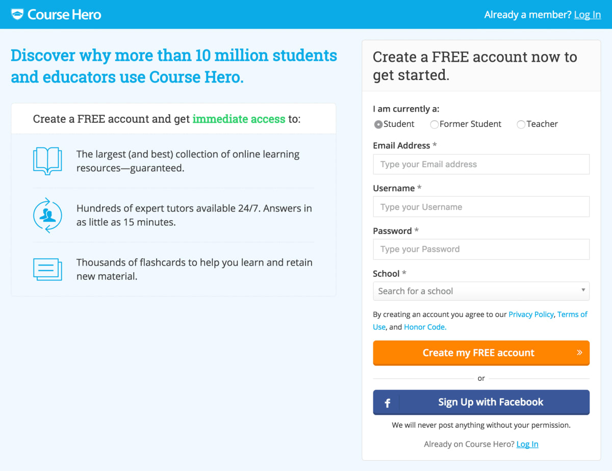
Test 1: By optimizing the “Create a Free Account” page, we got 19% more paid members
Why it won
Our research and analysis of the account creation process revealed that visitors had four main objections:
- Objection 1: Lack of awareness of Course Hero’s credibility and size. Some visitors were unsure whether to trust Course Hero. We overcame this objection by mentioning the size of Course Hero’s community—“more than 10 million students and educators” and “hundreds of expert tutors”. We added even more proof by stating that Course Hero has “the largest (and best) collection” of resources and “thousands of flashcards.” You can learn more about adding trust in our guide to credibility and proof.
- Objection 2: Confusion about how Course Hero works. We overcame this objection by rewriting the bullet points to describe better what the users get. For more information about this, see our guide to communicating value propositions.
- Objection 3: Uncertainty about the cost of creating an account. It’s free to create a Course Hero account, so we made that more prominent, and repeated it throughout subheadings and the call to action.
- Objection 4: Concerns about using Facebook to sign up. We overcame this objection by de-emphasizing the “Sign Up with Facebook” button, by moving it below the higher-converting “Create my FREE account” button. If your website has multiple ways to sign up, allow your visitors to choose which option they prefer.
Test 2: We increased the uploads of user-generated content by 21%
Why it won
When you optimize a two-sided platform, you need to juggle selling two things at once.
(In fact, this great article by Segment—which is inspired by this HBR one—describes how you can break down the problem into even more sub-goals.)
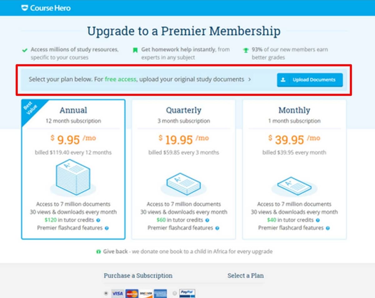
We knew we could improve the page by having one conversation at a time. So we removed all mention of the free upload option and focused just on paid access.
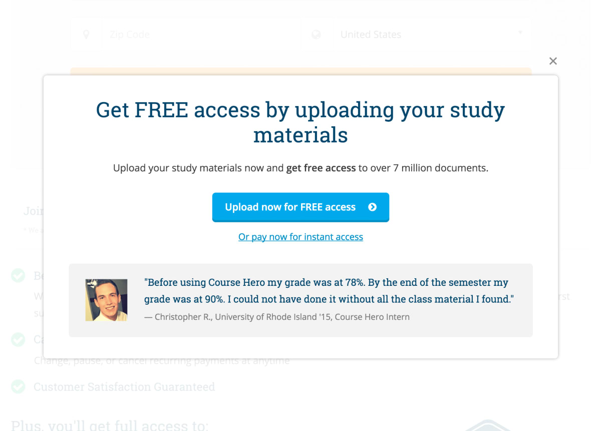
We then created an overlay that effectively down-sold users on the upload option.
You might expect that by promoting the free option we’d have lowered Course Hero’s revenues. But by separating the goals, the number of cash deposits rose too—by 24%.
If your website has distinct types of visitors, invest time to understand each of them deeply. It will give you a much better idea of how to organize your conversion funnel so that you show…
- …the right content…
- …with the right call-to-action…
- …to the right visitors…
- …at the right time in their journey.
Test 3: We got 9% more paid members by adding a promotional element to the sidebar
Why it won
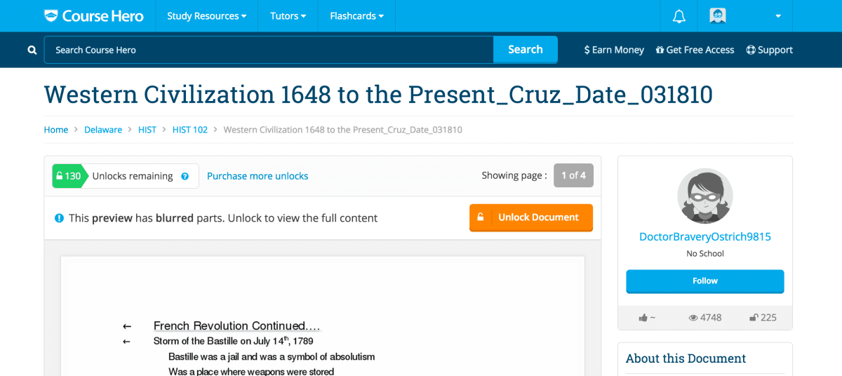
Web analytics revealed that the study resources were among Course Hero’s top landing pages. We carried out surveys on the “Study Resources” page. The responses revealed that visitors had unanswered questions about how Course Hero works.
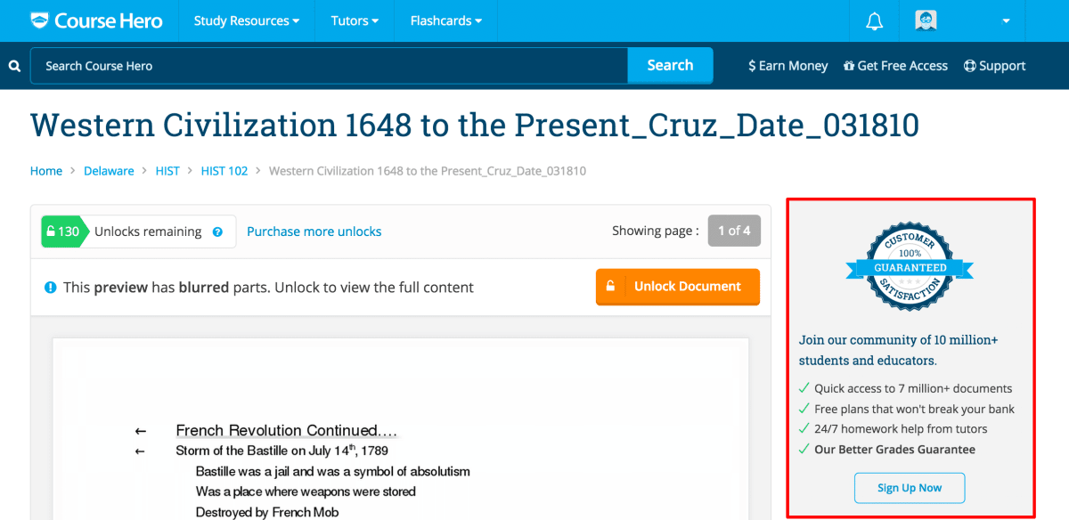
We had already carried out several winning A/B-tests in the sidebar, so we knew that the sidebar was a “nerve” that was sensitive to conversion.
By explaining in the sidebar what Course Hero is, and why it’s amazing, we increased conversion to paid members by 9%.
Tools we used
Here are just a few of the tools we used on this project:
- For on-page surveys, we used Qualaroo.
- For click-mapping, we used Crazy Egg.
- For A/B-tests, we used Optimizely.
- For customer surveys, we used Survey Gizmo.
A few words from the VP of Product and Marketing at Course Hero, Charlie Hazlehurst
Big thanks to the Course Hero team
It’s a pleasure working with the team at Course Hero. We’d like to thank them for having confidence in Conversion Rate Experts, and for trusting in our CRE Methodology.
Could you use more case studies like this?
If you’d like to see another case study about growing a two-sided business, see how we increased the conversion rate of Voices.com by over 400%. To see even more businesses we’ve grown, visit our “Clients and Results” page.
How much did you like this article?
What’s your goal today?
1. Hire us to grow your company
We’ve generated hundreds of millions for our clients, using our unique CRE Methodology™. To discover how we can help grow your business:
- Read our case studies, client success stories, and video testimonials.
- Learn about us, and our unique values, beliefs and quirks.
- Visit our “Services” page to see the process by which we assess whether we’re a good fit for each other.
- Schedule your FREE website strategy session with one of our renowned experts.
Schedule your FREE strategy session
2. Learn how to do conversion
Download a free copy of our Amazon #1 best-selling book, Making Websites Win, recommended by Google, Facebook, Microsoft, Moz, Econsultancy, and many more industry leaders. You’ll also be subscribed to our email newsletter and notified whenever we publish new articles or have something interesting to share.
Browse hundreds of articles, containing an amazing number of useful tools and techniques. Many readers tell us they have doubled their sales by following the advice in these articles.
Download a free copy of our best-selling book
3. Join our team
If you want to join our team—or discover why our team members love working with us—then see our “Careers” page.
4. Contact us
We help businesses worldwide, so get in touch!
© 2026 Conversion Rate Experts Limited. All rights reserved.
A Brandwidth Group Company.


