Less is more: how we used Crazy Egg to boost our own conversions
(By the way, to get articles like this free in your inbox, subscribe to our newsletter.)
This article is summarized in this 58-second video
The challenge: increase our opt-in rate
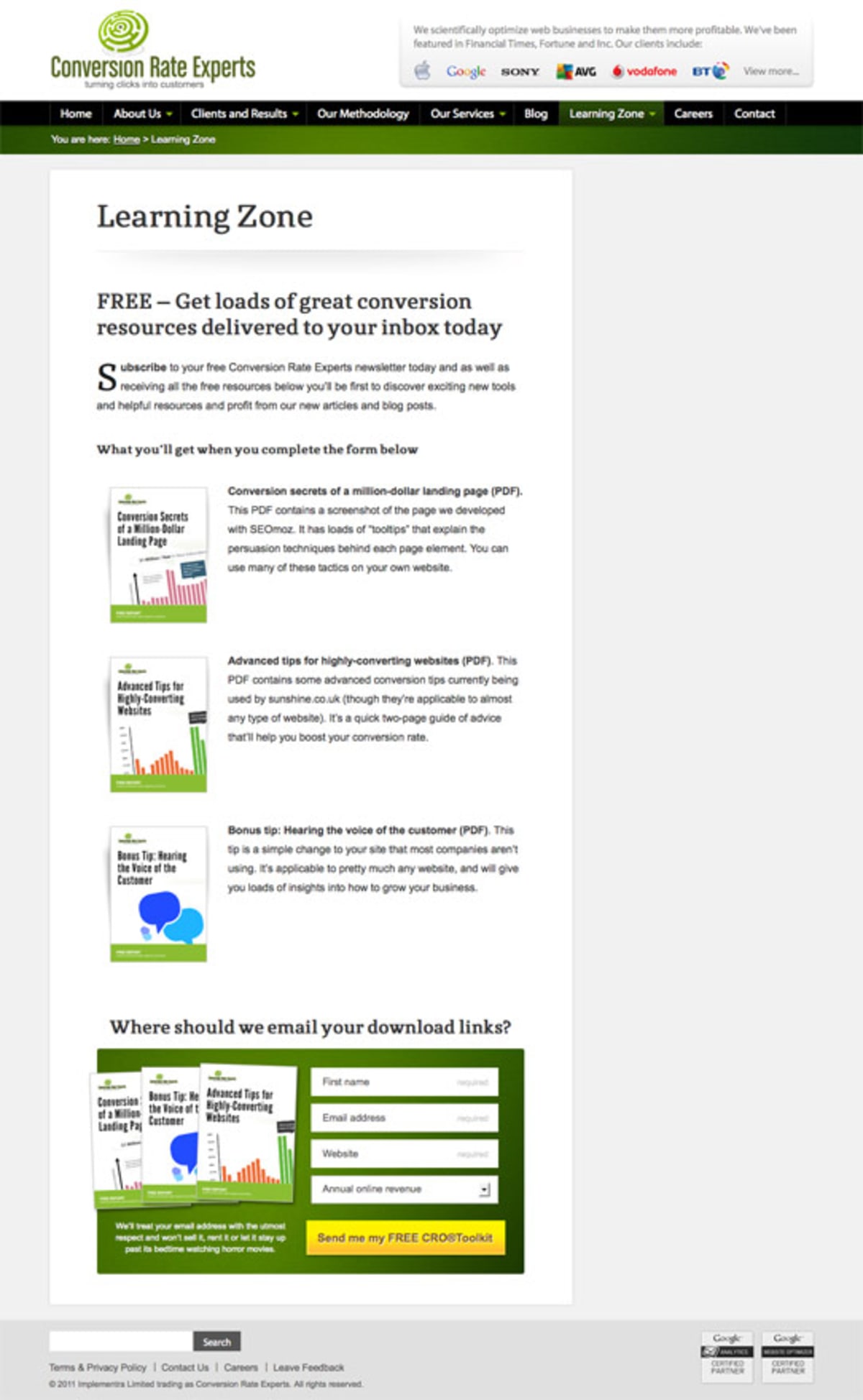
Recently, we aimed to improve the opt-in rate for the following page:
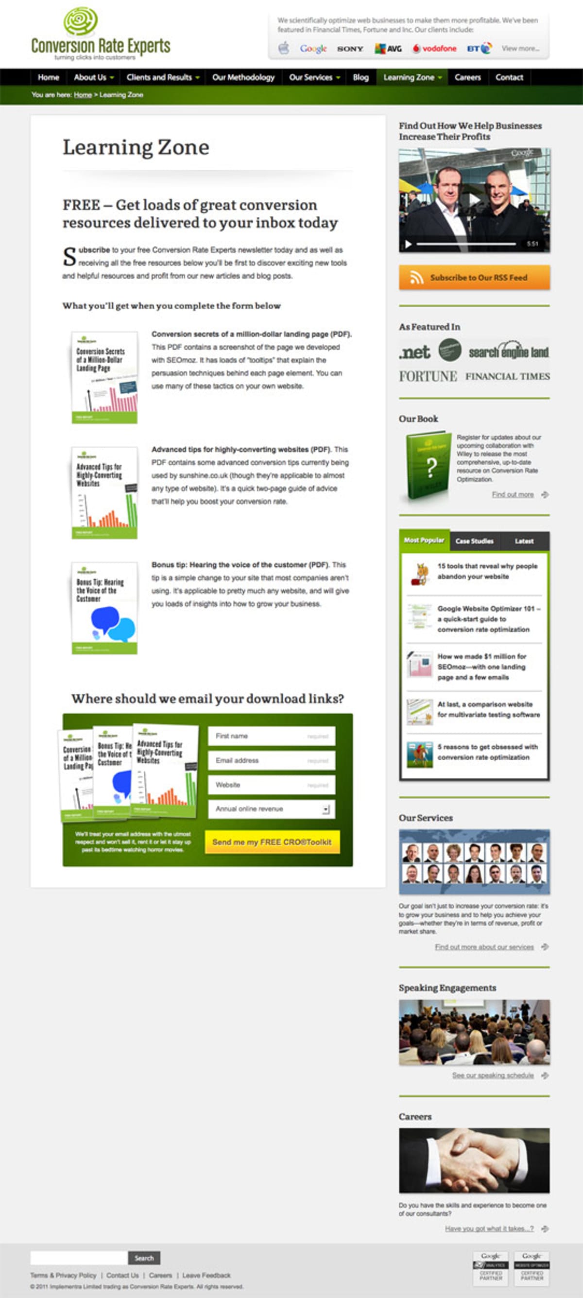
This page had been performing fine for us. We had surveyed our visitors using Qualaroo (formerly known as KISSinsights), Kampyle and 4Q, and most of their responses were complimentary. It wasn’t obvious that anything needed changing. In such situations, we often interrogate Crazy Egg.
Crazy Egg gave us the clue we needed
When we looked at the Crazy Egg overlay for our page, this is what we saw:
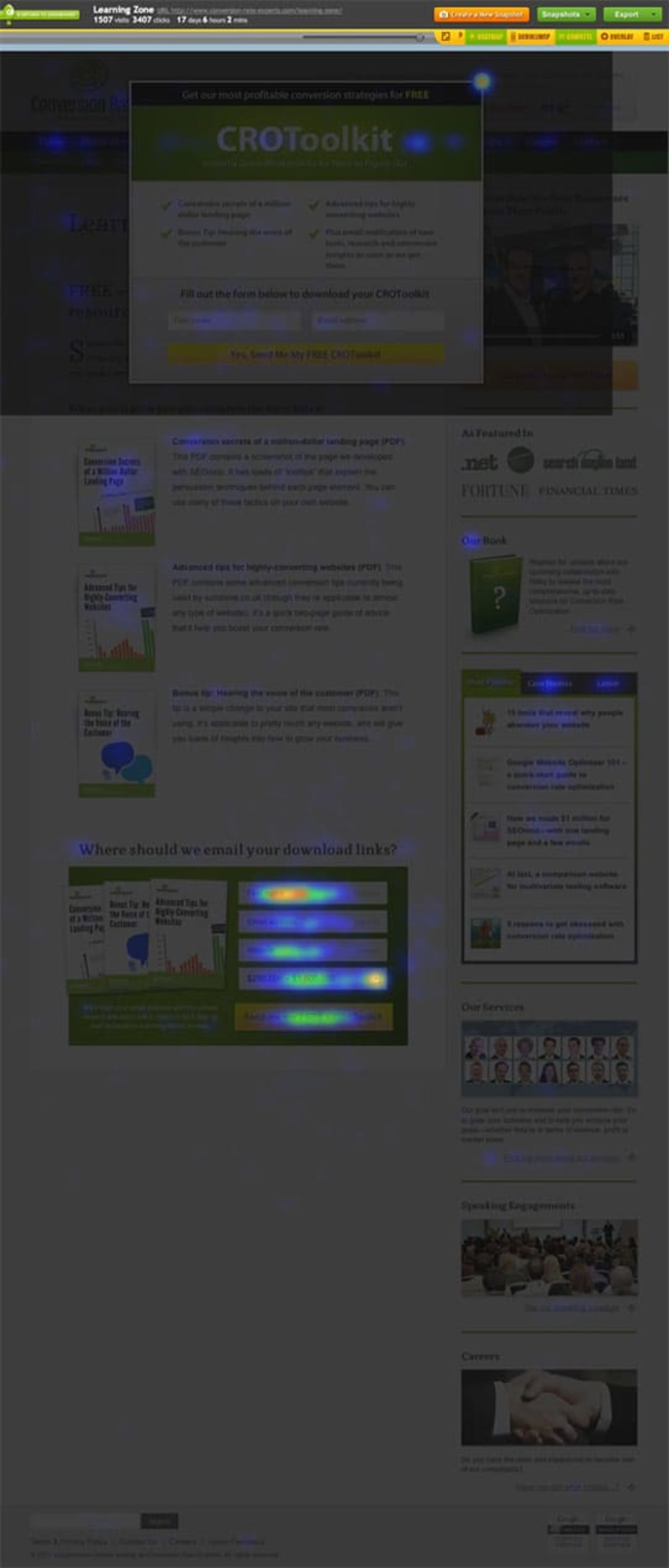
Notice how most of the clicks are where anyone would expect them to be—in the sign-up area for the free toolkit showcased on the page. (Ignore the rectangular area near the top of the page—it’s an entry overlay.)
If it hadn’t been for that pesky sidebar…
However, also notice how we were getting some clicks on the right sidebar area. It wasn’t red-hot, but we still got a noticeable number of clicks.
We realized that our site-wide sidebar was distracting some people from the task at hand, which was to download our free toolkit. We were practically asking them to click off to the right and not stay on topic.
We whipped up another page where everything stayed the same, except that we removed the right sidebar. The information in that sidebar appears in sidebars on other pages, so we were confident that sooner or later our visitors would see it all. A much higher priority was to have those visitors get our toolkit right now, so we’d have a way of contacting them in the future with news and other information.
Here’s the test page we created:
We tested it using Visual Website Optimizer. Here are the results:
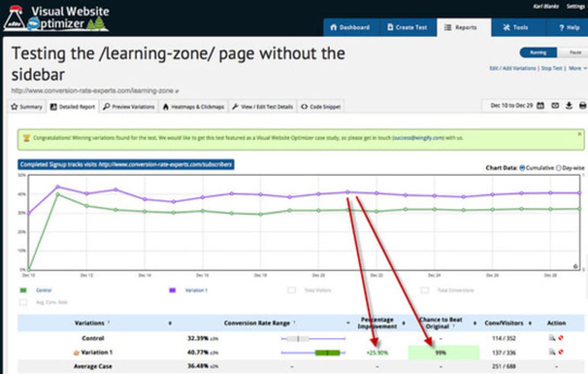
The new version of the page generated 25.9% more opt-ins during the test period, and was 99% likely to be better than the control.
It never ends—nor should it
Crazy Egg is a powerful tool for understanding visitor behavior, which in turn allows you to help direct that behavior toward your desired outcomes. To discover some other fantastic tools, visit this page.
Disclosure: Crazy Egg is one of our clients—though we were recommending it years before it was a client.
How much did you like this article?
What’s your goal today?
1. Hire us to grow your company
We’ve generated hundreds of millions for our clients, using our unique CRE Methodology™. To discover how we can help grow your business:
- Read our case studies, client success stories, and video testimonials.
- Learn about us, and our unique values, beliefs and quirks.
- Visit our “Services” page to see the process by which we assess whether we’re a good fit for each other.
- Schedule your FREE website strategy session with one of our renowned experts.
Schedule your FREE strategy session
2. Learn how to do conversion
Download a free copy of our Amazon #1 best-selling book, Making Websites Win, recommended by Google, Facebook, Microsoft, Moz, Econsultancy, and many more industry leaders. You’ll also be subscribed to our email newsletter and notified whenever we publish new articles or have something interesting to share.
Browse hundreds of articles, containing an amazing number of useful tools and techniques. Many readers tell us they have doubled their sales by following the advice in these articles.
Download a free copy of our best-selling book
3. Join our team
If you want to join our team—or discover why our team members love working with us—then see our “Careers” page.
4. Contact us
We help businesses worldwide, so get in touch!
© 2026 Conversion Rate Experts Limited. All rights reserved.
A Brandwidth Group Company.


