Ecommerce conversion optimization: Two winning tests for a multilingual online florist
(By the way, to get articles like this free in your inbox, subscribe to our newsletter.)
The following is from our huge library of client successes—why not discover how we can help grow your business?
In this article, we’ll show you how to increase your win rate by doing some diligent research. Plus, we’ll show you the results of two interesting tests from an ecommerce conversion optimization project.

Overview
Ecommerce sites have a particular challenge when it comes to conversion optimization: Implementation can require significant technical resources.
Because of this, it’s important that ecommerce marketers change only things that are likely to work. They don’t have the luxury of being able to “throw stuff against the wall to see what sticks.”
No one can win every test, of course, but you can increase your win rate. At Conversion Rate Experts, we have the advantage of having worked on many ecommerce stores, but even if you don’t have the benefit of experience, there are simple things you can do to radically improve your ability to design pages that increase profits.
This article describes the work we’ve been doing with Latin America’s largest network of florists. daFlores was the first to offer online flower delivery to South America, and now it delivers flowers worldwide. Its visitors speak many different languages, and come from an even greater number of countries. daFlores asked us whether we could help it to grow its already-successful business.
On this page, we reveal how we did it, so you can apply the same techniques to your business.
Note that, throughout this article, “we” refers to a team effort between Conversion Rate Experts (with our proven system and expertise) and daFlores (with its high-quality, pioneering service and dynamic team).
We started—as we always do—with objection collection
As you can imagine, daFlores’ visitors had a wide range of objections. Each objection is a potential conversion killer, so we sought to identify them all, using the following techniques:
- We ran surveys using 4Q (one for English-speaking customers and one for Spanish-speaking customers). This helped us to determine why certain visitors were not able to accomplish what they set out to do.
- We added Qualaroo exit surveys to specific pages where we wanted to learn further details about specific objections.
- We read thousands of lines of live chat transcripts—in Spanish and English—to discover what concerns visitors had before ordering.
- We asked the customer support team to create lists of the most common inquiries. If you’re short of time to do user research, we wholeheartedly recommend you do this. Your customer support people are an often-overlooked source of valuable insights. The feedback from daFlores’ customer support team was consistent with what we had discovered via the other research channels, and they helped us to understand visitors’ objections in a deeper, more empathic way.
- We emailed a SurveyMonkey survey to shopping cart abandoners, asking them—among other things—what had prevented them from completing their orders.
- We also gained many useful insights from ClickTale. For example,
- We watched videos of user sessions, which gave us valuable insights into how users navigated through the site and at which points they became frustrated and left.
- We set up various funnels to see how drop-out points varied by user type.
- We installed form analytics, which helped us to detect problems such as the way that people with different languages and in different locations entered addresses and phone numbers. This helped us to optimize the checkout process.
If you’d like to discover more tools for understanding your visitors, see this report.
The research revealed a huge amount of detail about daFlores’ visitors. For example, we identified that visitors from certain countries were having particular problems with the checkout and payment process. If you have distinct categories of visitors—for example, customers from different countries—remember that it might make sense to conduct user research separately for each category.
We made many improvements to the site—but here are two tiny ones that had huge impacts
Though it’s not glamorous work, the time that we spent understanding the visitors paid off many times over when it came to making improvements to the site. The research gave us a clear understanding of daFlores’ users’ objections, which made designing winning tests much easier. In fact, 83% of our tests have resulted in winners.
Rather than describing all of the improvements we made—many of which will be relevant only to daFlores’ business—we’ll now describe two of those tests. They are interesting because each of them involved a very small change to the site that had a disproportionately large impact on profits.
They also involve two principles—urgency and credibility—that are most likely relevant to your business.
1. Urgency: How a simple clock made visitors act
People often send flowers for important events—birthdays, anniversaries, etc.—so customers, particularly those who are ordering at last minute, need punctual delivery. Our research revealed that many visitors
- Were worried that flowers would not be delivered on time.
- Were not aware that daFlores offered same-day delivery.
There are a lot of ways of communicating urgency. In this case, we added to the category pages an image of a clock with the message: “Order in the next n hours for delivery today.” The number, n, was updated as the deadline approached.
This killed two birds with one stone: It made visitors aware of the same-day delivery service, and also created a feeling of urgency to order:
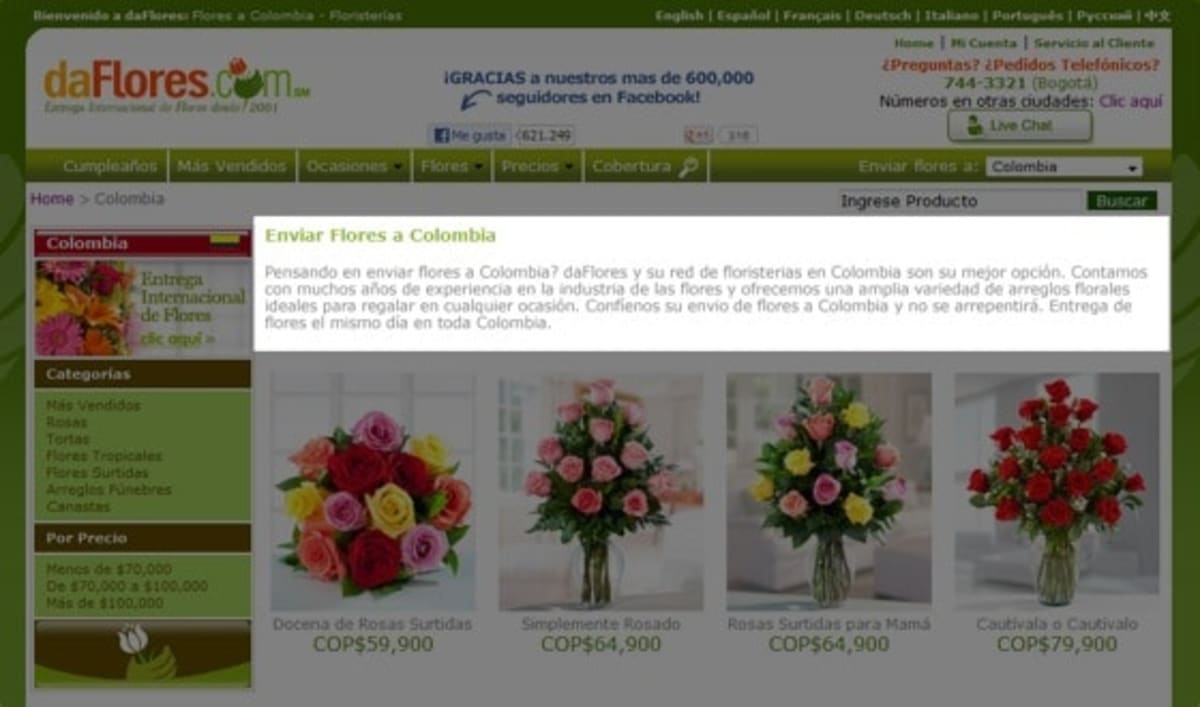
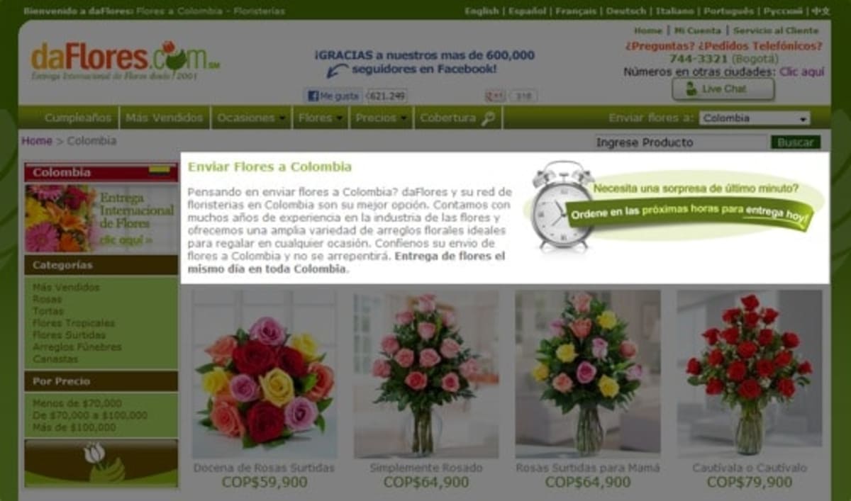
As always, we split-tested the original page (the control) against our design (the challenger), to verify that our recommendation had significantly grown the business.
Result: The test revealed that the clock and message gave a 27% uplift in orders.
To discover more about split-testing software, see our comparison table. Throughout this project, we used the split-testing tool Visual Website Optimizer.
2. A simple proof element: How Facebook helped to add credibility and trust
Some new visitors voiced concern that they had never heard of daFlores before. We needed to find a concise way of showing how popular daFlores is, and how happy its customers are. Our research revealed an impressive fact: No other flower delivery service had more Facebook “Likes” than daFlores. Split-testing revealed that mentioning this in the header—as shown in the image below—increased the conversion rate by a further 44%.
It’s possible that a Facebook logo could boost the credibility of your business even if you don’t have the most Facebook “Likes,” as long as the number is not unimpressive.
Don’t prescribe medication until you’ve diagnosed the symptoms
No competent doctor would prescribe medication without diagnosing the patient’s symptoms first. But the world of web design is still rife with people telling you to add supposedly miraculous page elements to your site, in ignorance of what your visitors actually want.
Yes, adding a clock and a Facebook graphic may work on your business, as it did for daFlores, but it’s important to understand why. For daFlores, they worked because they concisely overcame specific objections in visitors’ minds—objections that our research had uncovered.
A countdown timer may work on your site—but only if your website’s visitors would be persuaded by urgency.
Likewise, a Facebook graphic may work for you—if your visitors are concerned about your credibility.
If you want to get true breakthrough results, though, a comprehensive understanding of persuasion elements is not enough. You need to adopt a diagnosis-and-prescription approach.
And that’s the real secret to growing the conversion rate of ecommerce businesses.

A big thanks to the daFlores team
It is an absolute pleasure to be part of the daFlores team. We’d like to thank them for having confidence in Conversion Rate Experts, for trusting in our CRE Methodology, and for being so enthusiastic and relentlessly action-oriented.
A few words from the CEO and founder of daFlores, Francisco Bustos
Would you like to see more case studies like this?
If you would like to see more of our clients’ results, you can find a long list at our “Clients and Results” page.
How much did you like this article?
What’s your goal today?
1. Hire us to grow your company
We’ve generated hundreds of millions for our clients, using our unique CRE Methodology™. To discover how we can help grow your business:
- Read our case studies, client success stories, and video testimonials.
- Learn about us, and our unique values, beliefs and quirks.
- Visit our “Services” page to see the process by which we assess whether we’re a good fit for each other.
- Schedule your FREE website strategy session with one of our renowned experts.
Schedule your FREE strategy session
2. Learn how to do conversion
Download a free copy of our Amazon #1 best-selling book, Making Websites Win, recommended by Google, Facebook, Microsoft, Moz, Econsultancy, and many more industry leaders. You’ll also be subscribed to our email newsletter and notified whenever we publish new articles or have something interesting to share.
Browse hundreds of articles, containing an amazing number of useful tools and techniques. Many readers tell us they have doubled their sales by following the advice in these articles.
Download a free copy of our best-selling book
3. Join our team
If you want to join our team—or discover why our team members love working with us—then see our “Careers” page.
4. Contact us
We help businesses worldwide, so get in touch!
© 2026 Conversion Rate Experts Limited. All rights reserved.
A Brandwidth Group Company.