Conversion for mobile: how we helped grow a FinTech company by 470%
(By the way, to get articles like this free in your inbox, subscribe to our newsletter.)
The following is from our huge library of client successes—why not discover how we can help grow your business?
—Why you shouldn’t assume that your mobile visitors are just desktop visitors on a different device
—Includes before-and-after images of winning mobile A/B tests
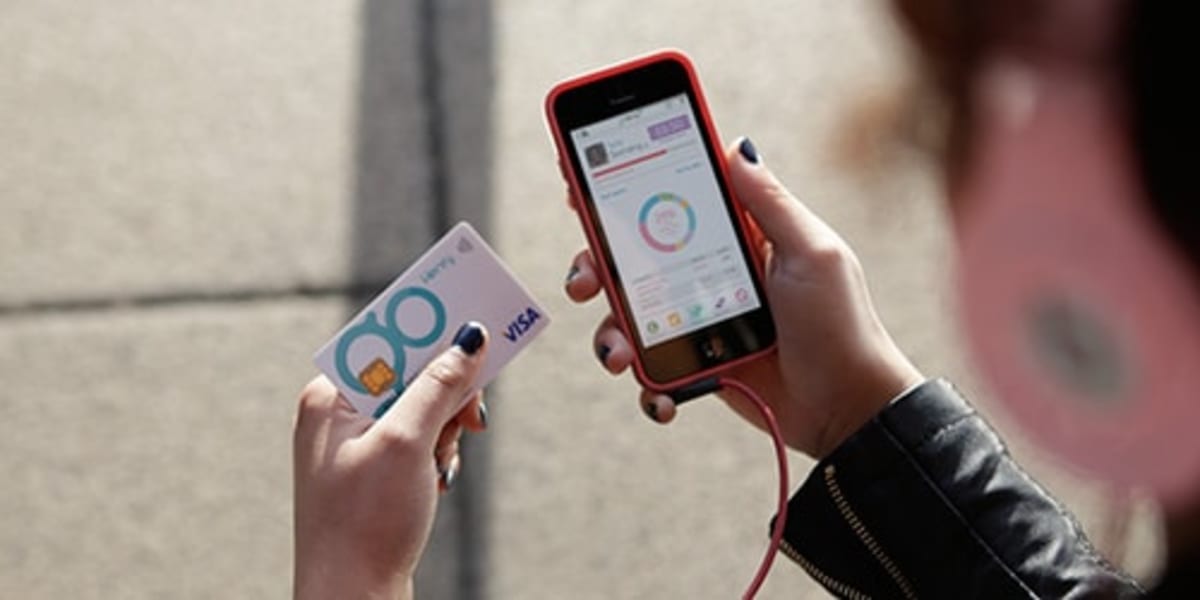
GoHenry is a financial-technology (FinTech) company that combines web and mobile apps to create a unique learning tool for children. It ranked in the FinTech 100, a list of the top companies in FinTech.
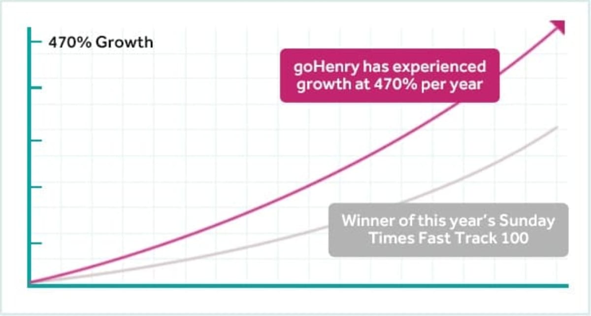
In early 2015, GoHenry hired us to increase the effectiveness of its digital marketing, and grow its market share. So far, we have helped to grow it by 470% (that’s nearly six times).
This article describes some of the things we’ve done.
Note that “we” refers to a team effort between Conversion Rate Experts (with our expertise and proven system) and GoHenry (with its highly effective team).
“They balanced strategy and execution with aplomb”—Dean Brauer, Founding Director of GoHenry.
Identifying the biggest opportunity, and adopting a mobile-led approach to optimization
GoHenry brought us in because it recognized that there was an opportunity to adopt a faster-moving, more experimental culture.
When we start working with new clients, we look for the big opportunities, the changes we can put in place quickly that will have a lasting—and scalable—effect on the business.
We used the following techniques to help identify the opportunities for GoHenry:
- We studied its analytics data to understand existing traffic sources—which channels were converting best, and where were the big opportunities for growth.
- We had a session with the GoHenry team to discuss its current approach to making changes on the website.
- We used a Business Model Canvas to document the parts of the business, and to identify the “winning business model” for GoHenry.
- We took time to understand the regulatory regime in which GoHenry operates (which can be particularly onerous for FinTech companies).
Two of the conclusions from the research were especially interesting:
- The winning business model for GoHenry required it to grow incredibly quickly—a strategy that we’ve applied successfully with many of our clients. Businesses like this tend to be “winner takes all.” GoHenry had the first-mover advantage, which can be formidable provided the pace is kept up. So GoHenry would need an approach to optimization that was lean and structured.
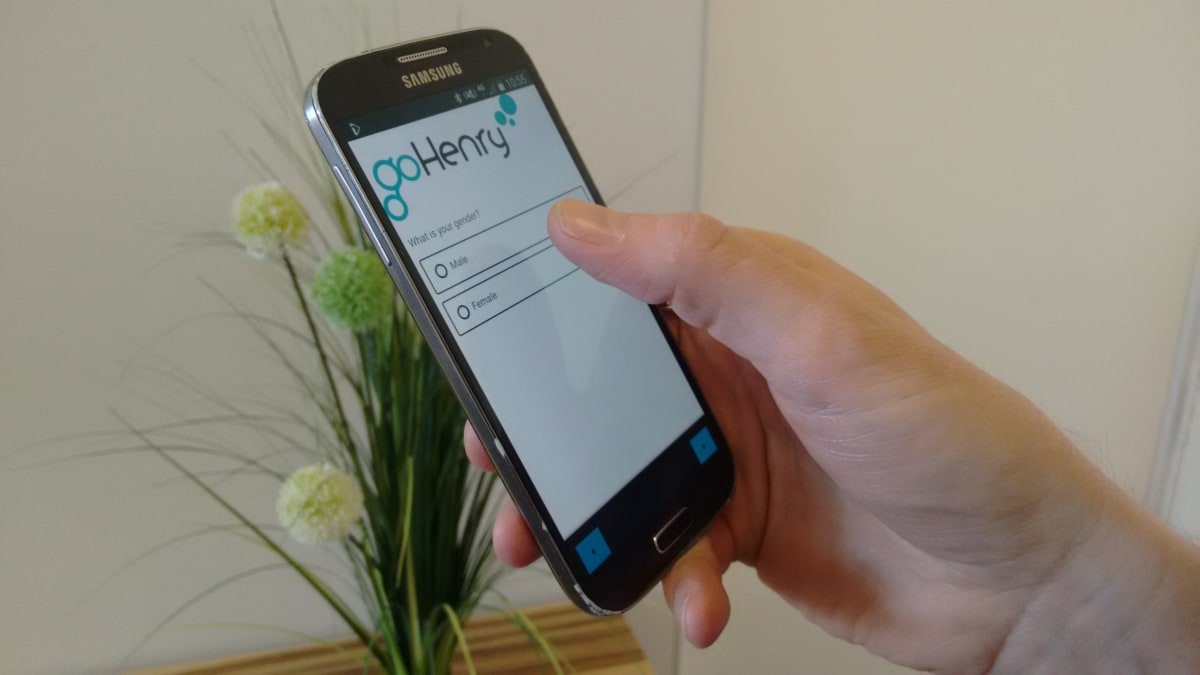
- The success of GoHenry depended on mobile users, so we’d need to build the workflow around mobile from the get-go.
Stepping into the visitors’ shoes—and why you should focus on mobile in isolation
We’ve grown a lot of companies—many of them in financial services. Each time, before we make any changes on the website, we listen to what the visitors are telling us.
It’s no different when we’re optimizing for mobile.
No different, that is, apart from one crucial detail: When optimizing for mobile, listen to what the mobile visitors are telling you.
Sounds obvious, but it’s often overlooked—even by companies with sophisticated mobile websites.
Don’t assume that your mobile visitors are just desktop visitors on a different device. If you do, you’ll focus on the user interface as the only difference between the two.
In fact—as we discovered when we gathered data on GoHenry’s visitors—mobile users can have very different intentions, likes and objections to their desktop counterparts. You’ll need to address these specifically on your mobile journey.
Some things we learned about GoHenry’s mobile visitors (and how they’re different from desktop visitors)
The difference between mobile users and desktop users isn’t just about screen size. Mobile users are more likely to have arrived from a social network, so they were different in the following respects:
- Mobile users were more impulsive. Many landed on the site on a whim—so knew much less about what was being offered. Bad news when you’re selling a new and innovative product, like GoHenry.
- They were 50% less likely to have their children with them when they signed up. Remember, GoHenry is a product for children, so this affected the mechanics of the new funnel as well as the messaging we used.
- They were 40% more likely to have concerns about trust and security (which are tough objections for a FinTech to overcome).
Knee-deep in insights about GoHenry’s mobile visitors, we set about designing a new mobile conversion funnel.
Here’s what happened.
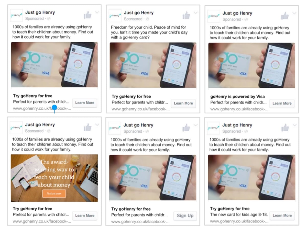
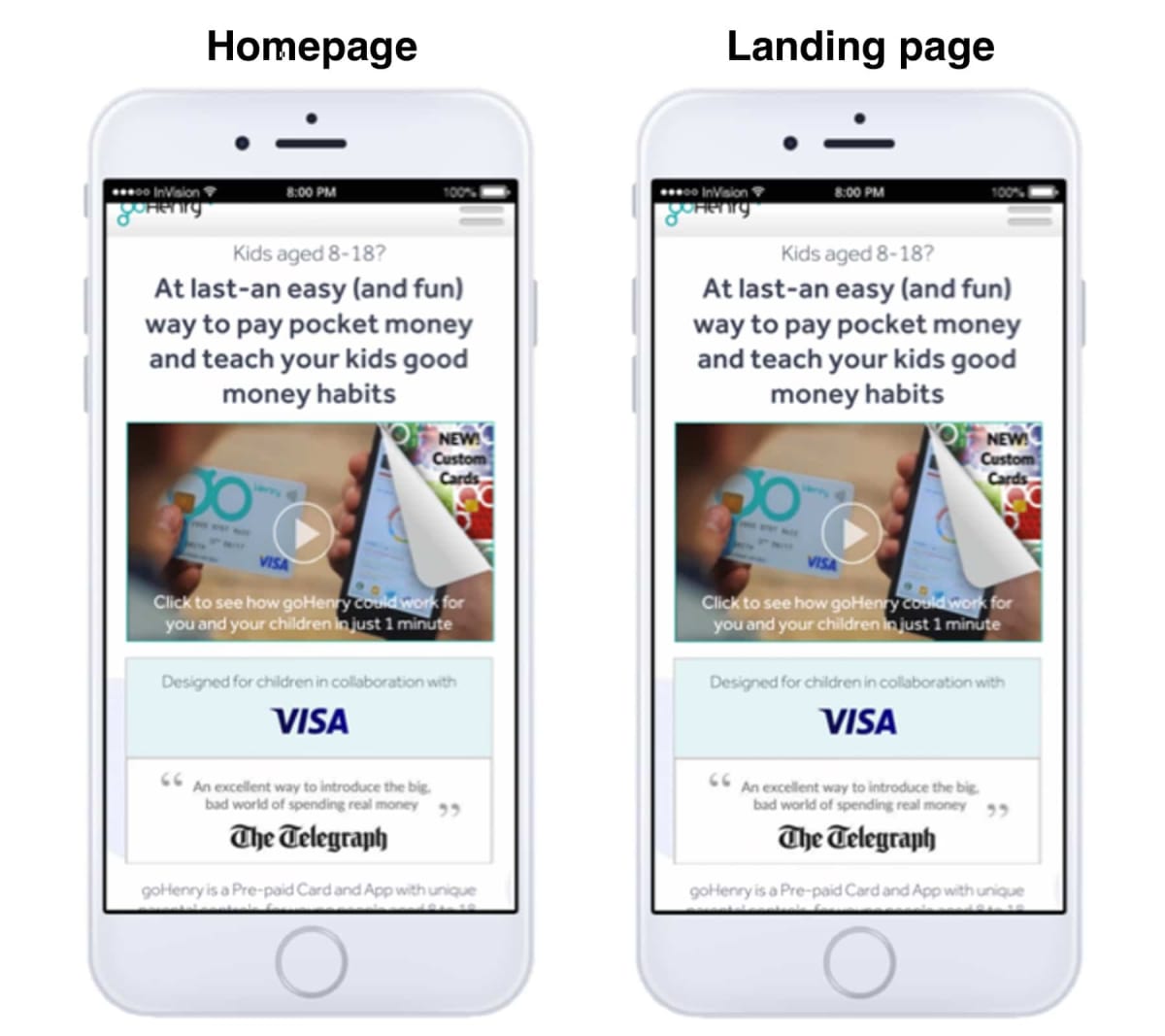
A new mobile landing page increased sign-ups by 78%
Using our insights on mobile visitors—and our workflow for developing high-converting pages for them—we created a new landing page for GoHenry.
It won an A/B-test convincingly, increasing sign-ups by 78% over the original. Here it is:
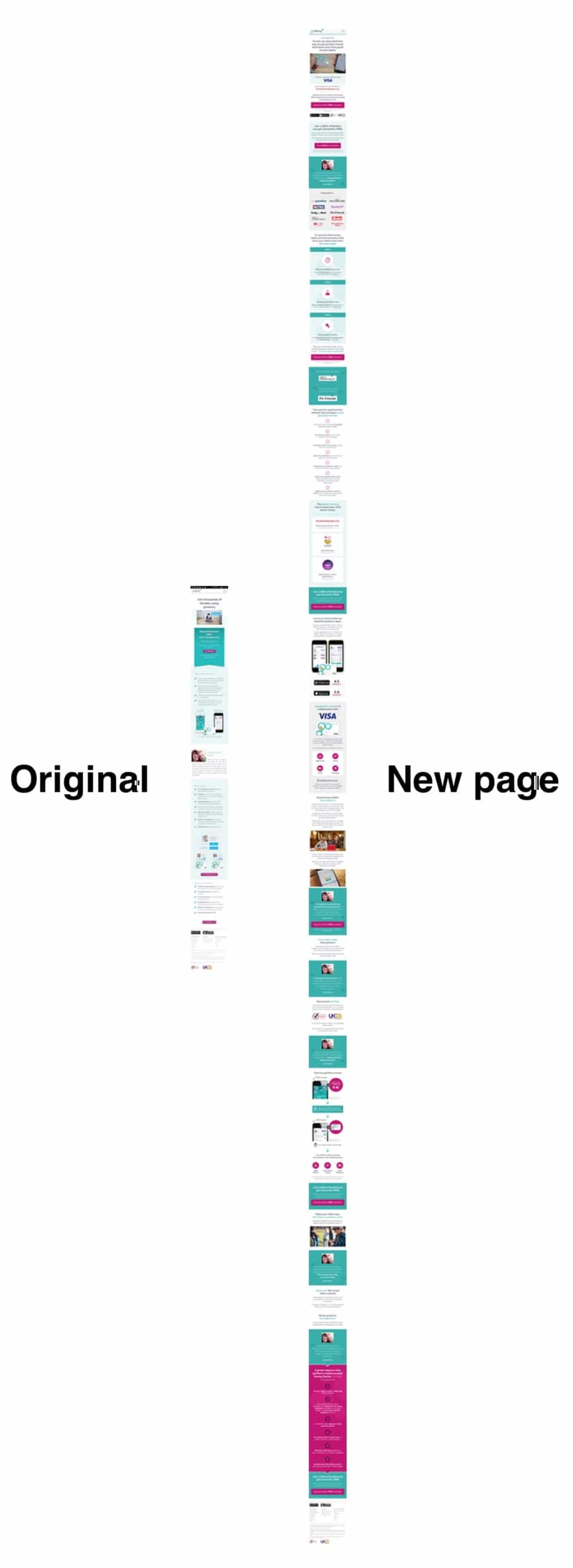
There are loads of reasons why our new page beat the original. Here are just some of the proven techniques we used:
Reasons it won #1: We had a long story to tell, so we created a long page
Our mobile visitors were intrigued but had many strong objections—as you would expect when selling a new financial product for children.
A long page allows us to address systematically all of the key objections, starting with the strongest.
Then, as each objection was addressed, we gave the prospect an opportunity to proceed through the funnel by sprinkling the “call to action” throughout the page. This effectively made the page as short as possible—but as long as necessary. This was particularly important on mobile.
There’s no such thing as a too-long page—only a too-boring one. So we had to ensure that the page was engaging from top to bottom.
Reasons it won #2: We used visual ways to present the information
Our research revealed that mobile visitors landed on the website with only a vague idea of what was being offered. Coupled with their strong objections, we were dealing with seriously volatile visitors, liable to self-destruct (leave the website) at any time.
We had to find ways to get our message across quickly.
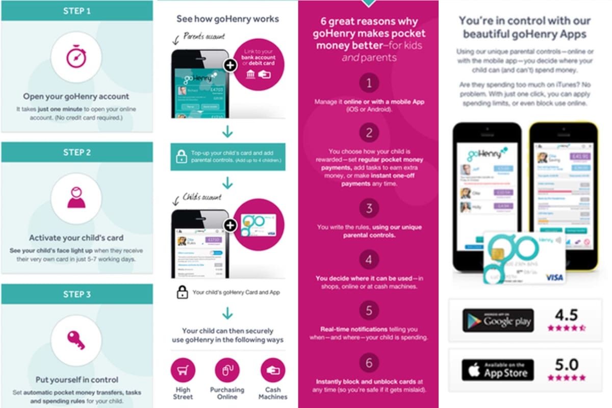
Notice that the above techniques use visual methods for presenting complex information. Done right, this can be especially effective on mobile, where attention spans are as small as the screens.
Reasons it won #3: We built trust and credibility—fast
Selling a new financial product and selling a new product for children are two of the toughest gigs in town. Buyers understandably have issues with trust and credibility.
Combining the two—selling a new financial product for children—is particularly difficult.
This became obvious when we looked at our research data.
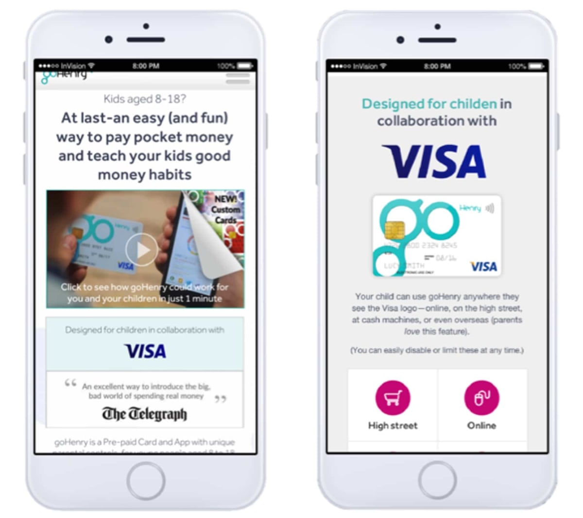
We needed something that would wipe out trust issues fast.
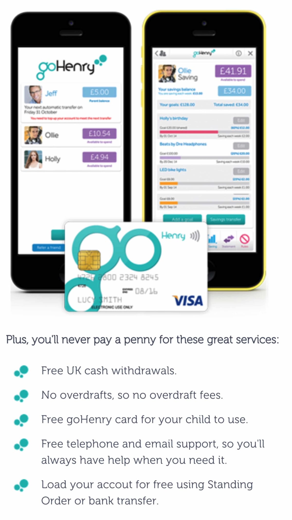
The answer lay in the fact that GoHenry is backed by Visa, one of the world’s most well-known and trusted financial institutions.
By positioning Visa much more prominently as part of the proposition—even to the extent that the GoHenry brand was marginalized—we leveraged the trust inherent in Visa and made it our own.
Do you have similar examples of “hidden wealth” in your business? Most of our clients have elements that could be highly persuasive to prospects, but that the prospects rarely see. Used correctly, such persuasion assets can be amazingly effective. It’s worth thoroughly searching your own business. Often, a fresh pair of eyes will spot something you’ve overlooked.
191% increase from optimizing mobile Facebook ads
When you’ve gathered loads of insights on your visitors, it’s crazy to focus only on the website. Every interaction a prospect, visitor or customer has with your business is an opportunity for optimization. Constantly look for other areas to apply your learnings. We use our research across all areas of the business, including offline.
Facebook was GoHenry’s primary source of acquisition, so it was an obvious candidate for us to work on. We optimized GoHenry’s Facebook ad campaign, applying multivariate-testing to its ad creatives. By sending the ads to our winning landing pages, we increased the number of sign-ups by 191% (that’s nearly three times).
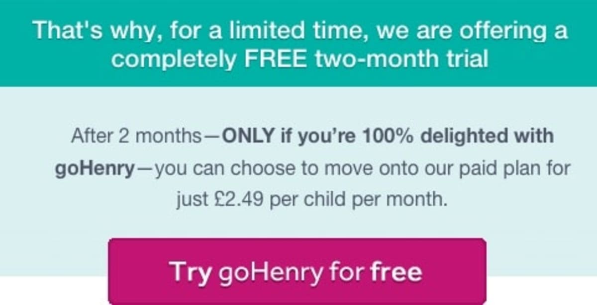
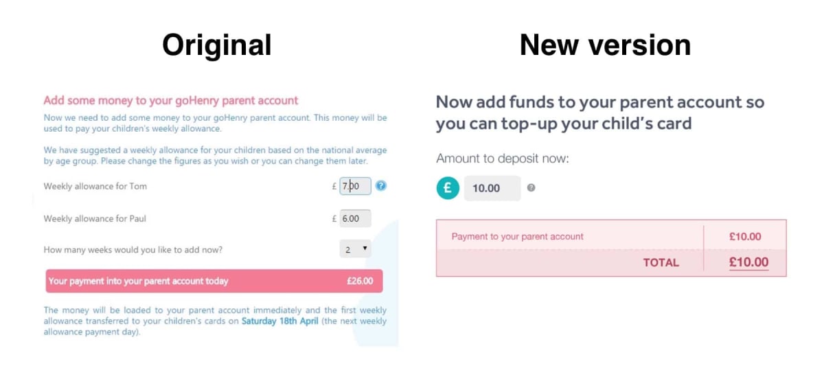
36% increase in sign-ups from optimizing the pricing page
We knew that price was a major pain point for prospects, so we turned our attention to the pricing page. Also, prospects had objections about being locked in, and how to cancel the subscription.
We designed a new page to address these issues. It increased sign-ups by 36% over the original:
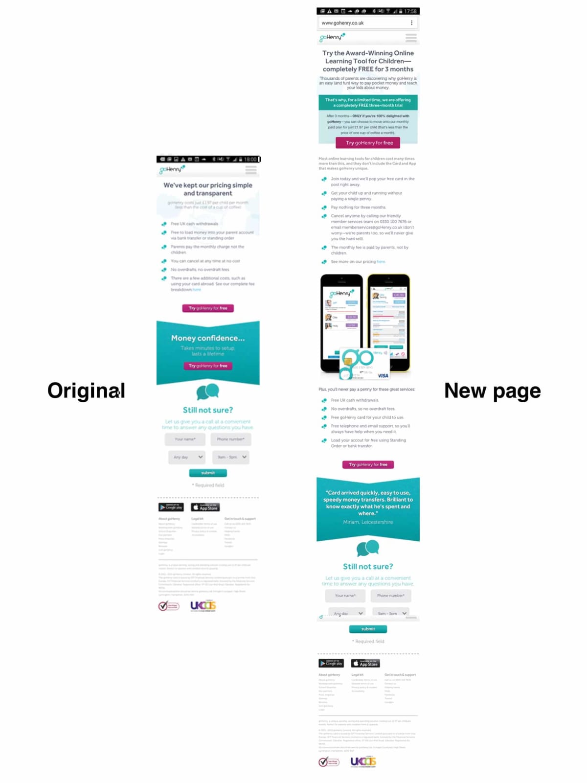
Here are some of the ways we addressed the pricing and trust objections:

23% increase in sign-ups from homepage optimization
We’ve already described how our new landing page beat the original by 78%.
Next, we tested it against the current homepage. It won again, by 23%.
It won because our research told us that half of the visitors to the homepage were originally from the same source as those on the landing page—they were just returning for a second look. So it followed that they would have the same objections, and be persuaded by the same appeals.
How did we know this? We asked them.
Do you know where your customers come from? If you don’t, ask them the following question: “Where did you first hear about us?”
You might be surprised at the answer.
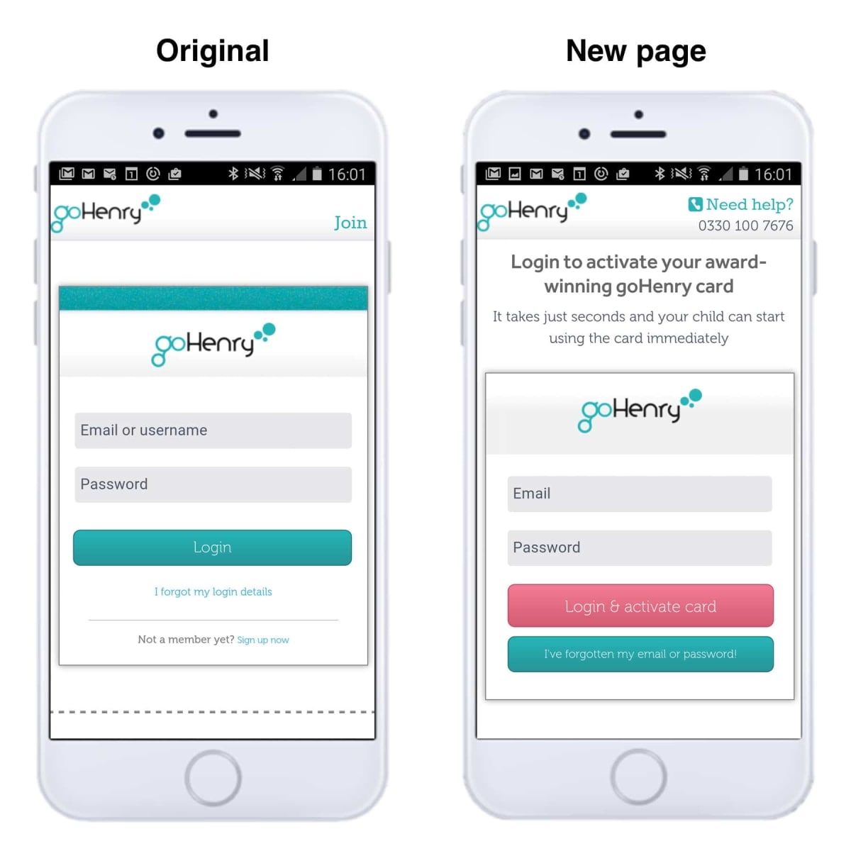
8% uplift in card activations from optimizing the post-sale pages
Having made a huge impact increasing sign-ups, we turned our attention to the activation funnel. When a child’s card arrives in the mail, the parent must first activate it before it can be used. This stage is crucial for GoHenry; each unactivated card is wasted money.
Before we began optimizing the card-activation stage, we carried out dedicated usability studies. The studies revealed two main issues:
- The activation process began with the standard member log-in screen. Many parents didn’t consider themselves members at this point, so weren’t sure they were in the right place.
- There were a several “cognitive barriers” on the journey, things that made members stop and think, diverting attention from the task at hand.
When we designed a new funnel to address these issues, card activations increased by 8%.
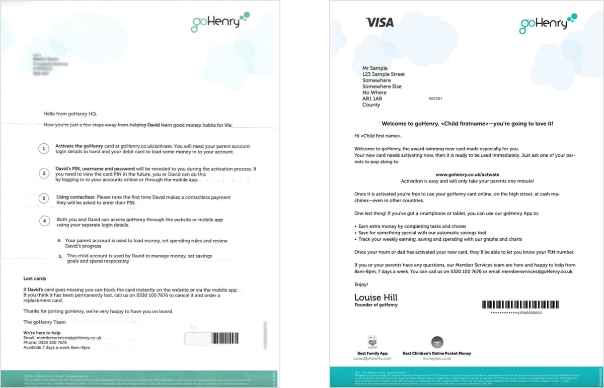
11% uplift in card activations from optimizing the offline journey
Don’t just limit optimization to your website. If part of your journey happens offline, optimize that too.
That’s exactly what we did with GoHenry’s card activation journey.
Our research told us that half of the children knew about the card before it arrived in the mail. Now, if you’ve got kids you’ll know how persuasive they can be, so it came as no surprise that parents were more likely to activate when their child knew about the card.
It followed that if we could make more kids aware of the card, more cards would be activated.
So we sent the welcome letter to the kids instead. After all, the purpose of GoHenry is to teach children financial responsibility.
The result? Card activations increased by 11%.
Some great tools we use on mobile projects
We use many tools for optimizing mobile websites and apps. Here are just a few of them:
- We use Qualaroo or Hotjar to add mobile-specific pop-up surveys to key pages.
- Each interaction between finger and screen expresses an intent—and you need to understand what it is. Tools like Hotjar, Crazy Egg and Clicktale will help you do just that.
- For maximum insights, use mobile screen recording software to capture usability tests (or simply record the test on another device). Tools like Lookback allow you to build an army of usability testers—or test recruiters—and have the videos land right in your inbox. It will even film the subject’s face during the test.
- If you can’t get friends or colleagues to help, use sites like UserTesting.com to do remote usability testing on mobile. (Tip: we love UserTesting.com’s webcam-based tests for mobile, so look out for this option.)
- Use tools like Verify to conduct quick straw polls.
- Make sure you can quickly view your wireframes on mobile. We use InVision to rapidly add functionality to our mobile wireframes. Then, we combine the wireframes with screenshots to create a semi-working version of the entire funnel. Finally, we use a service like UserTesting.com to test the prototype funnel.
- We use A/B-testing software like Optimizely to measure which page generates the most conversions. Optimizely’s advanced custom audience features came into their own on this project. Tests that would have been prohibitively complex to run were suddenly within reach.
“With developers at a premium, we made maximum use of Optimizely’s Visual Editor. It’s flexible and powerful, so the marketing team could set up tests that would otherwise have joined the queue for development.”— Jenny Thwaites, Head of Marketing for GoHenry.
A tip for succeeding in highly regulated industries
If you’re working in financial services—or any tightly regulated vertical—you’ll need to work closely with risk and compliance teams. This can be a major bottleneck in getting your ideas approved. Where possible, submit your ideas in “bite-sized” chunks, each with a mini business case. Complexity in these submissions can otherwise be crippling. Such “micro-approvals” are less onerous and much more likely to succeed.
What’s next?
We are now working on the GoHenry app itself, aiming to drive engagement and referrals.
On the website, we’re working on the sign-up funnel, as well as other key parts of the journey such as forgotten password and referrals.
Once complete, we will have rebuilt the entire site.
What’s unusual about this rebuild is that it has been done iteratively, and with conversion at the heart of every decision. Conversion, by definition, is the reason that any website exists.
Every new page has been
- driven by visitors
- measured to make sure it outperforms what went before it.
Nine out of every ten redesign projects we see go wrong. Performance and conversion often nosedive, and expensive—and time-consuming—remedial action is necessary. (We know this because this is why many clients pick up the phone and call us.)
By adopting the iterative approach we have outlined above, we eliminate the risk. Plus, every new page is ROI-positive from the moment it is pushed live.
What about desktop?
We have deliberately ignored desktop in this article, despite the fact that we’ve worked extensively on GoHenry’s desktop website. If you’d like to see some example of how to improve conversion on desktop, visit our case studies page or our “Clients and Results” page.
Huge thanks to the GoHenry team
We love working with the GoHenry team. The members are dynamic, energetic and action-oriented. They get a lot done.
If you have kids aged 8–18—or know someone who does—check out GoHenry.
A few words from Dean (Founding Director at GoHenry)
How much did you like this article?
What’s your goal today?
1. Hire us to grow your company
We’ve generated hundreds of millions for our clients, using our unique CRE Methodology™. To discover how we can help grow your business:
- Read our case studies, client success stories, and video testimonials.
- Learn about us, and our unique values, beliefs and quirks.
- Visit our “Services” page to see the process by which we assess whether we’re a good fit for each other.
- Schedule your FREE website strategy session with one of our renowned experts.
Schedule your FREE strategy session
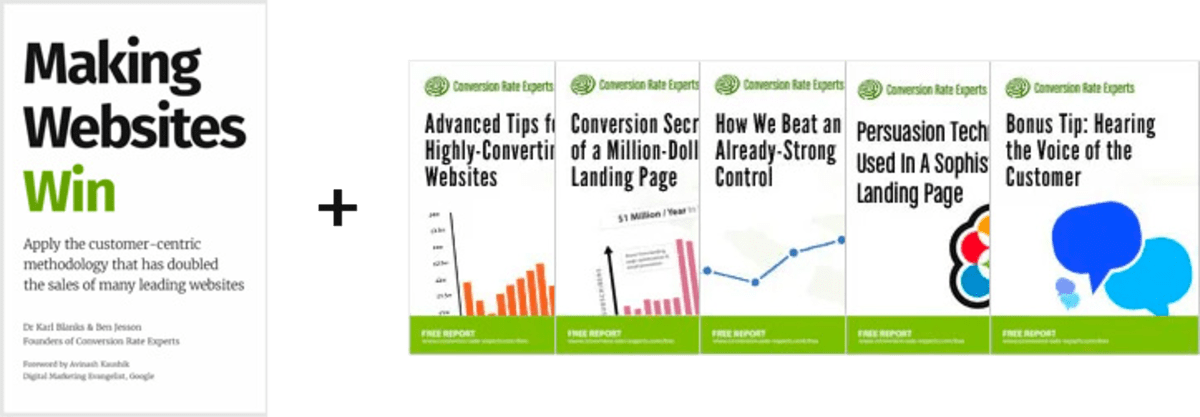
2. Learn how to do conversion
Download a free copy of our Amazon #1 best-selling book, Making Websites Win, recommended by Google, Facebook, Microsoft, Moz, Econsultancy, and many more industry leaders. You’ll also be subscribed to our email newsletter and notified whenever we publish new articles or have something interesting to share.
Browse hundreds of articles, containing an amazing number of useful tools and techniques. Many readers tell us they have doubled their sales by following the advice in these articles.
Download a free copy of our best-selling book
3. Join our team
If you want to join our team—or discover why our team members love working with us—then see our “Careers” page.
4. Contact us
We help businesses worldwide, so get in touch!
© 2026 Conversion Rate Experts Limited. All rights reserved.
A Brandwidth Group Company.