Win Report: How reframing a choice boosted paid subscriptions by 19%
(By the way, to get articles like this free in your inbox, subscribe to our newsletter.)
Win Reports help you grow your business by showing our methodology at work. Each Win Report showcases a real-world test, sharing the research, insights, and techniques that led to the win.

Research: Watching the user experience
During our usability research for Mobbin, we discovered an interaction that users understandably found jarring. It occurred when non-paying users selected content that was part of the paid plan, and triggered a modal.

Users who chose the Pro (paid) plan were moved to the pricing page, but those who opted to “Start for free” were simply dropped back into the website as the modal disappeared.
Having worked with similar modals in past engagements, we saw this as an opportunity to improve the user experience and increase the conversion rate.
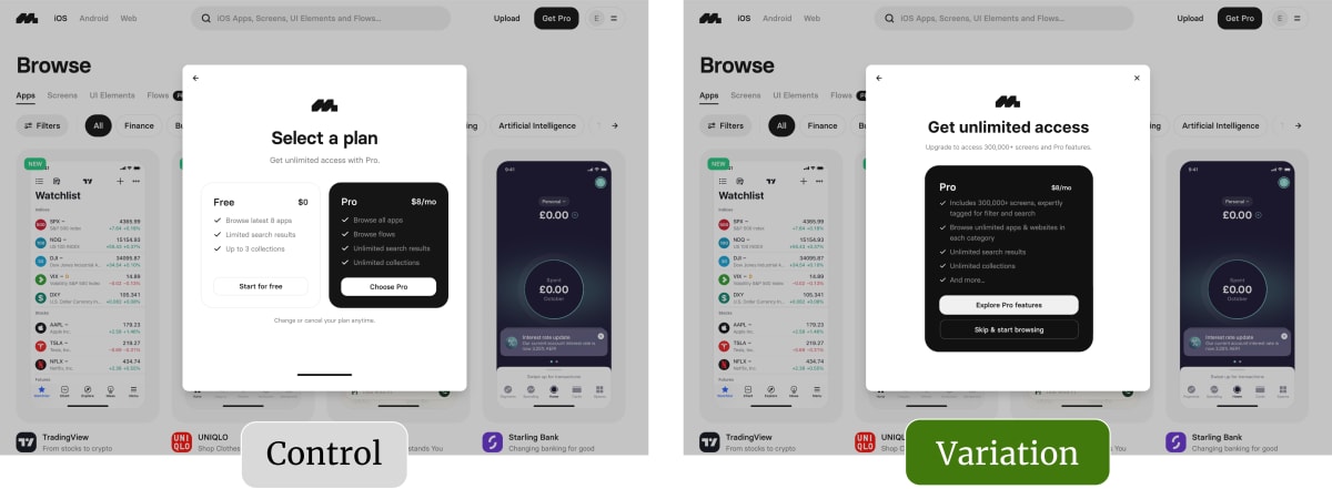
The original page (or control)
Here’s a closer view of the modal.

Each option takes up a similar area, but the Pro box highlighted four benefits of the paid plan:
- Browse all apps
- Browse flows
- Unlimited search results
- Unlimited collections
For many users, this sign-up process is the first interaction with the Pro plan, so we wanted to make the most of the opportunity. Rather than assume users won’t sign up for Pro, what happens if we reframe things and assume that they will?
The tested page (or variation)
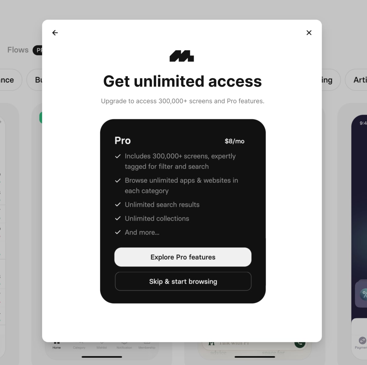
We removed the “Free” option and focused on the Pro plan. Here’s the variation we tested:

We reframed the sign-up choice as a decision between going Pro or skipping. The secondary CTA, “Skip & start browsing,” made sense of the modal disappearing and improved the user experience.
Removing the “Free” panel also gave us more space to promote the Pro plan. We did this by:
- Adding a benefit-driven headline: “Get unlimited access.”
- Quantifying what access meant: “300,000+ screens and pro features.”
- More details on pro features: Calling out tags, filters, and searches.
- Lower commitment CTA: From “Choose Pro” to “Explore Pro features.”
The “Explore Pro features” CTA encourages users to take the next step without mentally committing to something.
Result: Conversions increased by 19%
During the test, we observed a 29% increase in visits to the Pricing page (where users sign up for Pro) and a 19% increase in paid subscriptions.
We love to collaborate closely with our clients. This test leveraged Mobbin’s huge expertise in user interface design to create something that both looked good and delivered great results.
What next?
As usual, we added the test to our proprietary Wins Database, then looked for ways to apply its lessons to other parts of Mobbin’s business and then to other clients. In this case, we were able to leverage the learnings from the win into new tests and interactions.
If you want us to grow your profits—quickly and efficiently—check if you qualify for a free one-on-one strategy session with one of our CRO consultants.
We’ll only work with you if we believe we can get amazing results together. Our success has come entirely from positive word of mouth, and we plan to keep it that way.
Thanks to Mobbin for letting us share these insights (and their awesome interface design).
How much did you like this article?
What’s your goal today?
1. Hire us to grow your company
We’ve generated hundreds of millions for our clients, using our unique CRE Methodology™. To discover how we can help grow your business:
- Read our case studies, client success stories, and video testimonials.
- Learn about us, and our unique values, beliefs and quirks.
- Visit our “Services” page to see the process by which we assess whether we’re a good fit for each other.
- Schedule your FREE website strategy session with one of our renowned experts.
Schedule your FREE strategy session
2. Learn how to do conversion
Download a free copy of our Amazon #1 best-selling book, Making Websites Win, recommended by Google, Facebook, Microsoft, Moz, Econsultancy, and many more industry leaders. You’ll also be subscribed to our email newsletter and notified whenever we publish new articles or have something interesting to share.
Browse hundreds of articles, containing an amazing number of useful tools and techniques. Many readers tell us they have doubled their sales by following the advice in these articles.
Download a free copy of our best-selling book
3. Join our team
If you want to join our team—or discover why our team members love working with us—then see our “Careers” page.
4. Contact us
We help businesses worldwide, so get in touch!
© 2026 Conversion Rate Experts Limited. All rights reserved.
A Brandwidth Group Company.


