Win Report: How simplifying a homepage boosted sign-ups by 9%
(By the way, to get articles like this free in your inbox, subscribe to our newsletter.)
Win Reports help you grow your business by showing our methodology at work. Each Win Report showcases a real-world test, sharing the research, insights, and techniques that led to the win.
Trusted by Airbnb, Pinterest, and Headspace, Mobbin enables subscribers to take inspiration from over 300,000 real screens and 24,000 real navigation flows.
Research: An unusual insight
Mobbin scored highly during user testing and did well in our Competitor Analysis. However, participants in both studies rated the “Learn More” page as more useful than the homepage. In addition to detailing Mobbin’s features, the “Learn More” page included two benefits that were particularly persuasive:
- Mobbin was “The world’s largest mobile and web design library.”
- Mobbin’s free account was not a time-limited free trial, but free forever.
In contrast, the homepage featured a 4-slide carousel that highlighted the breadth of the service but appeared to get little engagement from users. Here’s a heatmap showing one of the carousel headlines.
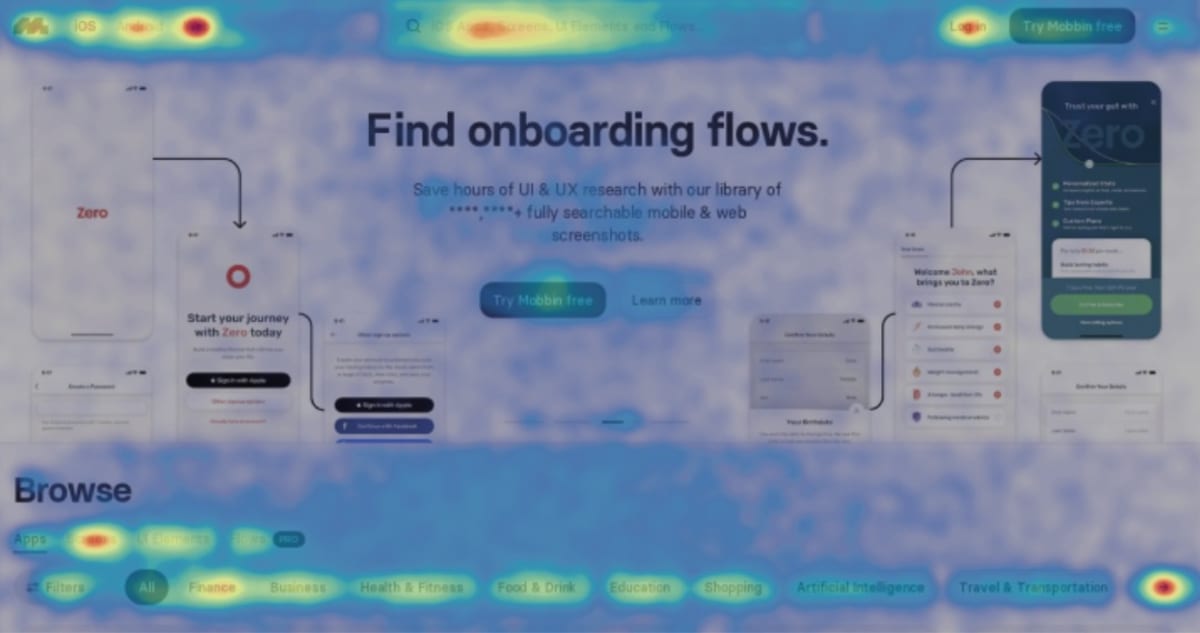
How could we make better use of the homepage and increase the page’s conversion rate?
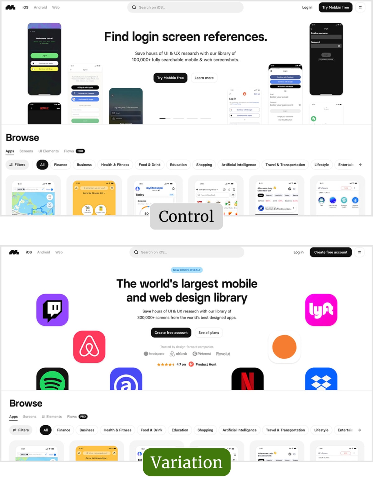
The original page (or control)
Here’s a short video showing the original homepage’s carousel. Notice how the user is trying (and failing) to stop the animation by clicking the grey lines.
Although the carousel’s body copy addressed Mobbin’s USP, the headlines targeted specific use cases (and were, therefore, less broadly relevant).
We hypothesized that removing the carousel and changing content to appeal more broadly, would improve conversion.
The tested page (or variation)
The new page featured some significant changes, starting with the removal of the carousel.
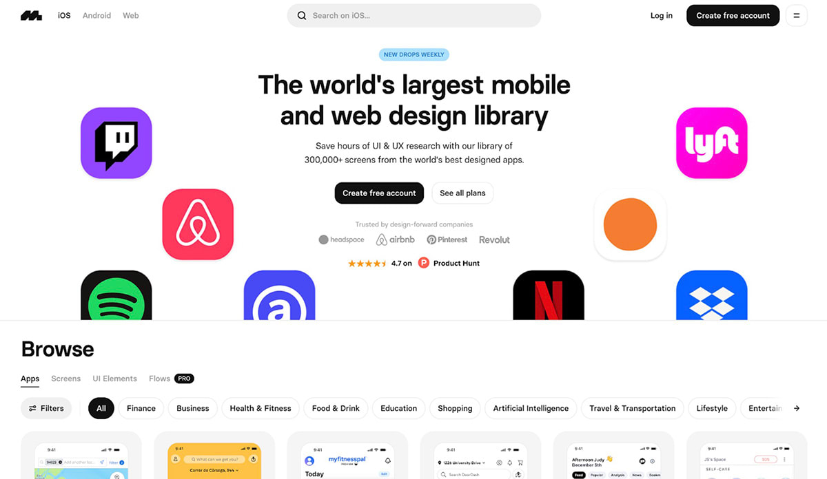
Other changes included:
- A new headline focused on the key persuasion point uncovered in the research: “The world’s largest mobile and web design library.”
- New drops weekly: A lozenge that highlighted recency and ever-increasing value.
- App icons: Showcasing Mobbin’s best-known assets (borrowed from the carousel.)
- Clearer button CTAs: Using “Create free account” removed the ambiguity of “Try Mobbin free,” (which some assumed was just a free trial.)
- Making the website a powerhouse of credibility and proof by adding, “Trusted by design-forward companies” and 4.7-star rating from Product Hunt.
Several of these changes were prompted by content that testers had found persuasive on the “Learn more” page—including the focus on the world’s largest library and the clarity about the free-forever account.
The copy beneath the headline remained the same, other than an update of Mobbin’s asset total (to 300,000+).
Result: Sign-ups increased by 9%
During the test, we observed that free subscriptions to Mobbin increased by 9%. In the same period, paid subscriptions rose by 55%.
For more information about Making the website a powerhouse of credibility and proof, see page 216 of our book, Making Websites Win, or read our Ultimate guide to proof.
What next?
As usual, we added the test to our proprietary Wins Database, then looked for ways to apply its lessons to other parts of Mobbin’s business and then to other clients.
If you want us to grow your profits—quickly and efficiently—check if you qualify for a free one-on-one strategy session with one of our CRO consultants.
We’ll only work with you if we believe we can get amazing results together. Our success has come entirely from positive word of mouth, and we plan to keep it that way.
Thanks to Mobbin for letting us share these insights (and lending their huge expertise to the interface design).
How much did you like this article?
What’s your goal today?
1. Hire us to grow your company
We’ve generated hundreds of millions for our clients, using our unique CRE Methodology™. To discover how we can help grow your business:
- Read our case studies, client success stories, and video testimonials.
- Learn about us, and our unique values, beliefs and quirks.
- Visit our “Services” page to see the process by which we assess whether we’re a good fit for each other.
- Schedule your FREE website strategy session with one of our renowned experts.
Schedule your FREE strategy session
2. Learn how to do conversion
Download a free copy of our Amazon #1 best-selling book, Making Websites Win, recommended by Google, Facebook, Microsoft, Moz, Econsultancy, and many more industry leaders. You’ll also be subscribed to our email newsletter and notified whenever we publish new articles or have something interesting to share.
Browse hundreds of articles, containing an amazing number of useful tools and techniques. Many readers tell us they have doubled their sales by following the advice in these articles.
Download a free copy of our best-selling book
3. Join our team
If you want to join our team—or discover why our team members love working with us—then see our “Careers” page.
4. Contact us
We help businesses worldwide, so get in touch!
© 2026 Conversion Rate Experts Limited. All rights reserved.
A Brandwidth Group Company.


