How we made $1 million for Moz (formerly SEOmoz)—using landing page optimization and email marketing
The following is from our huge library of client successes—why not discover how we can help grow your business?
When we first published this case study, Moz was called SEOmoz. Even though the company has since rebranded, the techniques described below are still as relevant as ever.
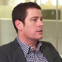
In this talk, Moz’s CEO, Rand Fishkin, raves about the work we did, explaining how the money that we generated enabled Moz to develop from a membership site into a web app.
Overview
Moz is one of the world’s largest providers of tools and resources for online marketing. The company was already highly successful, having a list of Fortune 500 clients as long as your arm. It had also conducted many split tests on its site. In fact, previous Moz split tests were the subject of 14 pages in an industry “best practices” guide for landing page optimization.
Nevertheless, in the first split test that Conversion Rate Experts conducted for Moz, we generated a 52% improvement in sales. It’s important to note that “we” refers to a team effort between Conversion Rate Experts (with our proven system) and Moz (with its solid products and a bias toward action).
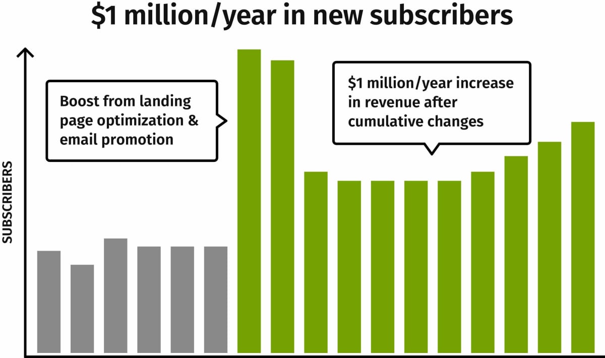
Within the first four months of work, we increased annual revenues by $1 million.
Phase I—analyzing the business and designing a more effective landing page
We’ve all heard the business principle of “listen to your customers.” In analyzing the Moz business, we took that principle much further: We listened not only to paying customers but also to free-trial customers who hadn’t yet decided to subscribe to the paid service, and to customers who had canceled their subscriptions.
After all, it takes time, effort, and money to bring visitors to a website. It’s worth the effort to determine just what is going through the heads of buyers, non-buyers, and former buyers. We knew what actions people took—now we had to discover why they took them.
Here are some of the methods we used to analyze Moz’s visitors:
- We asked paying members what they liked most about the Moz service, what ultimately convinced them to sign up, and how they would describe the service to a friend (among many other questions).
- Next, we asked non-paying (free trial) members many questions, including what would make them sign up for the service, which tools they liked the most and the least, and what their most time-consuming SEO tasks were.
- Then, we talked with paying members who had canceled, asking them the obvious question: “Why did you cancel?” We also wanted them to tell us the one thing that would bring them back.
- We learned from face-to-face selling. Rand Fishkin, the founder of Moz, could easily sell the service face to face at conferences but commented that he wished his website could be as effective. So we asked Rand to pretend we were the prospect while we recorded his approach. We then compared what was on the current website with the details Rand used to sell Moz face to face. This technique enabled us to identify what was missing from the website.
- We became the customer, which is a great way to see first-hand the good and not-so-good aspects of the actual customer experience.
- Next, we incorporated our findings into revised “wireframe” pages. A wireframe is a quick rendering of a proposed page, and it allows you to prototype quickly without bogging down programmers or designers. We then recruited people from the Moz Twitter feed to participate in usability tests of those wireframes. We wanted to know what they liked and didn’t like on a big-picture basis.
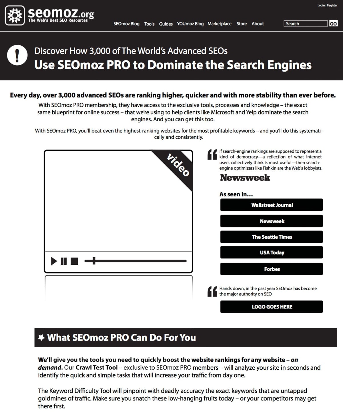
Through an iterative process of usability testing, modifying the page, and repeating, we eventually arrived at a version that we were confident would outperform the current one. We ran a split test to see how visitors would react to it. Using a statistically significant sample of more than 5,000 visitors, we achieved a 52% increase in sales of Moz’s PRO membership.

Some of the proven techniques we used on the landing page
1. We created a page long enough to tell the story.
There’s a popular myth among web marketers that “long pages don’t sell.” These people believe that it’s much better to have short pages that don’t require scrolling.
What we’ve discovered from many client consultations around the world is this: What counts is not how long your page is but rather how engaging it is.
In our analysis of Rand’s effective face-to-face presentation, we noticed that he needed at least five minutes to make the case for Moz’s paid product. Yet the existing page was more like a one-minute summary. Once we added the key elements of Rand’s presentation, the page became much longer:
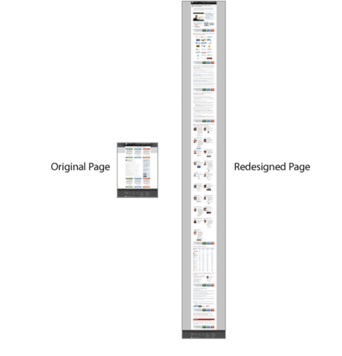
It’s interesting to note that Amazon.com, which is known for its relentless testing, tends to have extremely long product pages. Just see the page for its Kindle reader. (None of the links on this page are affiliate links, by the way.) Amazon realizes that buyers are engaged and want to know what they’re getting into. (If you want to know how far people scroll down your own pages, one good tool is ClickTale.)
2. We infused the headline with curiosity rather than overt “buy me” language.
Too many marketers rush into a sale right in the headline before they’ve generated sufficient reader interest.
The original headline wasn’t bad:
“Improve your traffic and rankings with an SEOmoz PRO Membership!”
We designed our new headline not to sell anything but to make visitors stop and pay attention. Here’s the new one:
“When eBay, Disney, and Marriott need SEO help, here’s what they do…”
This headline not only shows how some of the biggest companies on the planet rely on Moz, but it also incites curiosity by indicating that the readers will gain value just from reading the page.
3. We explained precisely what customers would get at each level.
Our analysis of customer emails and surveys made us realize that some customers weren’t aware of the impressive array of tools they’d get with a paid membership. In addition, they seemed to be confused about which tool was available at which membership level.
One handy chart solved both of those problems at a glance. Plus, visitors could hover over any element of the chart to reveal more details.
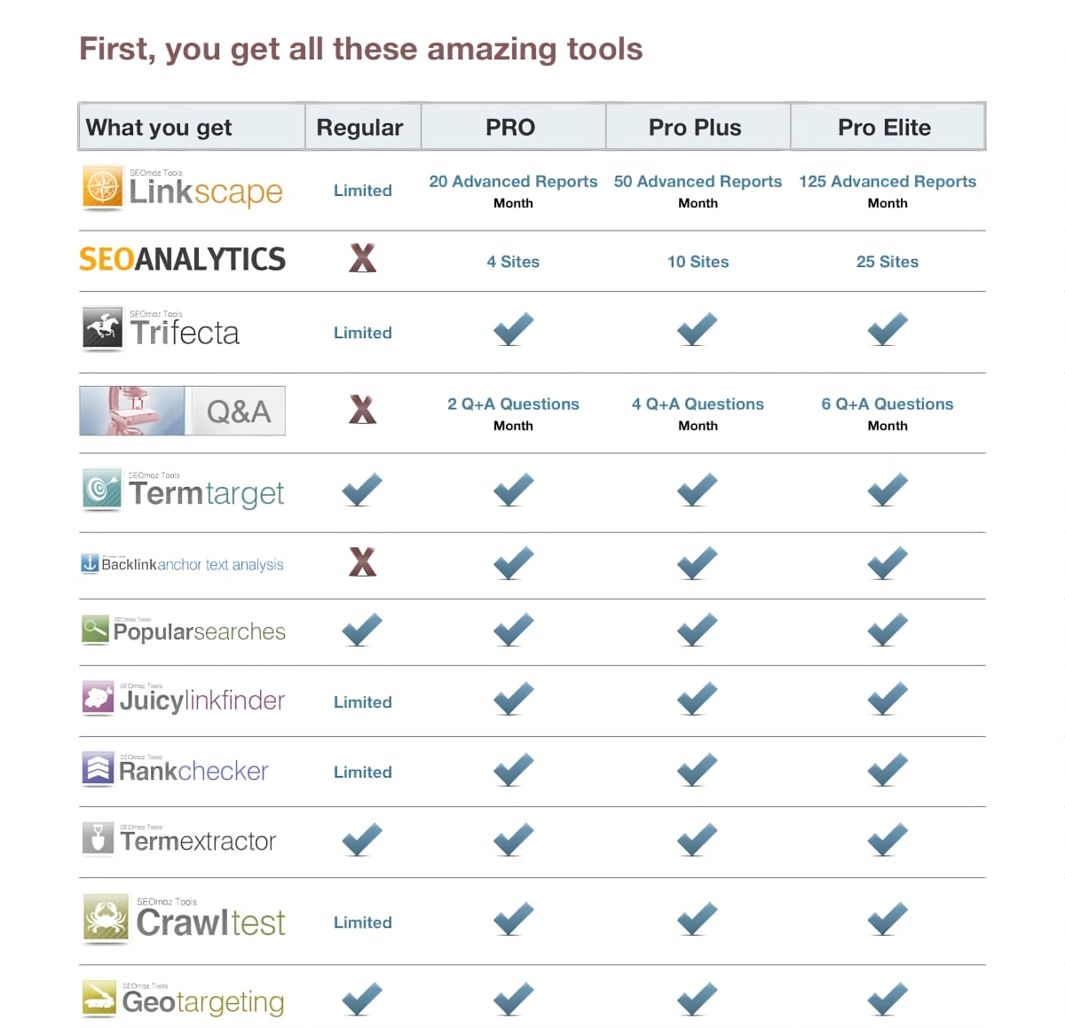
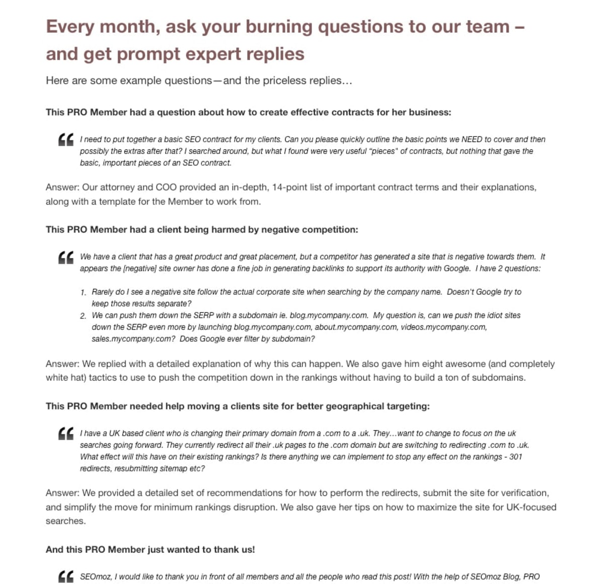
We also recognized that paid customers loved the “Q&A” feature but that the existing site did not mention it. It’s where members could ask detailed questions and get customized, personalized answers from the Moz team of experts. We made the Q&A service prominent in the new chart, and we created a separate section for it.
4. We showcased things that customers cared about but that Moz had taken for granted.
Almost every company takes some of its most impressive “persuasion assets” for granted. Moz was no exception; for example, it was so accustomed to dealing with major firms as clients that it was somewhat “ho-hum” about that fact.
We greatly increased the logo display of Moz’s well-known clients because it included so many world-famous brands.
We also added a long section of testimonials from professional SEO specialists. Sometimes comments from one’s peers—other professional SEOs in this case—can be even more influential than endorsements from brand-name clients.
5. We augmented the message with video.
Some people are most influenced by text, while others find audio or video to be more helpful.
Because we had videotaped Rand’s live presentation earlier, it was a simple matter to add highlights of his points to a short video on the page.
So that’s how we achieved the 52% improvement with the landing page. Next, we turned our attention to the offer.
Phase II—testing the offer
Our improved page did indeed tell the Moz story more completely, so it was now time to be brave with a call-to-action that could not be ignored.
1. We lowered the “risk bar,” to make it easier for customers to try the service.
We knew from customer research that visitors to the site were impressed with the tools but sometimes were just not sure if the tools would work in their own situations.
To overcome this objection, we made a special offer to Moz’s free subscribers: a 30-day full-featured membership for just $1.
2. We asked non-subscribers to tell us why they didn’t want even a $1 membership.
We could hardly lower the risk bar any further, so we really wanted to know what was on the minds of those visitors who refused even the $1 offer. And how do you read people’s minds? By asking them questions! In the first promotional email, we asked, “IF YOU DECIDE YOU DON’T WANT TO CLAIM THIS SPECIAL $1 OFFER … then please send a reply to this email with a brief explanation of why you aren’t interested.”
It turned out that about 500 of them had the same concern: Did our $1 trial contain a hidden catch that committed them to a long-term contract?
The answer was no, and this bit of feedback prompted us to send a follow-up email explaining that nothing was hidden—and that they could use the entire site for 30 days and cancel even on the last day with no commitment and no hard feelings. In other words, we identified the main objection and then flattened it. Here’s an extract of the email:
Howdy SEOmozzers,
In yesterday’s email I made a bit of a mistake…and today I received nearly 500 “feedback” emails as a result!
Here’s what I didn’t make clear: the $1 offer is absolutely no obligation. You get a whole month of SEOmoz PRO, which normally costs $79, for just $1. You don’t have to stay signed up for a whole year, you don’t even have to stay after the first month. You can sign up, pay one dollar and then leave after 29 days. It’ll just cost you a dollar, no more. So, yes, this really is the best offer we’ve ever made.
Why are we making it?
The email made it easy for the users to get started using the service (making them more likely to continue using the service beyond the trial period).
It resulted in another subscription boost.
Phases I and II succeeded in getting people comfortable with Moz and in persuading them to try out the PRO service. We had one remaining task:
Phase III—improving lifetime customer value (LCV) and retention
We of course knew that a $1 offer would boost subscriptions, but the real goal was to keep these users active beyond the trial period. A marketer’s toolbox contains many retention strategies, and we used several with Moz.
“Involvement devices” are one of the most widely applicable retention strategies. Involvement devices are mechanisms that help your customers or prospects derive value from your service quickly and easily. Here’s how we used this strategy with Moz:
We created a quick-start guide so customers could get quick wins.
We had 30 days to impress our new subscribers. The key was to get them to use the service and experience some quick wins with all the Moz tools.
We therefore stayed close to our subscribers with a series of 10 quick and easy things they could do to boost their search engine rankings within the first 30 days.
Hello [Name]!
Welcome to your first email in our “Get the Most from PRO” tutorial series!
You’ll receive weekly tips and tricks to help you get the most out of SEOmoz PRO and increase your rankings. The focus is on quick and easy advice—that’ll help you increase traffic within weeks. We’ll be covering all of the areas that are critical to search marketers—including site optimization, keyword research and linkbuilding. Your first tips and tricks are below. (If you already know PRO inside out and don’t want to get the weekly emails, you can unsubscribe here.)
Part 1: Site Optimization…
These three phases helped Moz to achieve a conversion increase of around 170% over four months and to generate more than $1 million in additional revenue.
Handy lessons
- Lots of businesses assume they know what their customers think and want, but very few businesses ever take the time to find out for sure. Put your own ideas aside and get as much customer feedback about your website and products as you can. You simply cannot overdo this activity.
- Compile a list of objections and, for each one, create a counter-objection. When visitors don’t buy, it’s for a reason—perhaps the price is too high, the product description is too vague, the site contains insufficient proof to back up the claims, or any of a hundred other objections. Take the most-common objections and methodically address each one through testimonials, case histories, examples, screenshots, and any other proof you can muster.
- Be bold in your tests but conservative in your exposure. We ran a $1 offer but did not advertise it to the world. Only existing subscribers saw it, and we carefully monitored the volume of sign-ups. You can afford to go for big, bold tests when you manage your downside.
- Use as much text as you need to fully explain your product or service and back up your claims with proof. There’s no such thing as a too-long page—only a too-boring one.
- Remember that when you sell face to face, you need to answer only one person’s objections. When you sell on the web, you must anticipate and address all the major objections, so don’t handicap yourself for the sake of some old myth about page length.
- Separate yourself from your competitors by offering something of value right away. Perhaps offer a truly valuable special report, or a full-featured trial membership. When you “give before you get,” you put visitors at ease by proving your value and avoiding the hype.
Some of the tools we used
- Adobe Test&Target was used to carry out split tests.
- Adobe Illustrator was used to create the wireframes. These days, we’re fairly smitten with Balsamiq, which takes about three milliseconds to learn to use.
- Twitter was used to recruit usability testers.
- Survey Monkey was used to conduct surveys of buyers, non-buyers, and former buyers—though we highly recommend SurveyGizmo too.
- The video was hosted with Vimeo.
The importance of having a great product
We were impressed by Moz from the very beginning. Though many companies build tools in order to sell them, Moz took a different approach: It built SEO tools for the express purpose of using them internally in its consulting practice with Fortune 500 companies and other major clients. These tools were not built to sell—they were built to work.
Later, Moz realized that other businesses could benefit from the same tools and thus its membership site was born.
Moz’s thoughts on the CRO process
Here’s a short video from Moz’s CEO:
Our gift to you: a free annotated PDF of the winning Moz page
If you’d like a screenshot of Moz’s winning page, with many “tooltips” explaining, in detail, the persuasion techniques behind each page element, just sign up to receive our free newsletter. We’ll send you a copy of the PDF straight away. We reckon it’s going to be an eye-opener for you, revealing persuasive techniques you might otherwise have overlooked.

Want more case studies like this?
If you would like to see more of our clients’ results, you can find a long list here.
Thanks to Moz
We’d like to thank Rand for allowing us to discuss the details of this project. We’d also like to thank the great Moz staff who worked with us on this project: Scott Willoughby, Sarah Bird, Jeff Pollard, Matt Heilman, Sam Niccolls, and Adam Feldstein. Moz is highly successful for several reasons: It’s committed to creating a great product, it has a close relationship with its customers, it’s brave, and it’s willing to take action through experiments to improve not only its products but also its website.
If you think you could benefit from Moz’s industrial-strength suite of SEO tools, visit Moz.
How much did you like this article?
What’s your goal today?
1. Hire us to grow your company
We’ve generated hundreds of millions for our clients, using our unique CRE Methodology™. To discover how we can help grow your business:
- Read our case studies, client success stories, and video testimonials.
- Learn about us, and our unique values, beliefs and quirks.
- Visit our “Services” page to see the process by which we assess whether we’re a good fit for each other.
- Schedule your FREE website strategy session with one of our renowned experts.
Schedule your FREE strategy session
2. Learn how to do conversion
Download a free copy of our Amazon #1 best-selling book, Making Websites Win, recommended by Google, Facebook, Microsoft, Moz, Econsultancy, and many more industry leaders. You’ll also be subscribed to our email newsletter and notified whenever we publish new articles or have something interesting to share.
Browse hundreds of articles, containing an amazing number of useful tools and techniques. Many readers tell us they have doubled their sales by following the advice in these articles.
Download a free copy of our best-selling book
3. Join our team
If you want to join our team—or discover why our team members love working with us—then see our “Careers” page.
4. Contact us
We help businesses worldwide, so get in touch!
© 2026 Conversion Rate Experts Limited. All rights reserved.
A Brandwidth Group Company.


