Win Report: Why adding one button increased sales by 30%
(By the way, to get articles like this free in your inbox, subscribe to our newsletter.)
Win Reports help you grow your business by showing our methodology at work. Each Win Report showcases a real-world test, sharing the research, insights, and techniques that led to the win.
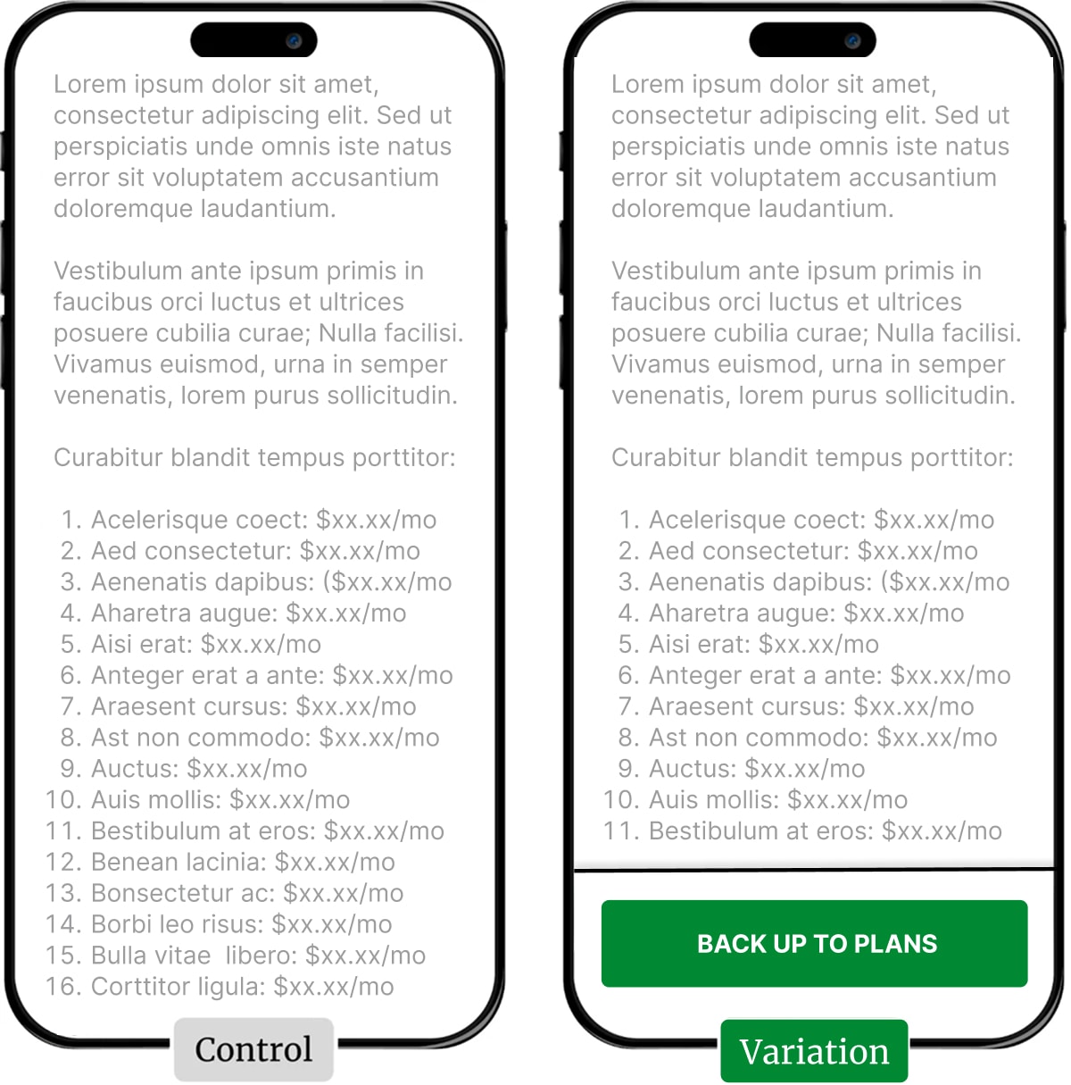
Here are our (lorem ipsum) wireframes of the control and winning variations. The list in the second half of the screens represents a comprehensive list of dog breeds with specific monthly prices.
Our client offers tailored plans for every breed of dog. This level of expertise builds trust, but it can also lead to some rather long pages—especially if the dog lovers also use mobile phones.
But wait. Scrolling on smartphones is quick and easy, right? How much can it really matter?
As it turns out, it can matter a lot.
Research: Mobile users are less… mobile
If you’ve read any of our Win Reports, you’ll probably have already seen how even small frictions can significantly affect conversions.
And this goes double for mobile users, where small issues are often magnified by the increased mental effort required. Yes, it is easy to scroll on mobile phones, but smaller screens increase both the amount of scrolling required and the cognitive load required to keep track of where you are, what you’ve seen, and what you are looking for.
We think of this as the Blair Witch problem: The less of the “world” you can see, the more effort you have to spend worrying about what’s out there (and what you are missing).

So, scrolling a long list of insurance prices on a mobile is already cognitively harder than scrolling on a desktop. Then we imagined that we were the owners of Terriers, or Whippets, or even the fabled hairless Xoloitzcuintli! (If you want to Google it, we’ll wait.)
Owners of these alphabetically-challenged breeds would be doing a lot of scrolling down to find the price, and then a lot of scrolling up to get back to the plans… which is ultimately what we want visitors to choose.
The original page (or control)
For this test, we focused on the client’s insurance comparison page. The top of the page (the pretty part we aren’t showing) provided a ranked list of the plans from various insurance providers, along with the average monthly costs for each.
Below the plan listing, the page included FAQs and the long list of breed-specific prices. Less pretty, but the kind of information that responsible pet owners might well sniff out.

The tested pages (or variations)
For our variation, we tested a design pattern that has won consistently across different clients and industries— adding a sticky footer with a button that returns users to the top of the page.
To avoid confusion, the visitors did not see the button until they had scrolled past the plan listing. After that, tapping the button would smooth-scroll the page back up to the top of the listing (and the highest rated offer).
In fact, we tested two alternative labels for the button.
- VIEW PLANS.
- BACK UP TO PLANS.

It seems obvious that the button would make it easier for a visitor to jump back up the page, but experience shows that its mere presence will also make it more likely that a user will “explore” the site. This is a subtle but useful distinction. A long scrolling list can feel like a trail into the wilderness; the button is like having your own driver following along.
Whatever happens, your exit plan is right there.
Using two different calls to action was an easy way to extend the value gleaned from a test. By adding the second variation and tracking both clicks and sales, we were actually testing:
- Whether adding a sticky footer with a button increased sales.
- Which variation of the button encouraged more clicks.
- Which variation of the button generated more sales.
The interaction between different variables can often generate ideas for future tests.
Result: Sales increased by 30%
Although both versions beat the control, Variation 2 (Back Up To Plans) won the test, generating a 30% increase in sales and revenue per visitor.
Interestingly, Back Up To Plans won despite receiving less than half the clicks of View Plans. Why? We hypothesize that View Plans created a false expectation that there was something more to see, generating more clicks but fewer sales. It’s a useful reminder that click-through rates and sales don’t always align, requiring further investigation.
In the meantime, what is clear, yet again, is that this deceptively simple pattern is a consistent winner.
What next?
As usual, we added the test to our proprietary Wins Database, then looked for ways to apply its lessons to other parts of our client’s business.
If you want us to grow your profits—quickly and efficiently—check if you qualify for a free one-on-one strategy session with one of our CRO consultants.
We’ll only work with you if we believe we can get amazing results together. Our success has come entirely from positive word of mouth, and we plan to keep it that way.
How much did you like this article?
What’s your goal today?
1. Hire us to grow your company
We’ve generated hundreds of millions for our clients, using our unique CRE Methodology™. To discover how we can help grow your business:
- Read our case studies, client success stories, and video testimonials.
- Learn about us, and our unique values, beliefs and quirks.
- Visit our “Services” page to see the process by which we assess whether we’re a good fit for each other.
- Schedule your FREE website strategy session with one of our renowned experts.
Schedule your FREE strategy session
2. Learn how to do conversion
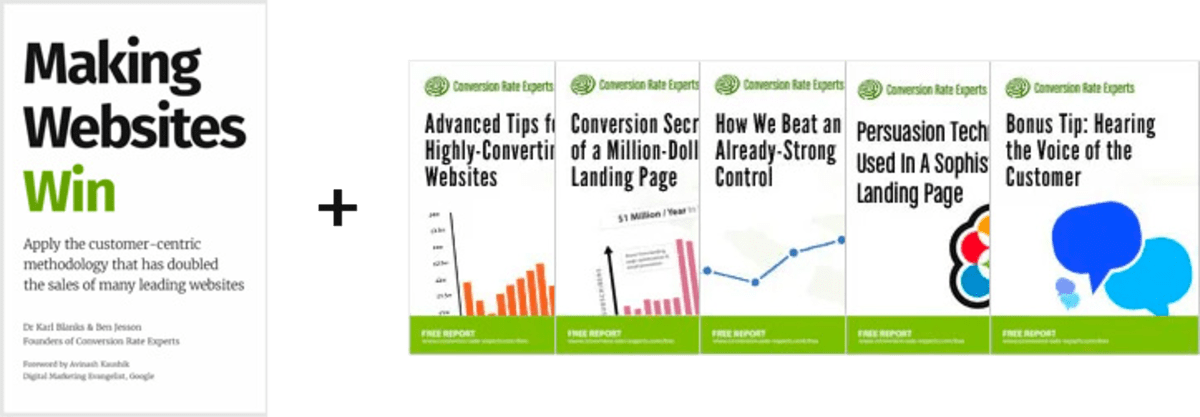
Download a free copy of our Amazon #1 best-selling book, Making Websites Win, recommended by Google, Facebook, Microsoft, Moz, Econsultancy, and many more industry leaders. You’ll also be subscribed to our email newsletter and notified whenever we publish new articles or have something interesting to share.
Browse hundreds of articles, containing an amazing number of useful tools and techniques. Many readers tell us they have doubled their sales by following the advice in these articles.
Download a free copy of our best-selling book
3. Join our team
If you want to join our team—or discover why our team members love working with us—then see our “Careers” page.
4. Contact us
We help businesses worldwide, so get in touch!
© 2026 Conversion Rate Experts Limited. All rights reserved.
A Brandwidth Group Company.