How to sell complex products and services (Part 3)
(By the way, to get articles like this free in your inbox, subscribe to our newsletter.)
—How to use “progressive disclosure” to stop your visitors getting overwhelmed and abandoning
—And how to convert visitors who can’t find what they need
(This is one of a series of articles, the first of which is here.)
In a previous article, we explained the first two steps for selling complex products:
- Step 1: How to manage objections
- Step 2: How to decide whether to use long or short copy
Then, in our last article, we described the next four steps:
- Step 3: How “separation of concerns” can prevent your website from becoming a disastrous mess
- Step 4: Make it clear where one module ends and the next begins
- Step 5: Optimize your navigation
- Step 6: How to turn your headings into “teasers” and “spoilers.”
This article describes the remaining two steps:
- Step 7: Progressive disclosure: Powerful ways to prevent your visitors from getting lost in all the detail.
- Step 8: If your visitors do get lost, here’s what you can do about it.
Step 7: Progressive disclosure: Powerful ways to prevent your visitors from getting lost in all the detail
Progressive disclosure means hiding information so visitors don’t see it until they need it.
In 2006, when we tripled the sales of a telecoms company, we relied heavily on progressive disclosure. Even now, a decade later, it is still greatly underused.
On the web, the most common method of progressive disclosure is to put information onto another page. That way, the visitor won’t see the information unless they click on a link to it. This method has drawbacks, though. Once a visitor clicks on a link to go to another page, they may not return.
It’s often much better to use on-page elements. There are many ways to hide information within a page so it’s revealed only when the user hovers over it or clicks on it:
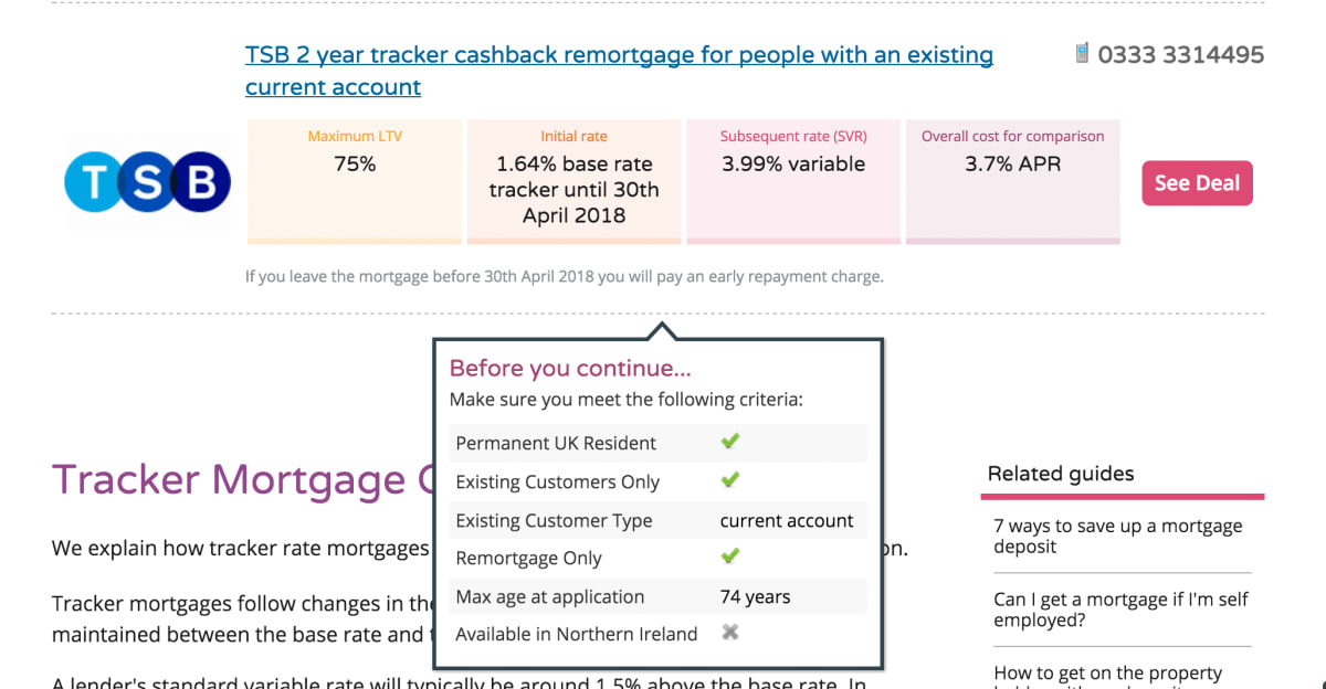

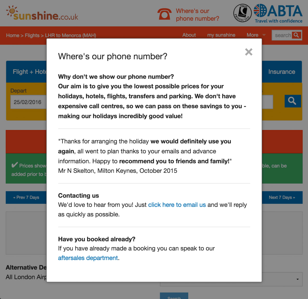
Visitors to sunshine.co.uk were concerned that the company had no phone number. We wrote a counter-objection that explained why this perceived shortcoming was actually a benefit. We added “Where’s our phone number” to the header, and linked it to an overlay. This was one of the contributing factors that helped us make an additional $20m (£14m) per year for the company:
At the start of this article, we described progressive disclosure as hiding information. However, it may be more intuitive to think of progressive disclosure in the positive sense—as adding information that otherwise may not warrant space on the page.
The “building blocks” of progressive disclosure
There are so many ways to progressively disclose information, how do you know where to start? Should you use a tooltip or an exit overlay? This section describes the “building blocks” with which you can build progressive-disclosure elements.
1. Ways to indicate that more information can be revealed
You can use any of the following visual text cues to indicate that more information can be revealed:
- Arrows, triangles, and chevrons indicate that information will appear as an expanding element.
- Text that’s made to look like a link—usually by being a different color or underlined—is often effective and uses no additional space.
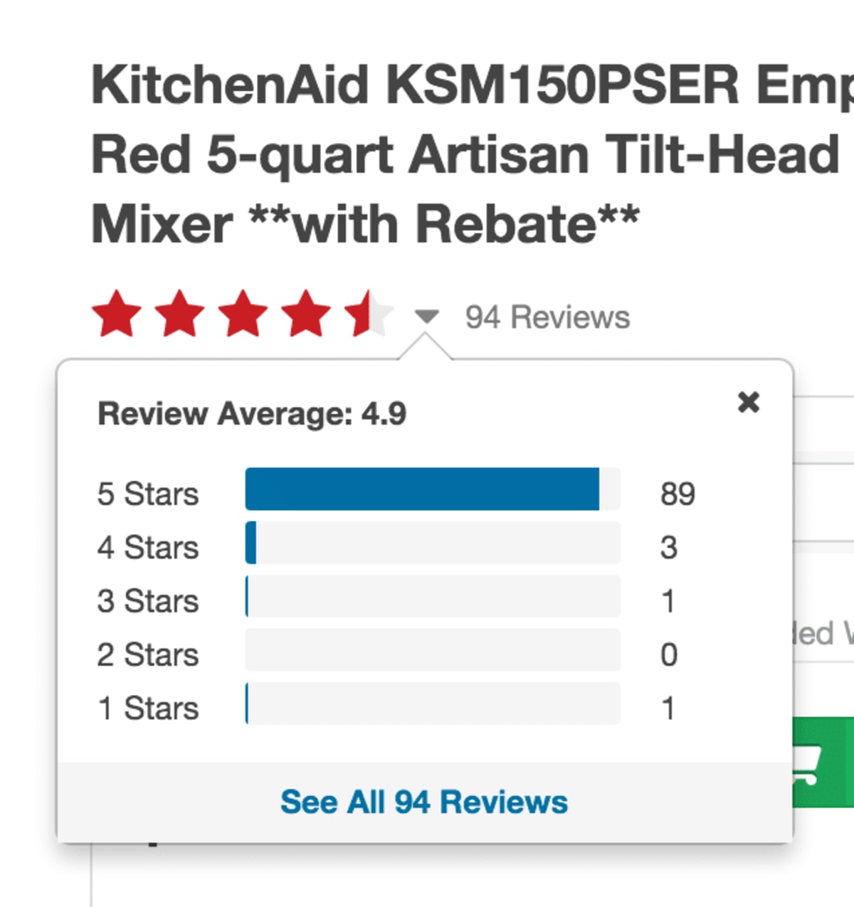
- Icons with one of the following on them: +, ? or i use little space and hint at the nature of the content that will appear.
- Magnifying glasses, depending on context, can indicate that the resulting information will be zoomed in, or that a search field will appear.
- Nothing—in other words, you give no clue that information will be progressively disclosed. Use this if you aren’t anxious for the visitor to discover the information.
- Showing elements that are abruptly cut off. If only part of an element—a photo, for example—is visible, visitors correctly guess that the rest of it can be revealed. (This is one of the techniques we described in our article about how to make users scroll down your page.)
2. Ways to trigger the information
The information can be triggered in several ways:
- By users clicking on the area. Use this if you don’t want to show the information unless users are keen to see it.
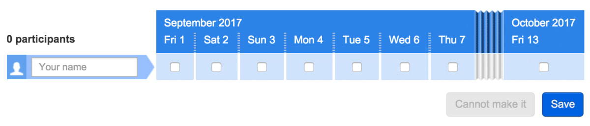
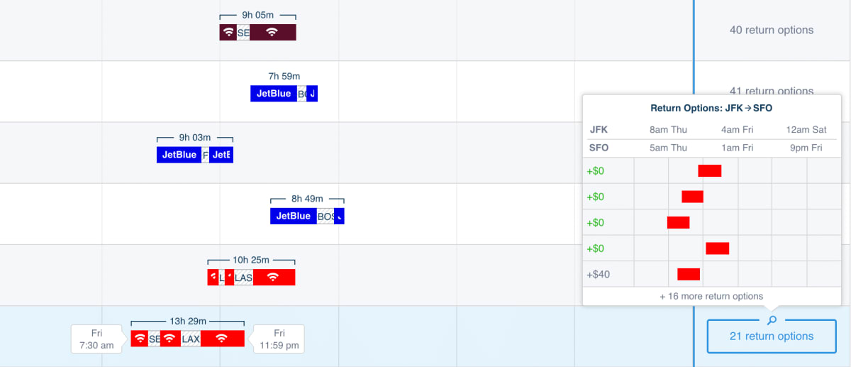
- By users swiping, as with carousels. (Consider offering clickable arrows too, to supplement the swiping.) Swiping is great for showing a large amount of extra information without disorienting the visitor. Think of how Google Maps uses it, for example.
- By users hovering over the area. Use this option if you are keen for the information to be viewed. Touchscreens don’t support hovering, so touchscreen users usually have to click instead.
- When the user scrolls a certain distance down a page.
- When the user appears to be exiting the page, by moving their pointer above the viewport of the browser.
- Some websites effectively do progressive disclosure in reverse; they reveal the information spontaneously when the page loads, and then allow it to be hidden. Booking.com displays notifications that appear when the page loads and then disappear after a few seconds. Qualaroo’s on-page surveys appear spontaneously but can be hidden by clicking on their “minimize” tabs.
3. Formats in which to present the information
The hidden information can appear in several formats:
- In a separate page. Do this if you aren’t anxious for the visitor to return to the original page.
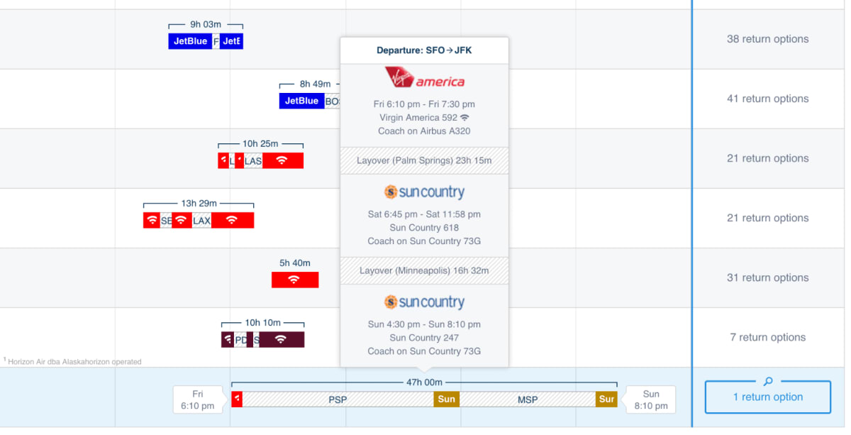
- In an overlay. Overlays can be effective if you don’t want to distract the visitor from your conversion funnel. They are often effective.
- In a carousel. These comes in useful when there’s a lot of similar information to show.
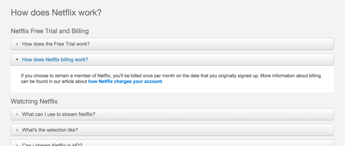
- In a tooltip (which is effectively a small overlay). These are great for small amounts of information. They tend to be anchored to a point on the page, so they can be fiddly when triggered near the edge of the viewport.
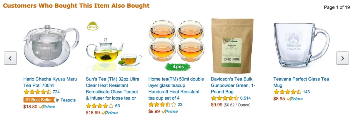
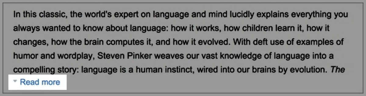
- By a page section expanding within the page (like Amazon’s “Read more” buttons). These are particularly useful when the information doesn’t need to be hidden again. And when expanding them won’t mess up the layout of the page.
4. Ways to trigger the information to be hidden again
The revealed information can be hidden again in several ways:
- By disappearing when the user stops hovering over that section. This can help or hinder users, depending on whether they are more likely to have problems continuing to hover over the content (because it’s small) or hiding it (often because it’s large). Hovering doesn’t apply to touchscreens, for which clicking must be used instead.
- By users clicking on a “Close” icon. This is often the best option.
- By users clicking away from the page element. This is convenient for users who are “in the know,” but it isn’t discoverable, so it should be used in addition to showing a “Close” icon.
- Spontaneously after a certain time period. This is often used with information that appeared spontaneously too.
- When the user stops doing whatever triggered the information.
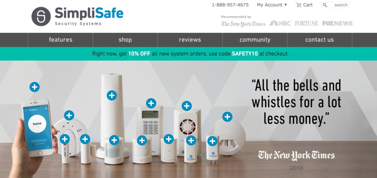
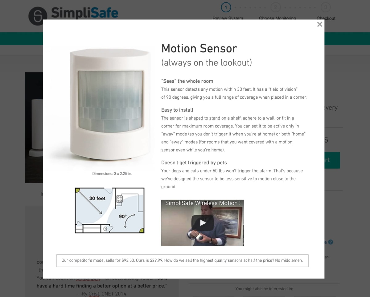
SimpliSafe is an innovative home security company. We have helped it to grow its revenue by more than five times. (Its team members are some of the smartest, most dynamic people we’ve worked with.) Because SimpliSafe sells self-install systems, its visitors need a lot of advice. In the following example, SimpliSafe hides a huge amount of information behind those turquoise “+” signs:
Step 8: Fall-back options for when users still can’t find what they need
Sometimes, visitors will fail to find information no matter how well you have structured it.
In such cases, the following “fall-back options” can be effective:
- A search box. Search can help users to find what they need, but only at the expense of “teleporting” them into a different part of your website. Once they arrive on the search results page, they often lose their bearings. Once in a while, look through the queries in your search logs to identify which information the visitors had failed to find while browsing. Often, you’ll find that the information wasn’t where users would have expected it to be.
- A knowledge base, like those powered by ZenDesk and Helpjuice, can help users to find answers to their questions. But, as with search boxes, visitors who search a knowledge base often lose where they were in the conversion funnel.
- Live chat, like that powered by Zopim and Olark. A live-chat operator should be able to find information that the visitor can’t. Whether live chat is economically viable depends on the economics of your business (and not on the whims of the customer-support team).
- A prominently placed phone number. Not all visitors want to pick up the phone. But for those who do, phone calls tend to convert extremely well. The main drawback of phone calls is that they don’t scale easily; call centers operatives need hiring, training, paying(!), and looking after. As such, the ideal combination is usually for the website to do as much of the work as possible.
Read the next article in this series
This article is one of a series that began here. The next in the series is here.
How much did you like this article?
What’s your goal today?
1. Hire us to grow your company
We’ve generated hundreds of millions for our clients, using our unique CRE Methodology™. To discover how we can help grow your business:
- Read our case studies, client success stories, and video testimonials.
- Learn about us, and our unique values, beliefs and quirks.
- Visit our “Services” page to see the process by which we assess whether we’re a good fit for each other.
- Schedule your FREE website strategy session with one of our renowned experts.
Schedule your FREE strategy session
2. Learn how to do conversion
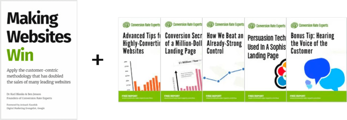
Download a free copy of our Amazon #1 best-selling book, Making Websites Win, recommended by Google, Facebook, Microsoft, Moz, Econsultancy, and many more industry leaders. You’ll also be subscribed to our email newsletter and notified whenever we publish new articles or have something interesting to share.
Browse hundreds of articles, containing an amazing number of useful tools and techniques. Many readers tell us they have doubled their sales by following the advice in these articles.
Download a free copy of our best-selling book
3. Join our team
If you want to join our team—or discover why our team members love working with us—then see our “Careers” page.
4. Contact us
We help businesses worldwide, so get in touch!
© 2026 Conversion Rate Experts Limited. All rights reserved.
A Brandwidth Group Company.