A case study in redesigning navigation
Win Reports help you grow your business by showing our methodology at work. Each Win Report showcases a real-world test, sharing the research, insights, and techniques that led to the win.
SFG20 is the UK industry standard for building maintenance specification. Its comprehensive library of schedules helps building owners and managers keep track of changes in legislation, regulation, and codes of practice. SFG20 sells cutting-edge software that helps customers ensure that buildings are safe and legally compliant.
Research: What’s on the menu?
Website navigation is often overlooked as a testing target, but it can be a huge opportunity for conversion rate optimization. Very few CRO levers appear on (almost) every web page—let alone right at the top. And for SFG20, whose B2B traffic skews over 80% desktop, the menu warranted particular attention.

What’s the first thing you notice? Most obviously, user intent is highly concentrated on just two items:
- What is SFG20? (The first menu item next to the logo.)
- Careers (middle of the top menu).
Our early research had shown that visitors were hungry to understand what SFG20 was, so that result makes sense. This is a menu item that was meeting the audience where they were on the journey.
The second hotspot, “Careers”, was more of a surprise. Although recruitment is a critical activity for high-performing businesses, should it be the second most popular link on a SaaS site like SFG20? For us, this was a signal that the rest of the menu wasn’t working hard enough.
And if you look at the actual menu, you’ll get some sense of why:

Including the logo, there are twelve targets on this menu. Although the first menu item is on point, others require pre-existing knowledge. (If you don’t know what “Facilities-iQ” is, can you guess?) Our user testers couldn’t, and they also found the two-layer menu overwhelming. Some worked to understand the dropdowns with nested sub-menus and hover-dependent content. Others just skipped it.
This combination—concentrated hotspots and user friction—convinced us that the menu was worth testing.
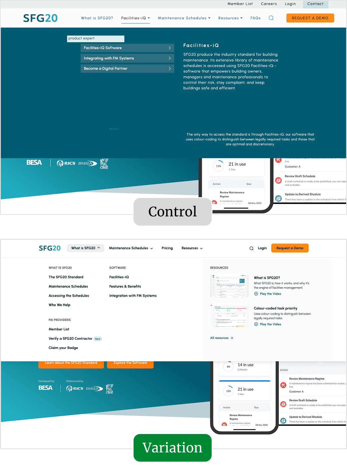
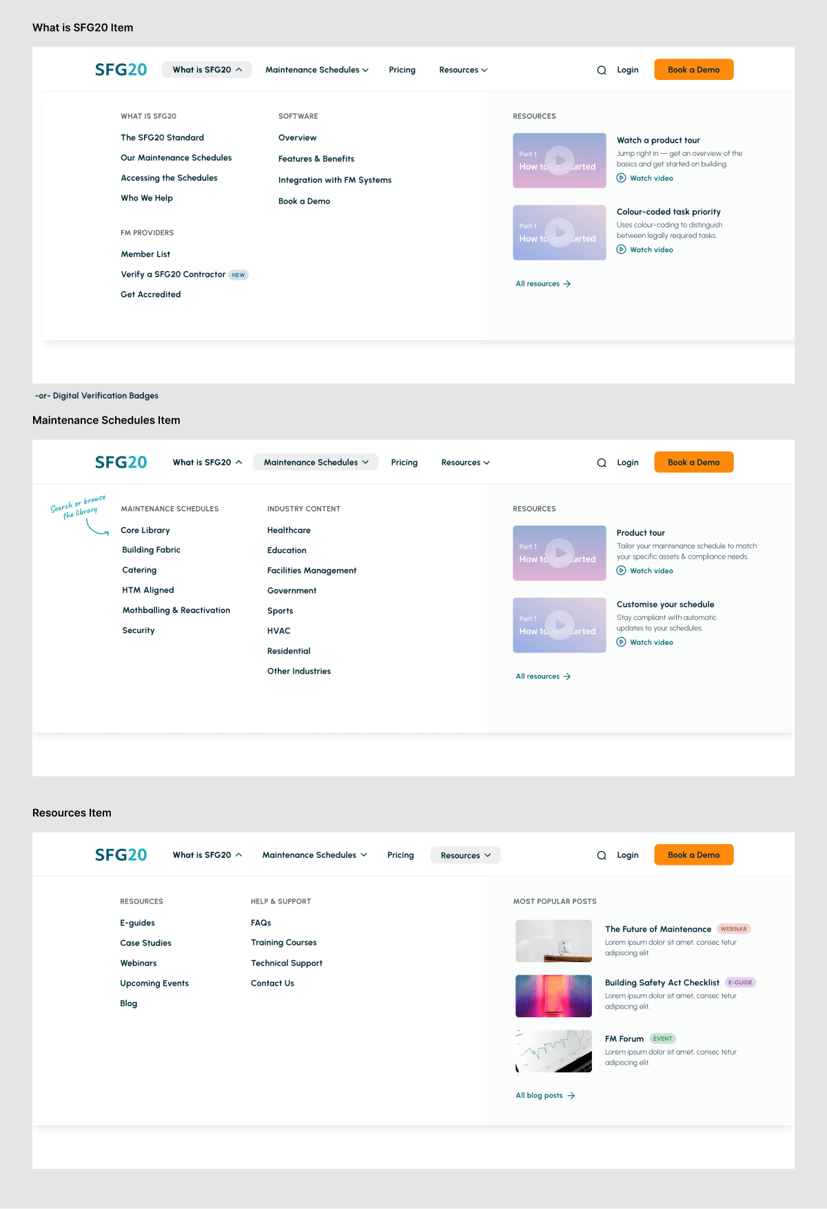
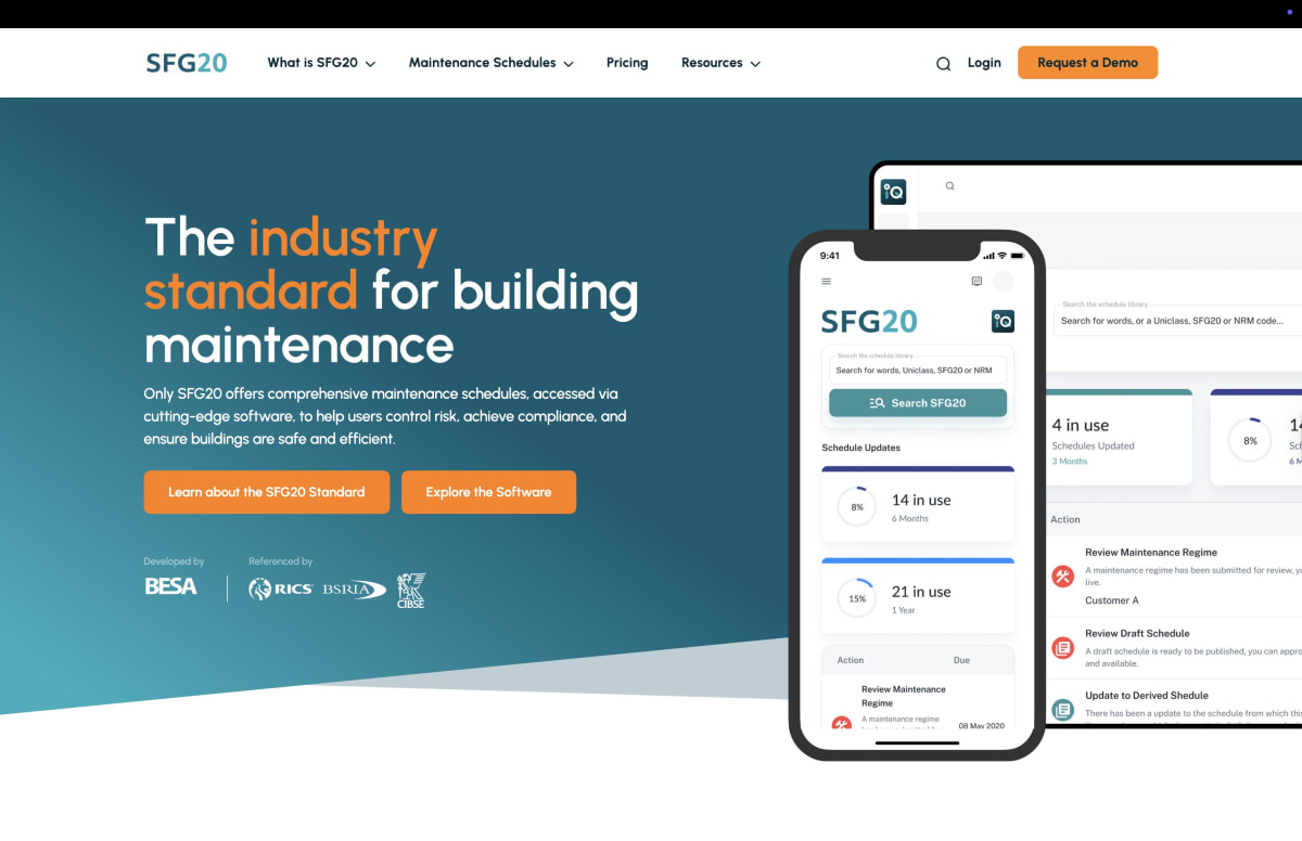
The original page (or control)
To illustrate the context properly, here’s the homepage without the menu expanded.

We considered adding highlights to this image so you’d find it easier to see the dropdown, but decided against it so that you could experience the menu more as SFG20’s visitors did. In this case, the activated “Facilities-iQ“ menu has dropped down to reveal a sub-menu with three options.
Here’s that menu in action.
Hovering over an option triggers additional explanatory content to appear on the right-hand side of the screen. Clicking on the buttons takes you through to a specific page.
The dropdown isn’t impossible to understand, but taken with the complexity of the menu above, it represented a huge opportunity for improvement and redesign.
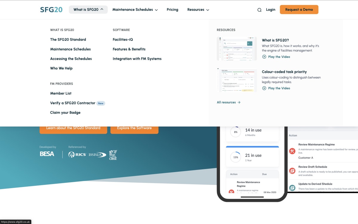
The tested page (or variation)
Given that we were completely reworking the site’s navigation, we aimed to “tell the story” of the SFG20 proposition through the menu. The test was an opportunity to create a guided customer journey without fully overhauling the site.
We started by mapping out that “journey,” incorporating links to high-value pages and anchor points.

What’s not obvious (from the small image above) is how much this process simplified the number of targets in the menu—from twelve to eight.
- Logo.
- What is SFG20.
- Maintenance Schedules.
- Pricing.
- Resources.
- Search.
- Login.
- Book a Demo.
And when you see the top-menu design in Figma, it feels even simpler.

As part of the process, we designed each of the dropdown menus inside Figma. Here they are:
To test our thinking, we conducted a usability study to test the new design against the control. The testers, who were all pre-screened for relevance to SFG20’s market, overwhelmingly preferred the new variation.

The reasons that testers cited for preferring the variation included:
- Cleaner and more modern design: Users found it visually appealing and professional.
- Better organization and structure: Navigation felt intuitive and well-sectioned.
- Easier to understand SFG20’s offering: Content was clearer and more digestible.
- More exploration encouraged: Users found browsing and finding relevant pages easier.
- More engaging user experience: Improved layout and hover effects made it smoother to use.
- Improved readability: Better color contrast and text clarity compared to the control.
Once the usability study results came in, we worked directly with SFG20’s developer to ensure the new menu was implemented quickly and accurately, supporting them throughout the process.
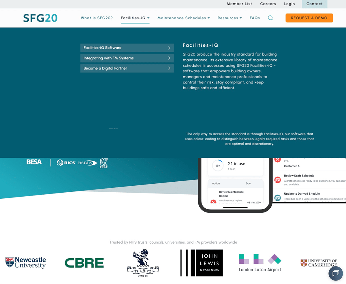
Here’s the final variation page (menu closed)…
And here’s the page with the “What is SFG20” menu activated.
To summarize the final changes:
- We completely redesigned SFG20’s primary navigation.
- We simplified the menu, making it easier to use while resolving numerous usability issues.
- We aimed to “tell the story” of the SFG20 proposition through the menu, incorporating links to various pages and anchor points.
- We introduced supporting resources to help users better understand the proposition.
What difference would these changes make in a real-world test?
Result: SaaS demo requests increased by 38%
During the test, we observed a 38% increase in SaaS demo requests for SFG20. In addition, the new navigation delivered:
- 35% increase in clicks on the menu links (including the dropdowns).
- 12% increase in visits to key pages, including:
- 18% increase to “What is SFG20.”
- 52% increase to “Facilities-iQ” pages.
- 20% increase to industry-specific maintenance schedule pages.
- A decrease in the sitewide bounce rate (an improvement).
Here’s what our client had to say

Lisa Hamilton, Director of Marketing, SFG20, the UK industry standard for building maintenance specification.
“The navigation redesign turned a series of complex messages into a simple, guided journey. By simplifying the menu and focusing on intent, users found what they needed faster—delivering a 38% increase in demo requests, stronger engagement with ‘What is SFG20’ and product pages, and a noticeable drop in bounce.
“It’s been a high-impact win and a fascinating project to work on!”
What next?
As usual, we added the test to our proprietary Wins Database, then looked for ways to apply its lessons to other parts of SFG20’s business and then to other clients.
If you want us to grow your profits—quickly and efficiently—check if you qualify for a free one-on-one strategy session with one of our CRO consultants.
We’ll only work with you if we believe we can get amazing results together. Our success has come entirely from positive word of mouth, and we plan to keep it that way.
A few words from Jessica and Lisa at SFG20
Watch the full testimonial below, or read a transcript.
Thanks to SFG20 for letting us share these insights (and for being such a great team to work with).
How much did you like this article?
What’s your goal today?
1. Hire us to grow your company
We’ve generated hundreds of millions for our clients, using our unique CRE Methodology™. To discover how we can help grow your business:
- Read our case studies, client success stories, and video testimonials.
- Learn about us, and our unique values, beliefs and quirks.
- Visit our “Services” page to see the process by which we assess whether we’re a good fit for each other.
- Schedule your FREE website strategy session with one of our renowned experts.
Schedule your FREE strategy session
2. Learn how to do conversion
Download a free copy of our Amazon #1 best-selling book, Making Websites Win, recommended by Google, Facebook, Microsoft, Moz, Econsultancy, and many more industry leaders. You’ll also be subscribed to our email newsletter and notified whenever we publish new articles or have something interesting to share.
Browse hundreds of articles, containing an amazing number of useful tools and techniques. Many readers tell us they have doubled their sales by following the advice in these articles.
Download a free copy of our best-selling book
3. Join our team
If you want to join our team—or discover why our team members love working with us—then see our “Careers” page.
4. Contact us
We help businesses worldwide, so get in touch!
© 2026 Conversion Rate Experts Limited. All rights reserved.