How we got a 157% increase for one of the world’s leading digital marketing teams
(By the way, to get articles like this free in your inbox, subscribe to our newsletter.)
The following is from our huge library of client successes—why not discover how we can help grow your business?
—Use these techniques on your own website.
—How to profit from better navigation, forms and pricing.
—Three techniques we recommend you use for research: (i) tree testing, (ii) customer-journey mapping and (iii) likes–dislikes maps.
—Mastermind Sessions and the Wins Database—two ways we generate ideas.
—Before-and-after images of winning A/B-tests.
—To get an annotated PDF of one of the winning pages, showing all of the techniques we used, subscribe to our free newsletter.
The challenge
We’ve grown many sophisticated publishing companies, including GQ, New Yorker, WIRED and Glamour. But could we grow Smart Insights, run by one of the world’s leading digital marketing teams?
(We wonder whether the title of this page gives away the answer to that question.)
“Conversion rate is the lifeblood of our business … there’s a lot of competition.”—Dr. Dave Chaffey, CEO and co-founder of Smart Insights
Smart Insights is a leading publisher and consultancy that provides guides, e-books and training to help businesses succeed online. It is the brainchild of Dr. Dave Chaffey, who—according to the Chartered Institute of Marketing—is “one of 50 gurus who has shaped the future of marketing.”
Note that in the following article “we” refers to a team effort between Conversion Rate Experts (with our expertise and proven methodology) and Smart Insights (with its great team and experimental culture).
How we identified actionable ideas to grow Smart Insights
When Abraham Lincoln was asked about his approach to A/B-testing, he famously said, “Give me six weeks to run a test, and I will spend the first four gathering insights about the visitors.”
(Or maybe he was talking about chopping down trees and sharpening his axe.)
Honest Abe’s approach reflects our unique methodology. The research we do before we lay a finger on a website is the most critical activity we undertake on any project. It’s also the most frequently ignored by most web businesses.
Stripped down to its basics, conversion rate optimization (CRO) is simple. You just need to be able to answer these two questions:
- Why aren’t my visitors converting?
- What should I do about it?
The mistake most businesses make is to skip straight to question 2. They start guessing what to do to increase their conversion rate, and in our experience, it usually ends in failure.
Successful businesses know that taking a visitor-centric approach is key to growing fast. When Smart Insights came to us, they recognized this right away. We spent lots of time conducting in-depth analyses to get inside the heads of their visitors. We used the following techniques:
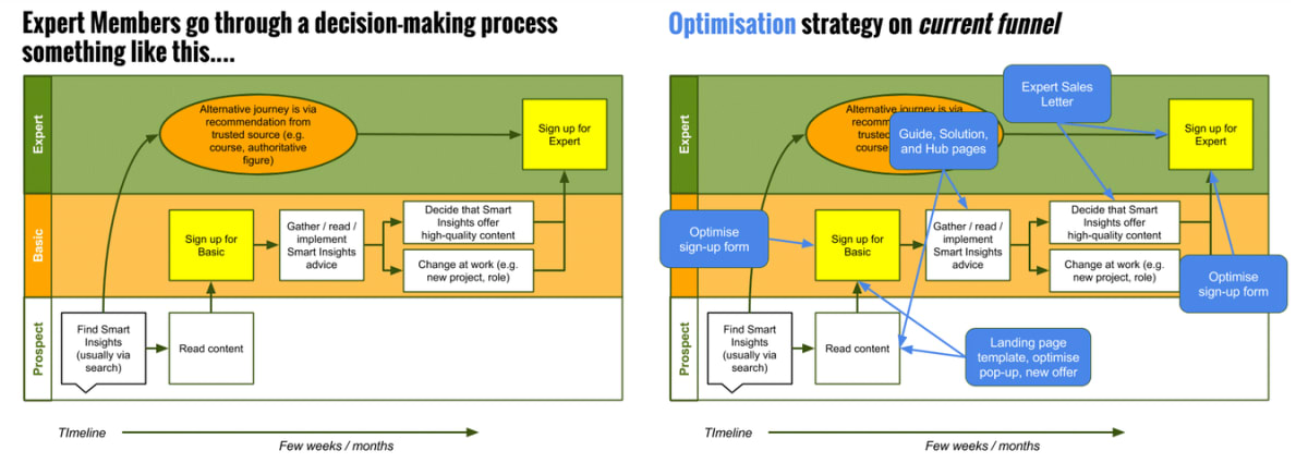
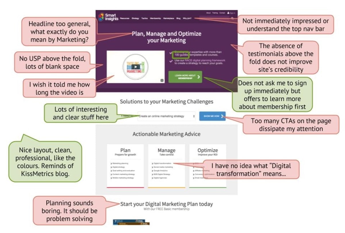
- We became the customer, not just going through the funnel (though we did that, too—and recorded it), but living the entire customer journey.
- We reviewed data that Smart Insights had already collected—from existing feedback mechanisms, customer-service teams and previous customer surveys.
- We interviewed real visitors to the website, which we recruited using a popup.
- We recruited qualified prospects, and asked them to go through the funnel as part of a user-testing program.
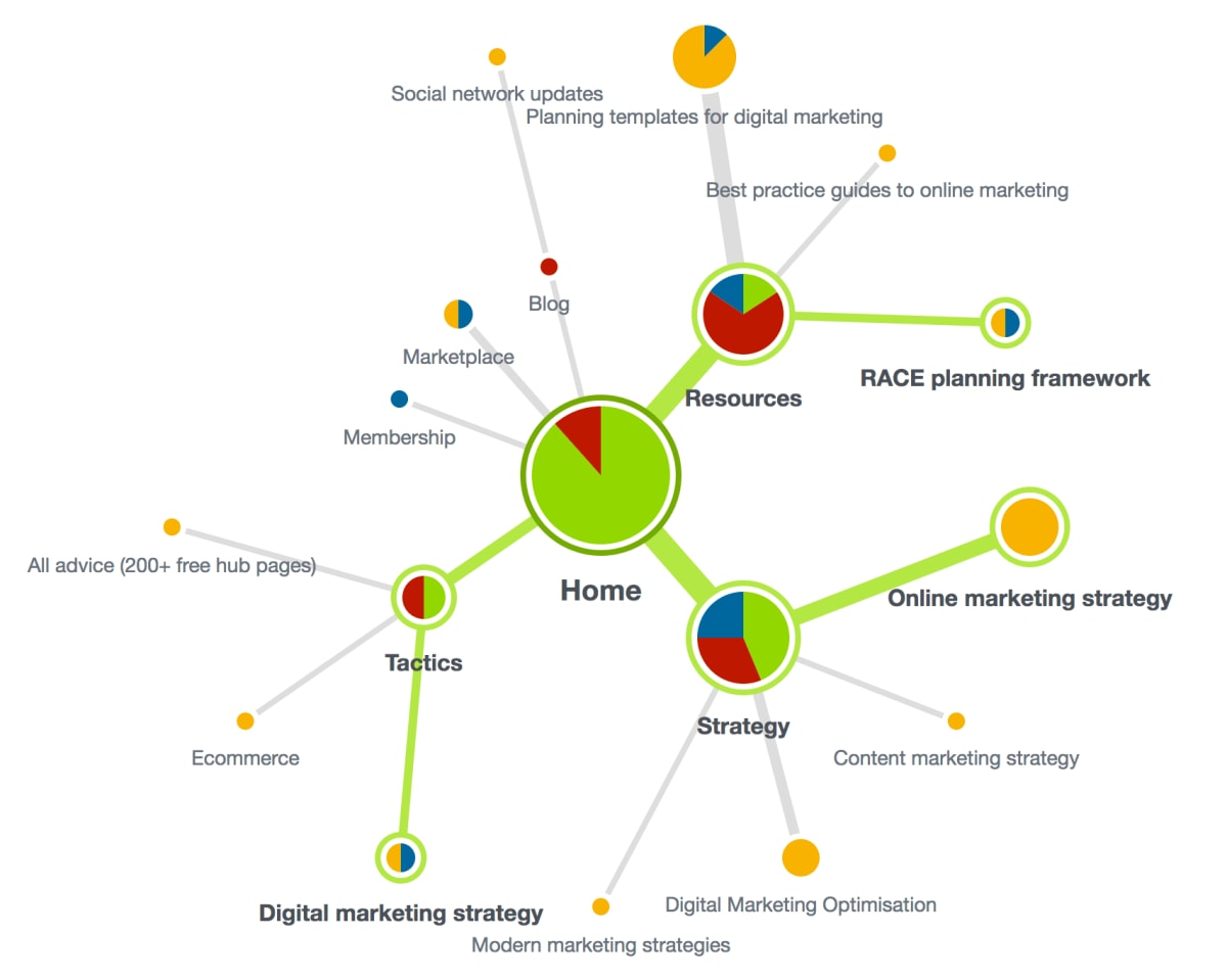
- We used tree testing to analyze the navigation and information architecture on the website.
- We studied visitor behavior, using analytics, heatmaps and session-recording tools.
- We designed a series of surveys and polls to gather data on visitors and customers. We used them also to collect testimonials that we could use on the website.
“One of the best features of the service with Conversion Rate Experts is that it’s really based on deep research.”—Dr. Dave Chaffey, CEO and co-founder of Smart Insights
How we came up with the winning ideas
Armed with an extensive body of research on Smart Insights—having sharpened our axe—it was time to chop down some trees. Using our Wins Database and our team of conversion experts, we generated a list of ideas for rapidly growing Smart Insights:
- The Wins Database is where we store every win that we ever get for our clients. As soon as a win is declared, we record it in the database. We categorize it by industry vertical, type of test (e.g. registration form) and size of win. It’s invaluable to be able to search the database for things that have worked in particular situations. You can create your own wins database by searching online for case studies of successful A/B-tests that others have run in similar businesses to yours.
- The best ideas often come from what we call “Mastermind Sessions.” We begin a Mastermind Session by presenting a summary of all of the research. Then, the participants, our experts, answer the question “How would you double this company’s sales (or conversions)?” By framing the question this way, we focus on the ideas that are most likely to get big wins. Much of the success of these sessions comes down to problem solving and ingenuity. If you decide to hold a Mastermind Session within your company (and we recommend you do), then keep the focus on the big ideas. Many will be impractical, but you can double a company’s sales with just a few great ones.
Rather than describing all the improvements we made to Smart Insights, we’ll focus on three experiments that are likely to be applicable to many businesses.
Adding a sales letter to the funnel increased paid memberships by 157%
With all of our projects, we have the benefit of having “fresh eyes.” We can empathize with a company’s new visitors in a way that’s impossible for someone who has worked for the company for years.
Many of Smart Insights’ visitors have been following Dr Dave Chaffey for years, some for their whole careers in marketing. Others are brand new.
We observed during the research that, for newcomers, the funnel for paid memberships revealed the pricing too soon. At the point of having to make a decision, the newcomers didn’t appreciate the depth of resources being offered.
So we designed a new page that visitors would see before the pricing. It presented the offer and included all the key appeals and objections we had identified during our research.
Here it is, alongside the original page. In an A/B test it generated 157% more paid memberships:
The new page is a big one. There are loads of reasons it beat the original. Here are just a few of them:
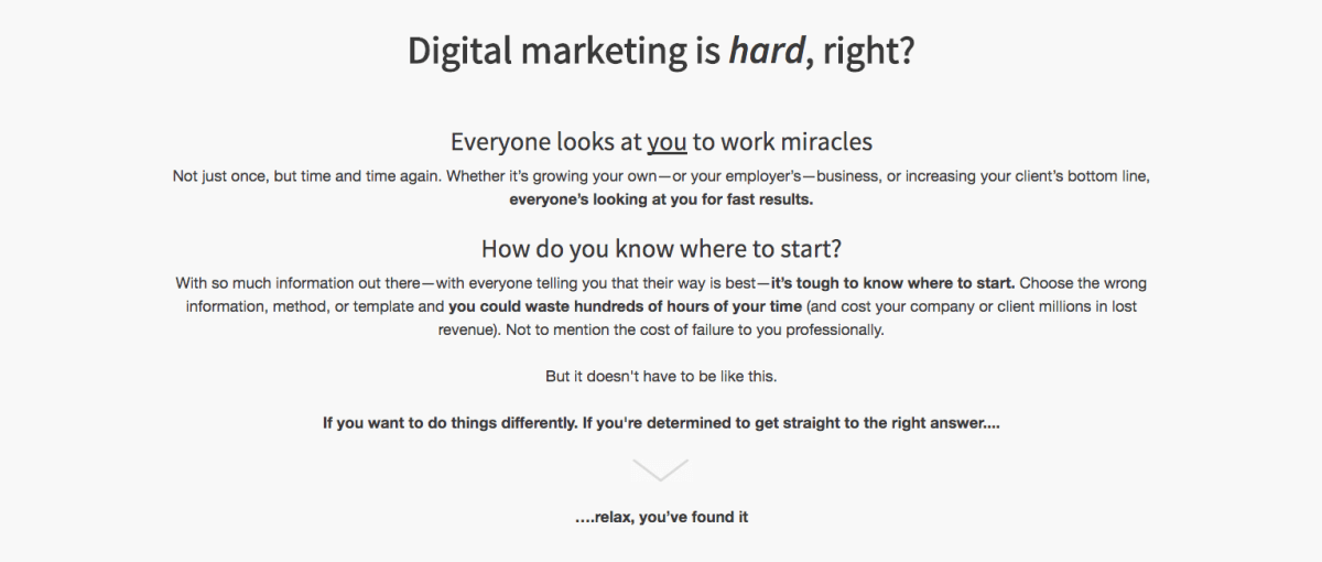
Reasons it won #1: We entered the conversation already happening in the prospects’ heads
Before you can sell something, you need to get your prospects’ attention. You need to interrupt them—make them sit up and take notice.
One of the most effective ways to do this is to enter the conversation already going on in their heads. If you can get your visitors nodding along in agreement, not only have you got their attention, you’ve positioned yourself as being on their side, as a trusted advisor.
Reasons it won #2: We used anchoring to address price objections
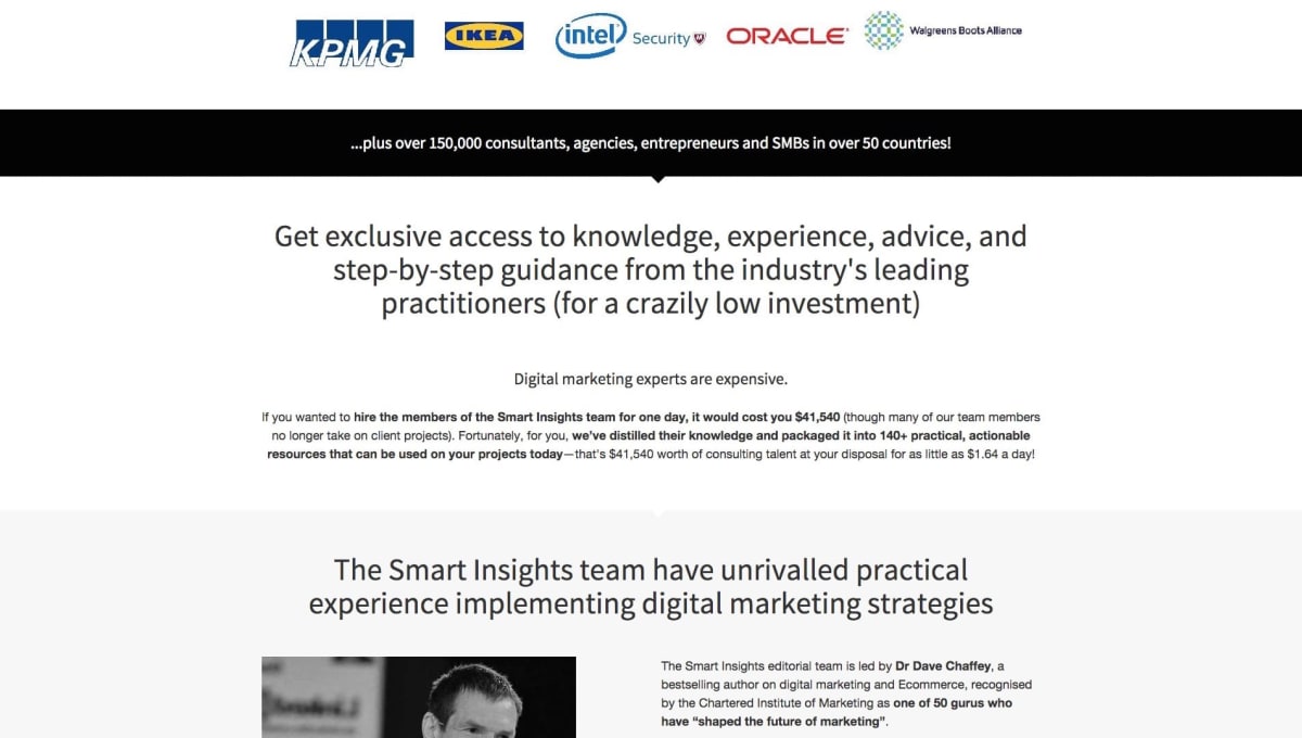
Good and bad, there’s a lot of free advice available on digital marketing. Smart Insights’ prospects know this, and so had strong objections to paying for the service.
So how do we compete on price with these websites?
Answer: we don’t. Instead, we positioned ourselves as the online equivalent of getting a personal consultation from the world’s best digital marketing experts.
Then, we put a value on it and used it as the price anchor. Compare the price of a Smart Insights subscription to the cost of having Dave and the team visit you in your office. Suddenly, it transpires that the price is extremely low.
Reasons it won #3: Mention every valuable benefit
If you’re close to a product or service, it’s easy to overlook—or take for granted—the value it provides.
When we talk to customers, they often highlight features or benefits they love that weren’t communicated on the website. It’s no surprise that sales usually increase when we explicitly mention these features or benefits.
That’s exactly what happened with Smart Insights. Members get a lot of great stuff, and when we asked them what they liked best, we received many different answers.
This made us excited, so we made a list of all the stuff that you get as a member, and how it can help you. Then we added the list to the new landing page (click it to enlarge it):

Are you communicating the value of your product or service effectively? It’s worth taking a step back to make sure you’re not missing anything. Better still, ask your customers what they like best about you. You can learn more about this in our guide to communicating value propositions.
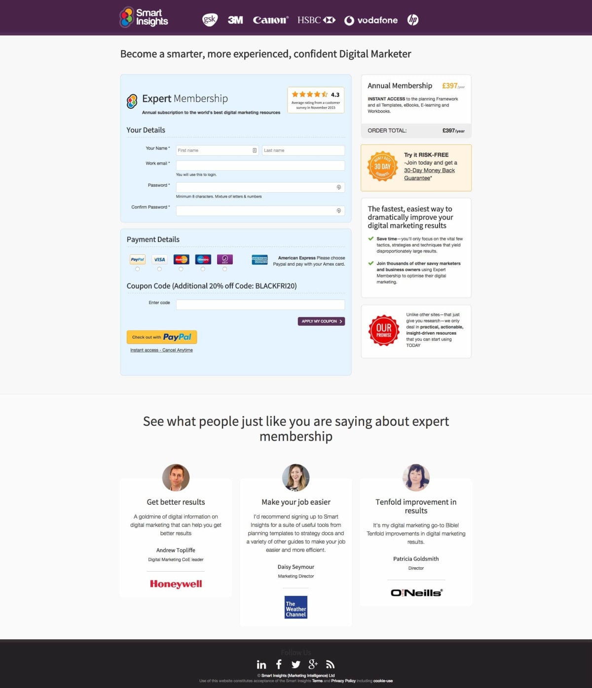
We optimized the membership form, and increased annual memberships by 91%
Why it won
Forms lie at the heart of almost every conversion funnel, so they’re an obvious—and powerful—candidate for optimization. They are also, surprisingly, an often-overlooked part of the funnel. So make sure to prioritize your forms when planning your optimization strategy.
Forms are a necessary evil, so focus on making them as intuitive and pleasant an experience as possible. In other words, reduce “form friction.” You’ll find some tools to help discover what’s causing friction in this article.
Our research revealed several factors that were causing friction on the Smart Insights form:
- Many prospects were joining because they needed help with an urgent problem—so they were looking for reassurance that they would get instant access to the resources.
- Some of the key objections about the value of the service lingered through the funnel to the form—so prospects needed reminding that they were getting world-class resources.
- The form had many fields for good reason: Smart Insights needed to understand the customers in order to provide the most relevant resources. However, each of those fields became friction points.
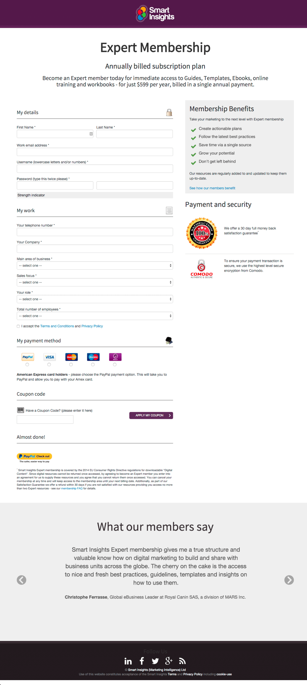
We designed a challenger form to address the first two issues. The new headline and sidebar content promoted the appeals that we had identified, and we added proof elements to counter the lingering objections.
In addition, we split the form into two parts, removing any fields that weren’t essential to the sign-up process, and repositioning them as a post-form wizard to “configure your Smart Insights profile.” By doing so, we turned an objection into an appealing part of the service.
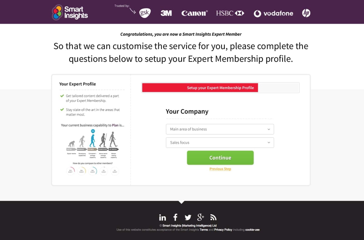
Always remember that visitors are filling in your form to solve a problem they are having. Take time to find out as much about their problem as you can—then promise to solve it.
A new navigation increased paid memberships by 75%
A good navigation should reflect how your visitors expect to find things. Someone new to your website should easily be able to find the information they need.
Supermarkets are experts at navigation. They organize complex information so you can walk into a huge building for the first time and find a single product among hundreds of thousands—usually in seconds. (Unless you’re looking for eggs—we can never find those.)
When we conducted usability tests, we identified a group of visitors for whom Smart Insights’ information architecture didn’t reflect their mental model.

What those visitors didn’t tell us was how to fix it. So we used tree testing to analyze the routes that prospects were taking through the navigation to solve common problems. We then came up with an optimized version to test against the control.
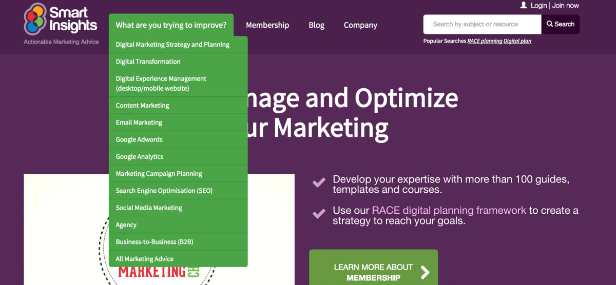
Never turn a blind eye to what your visitors are telling you. The original navigation was based on the industry standard, so it was a bold decision to test something different. Thanks to Smart Insights’ willingness to fly in the face of convention, memberships increased by 75%.
Our gift to you: a free annotated PDF of the page that generated 157% more paid memberships
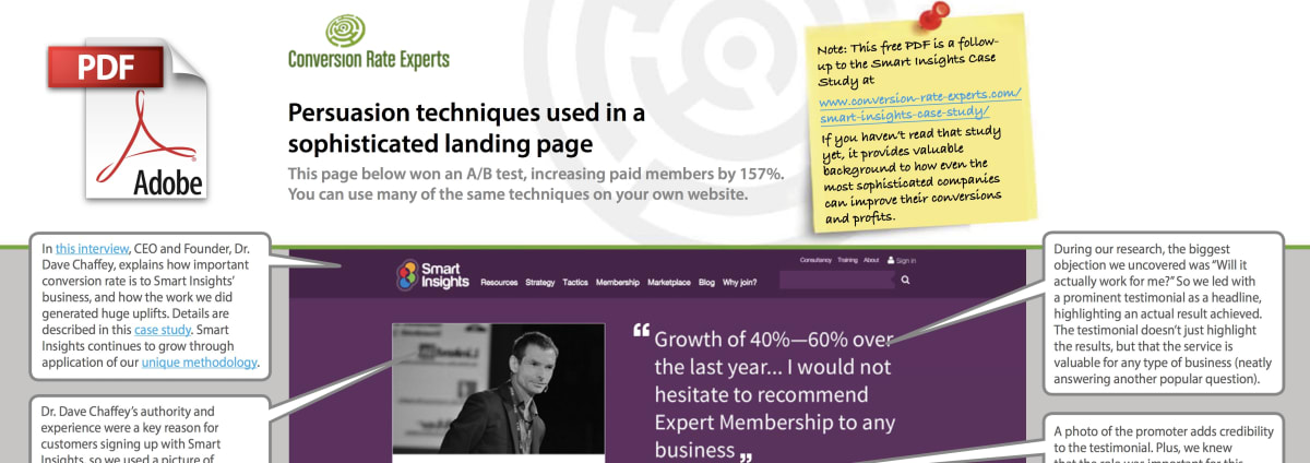
We have taken a screenshot of the page that generated 157% more paid memberships, and we have added 45 “tooltips” that explain, in detail, the persuasion techniques behind each page element.
Just subscribe to our free newsletter and we’ll send you a copy of the PDF straight away. It’ll reveal many persuasive techniques that you might otherwise have overlooked. Our newsletter is read by the world’s most successful companies, and you can easily unsubscribe whenever you wish (though few people do).
A few words from the CEO of Smart Insights, Dr. Dave Chaffey
Big thanks to the Smart Insights team
It’s great working with the team at Smart Insights. They are passionate about testing and get things done quickly—two key ingredients for winning businesses.
You can get free access to many of Smart Insights’ reports by signing up for its free membership, here.
How much did you like this article?
What’s your goal today?
1. Hire us to grow your company
We’ve generated hundreds of millions for our clients, using our unique CRE Methodology™. To discover how we can help grow your business:
- Read our case studies, client success stories, and video testimonials.
- Learn about us, and our unique values, beliefs and quirks.
- Visit our “Services” page to see the process by which we assess whether we’re a good fit for each other.
- Schedule your FREE website strategy session with one of our renowned experts.
Schedule your FREE strategy session
2. Learn how to do conversion
Download a free copy of our Amazon #1 best-selling book, Making Websites Win, recommended by Google, Facebook, Microsoft, Moz, Econsultancy, and many more industry leaders. You’ll also be subscribed to our email newsletter and notified whenever we publish new articles or have something interesting to share.
Browse hundreds of articles, containing an amazing number of useful tools and techniques. Many readers tell us they have doubled their sales by following the advice in these articles.
Download a free copy of our best-selling book
3. Join our team
If you want to join our team—or discover why our team members love working with us—then see our “Careers” page.
4. Contact us
We help businesses worldwide, so get in touch!
© 2026 Conversion Rate Experts Limited. All rights reserved.
A Brandwidth Group Company.


