Win Report: How a “sticky” call to action increased sales by 25%
(By the way, to get articles like this free in your inbox, subscribe to our newsletter.)
Win Reports help you grow your business by showing our methodology at work. Each Win Report showcases a real-world test, sharing the research, insights, and techniques that led to the win.

Research: Opportunities to improve a long product page
The client manufactures high-price products for discerning users. Selling the products online is challenging because customers have personal preferences and are often nervous about committing to something they haven’t tried. (In our research, the inability to experience the product firsthand was the single biggest objection to buying online.)
As a result, the product page contained a good deal of carefully curated content. Long sales pages are often necessary for complex sales (see our GoHenry case study). However, our initial research—including user tests, surveys, and heatmaps—uncovered two early insights ripe for testing:
- Visitors who read deep into the page struggled to know how to progress their purchase—even as the counterobjections addressed their concerns. The sales form was “hidden” way off-screen.
- Some visitors felt the “Add to Cart” call to action was too much of a commitment.
The original page (or control)
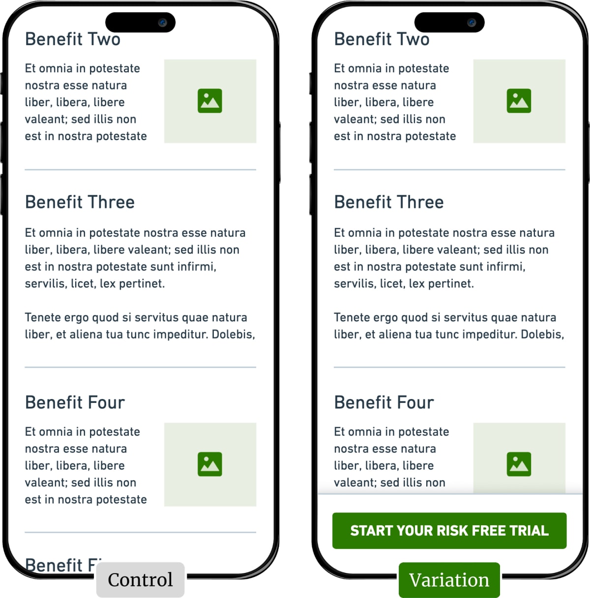
The client’s page was long—containing lots of strong persuasive content—but once someone scrolled down from the top, the call to action was “lost” off-screen. The following wireframe illustrates the issue.

The tested pages (or variations)
After discussions with the client, we created four variations:
In each variation, we added a “sticky” button to the bottom of the mobile screen: The button appeared once the user had scrolled past the existing sales form. Tapping the button scrolled the user back to the form. (This was a “smooth” scroll so they could see and understand what was happening.)
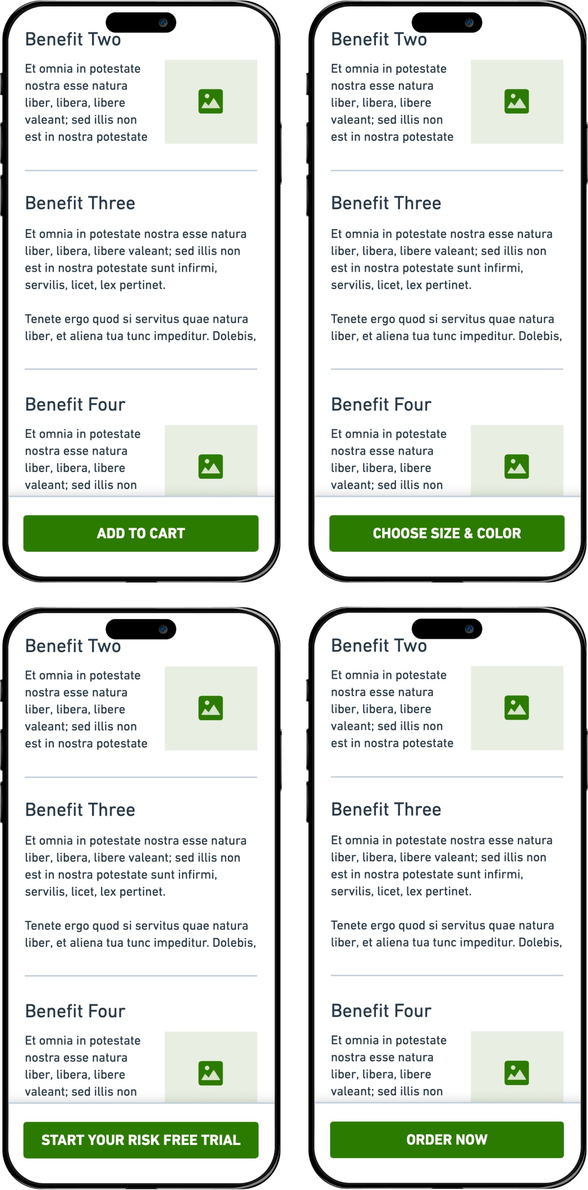
For three of the variations, we experimented with different calls to action: Adding the sticky button allowed us to test multiple messages. For Variation 1, we duplicated the existing call to action (“Add to Cart”) to isolate the button’s effect. We then created three further variations to test different levels of perceived commitment. Here’s the full list:
- Add to Cart (the “button-only” version)
- Choose Size & Color (low commitment call to action)
- Start Your Risk-Free Trial (low commitment call to action)
- Order Now (high commitment call to action)
And here are wireframes of the four variations we tested:

The four variations. The green button “sticks” to the bottom of the window as the user scrolls down the page.
Result: Sales increased by 25%
Every variation beat the no-button control by at least 8%. “Start Your Risk-Free Trial” won the test, delivering a 25% increase in sales and a 22% increase in Revenue Per Visitor (RPV).
Here’s what we learned:
- The sticky button consistently increased conversion on the long webpage, even when we used the same call to action as the control. The minimum conversion lift from adding the button was 8%.
- “Choose Size & Color”—the lowest commitment call to action—received more clicks than any other variation but led to fewer sales.
- “Start Your Risk-Free Trial”—the winning variation—increased sales by 25%, which backed up our research that visitors weren’t confident buying online without trying it first. (See our article, How to sell complex products and services (Part 1), for more on deferring commitment.)
What next?
Based on the success of this test, we leveraged the risk-free trial across other pages and delivered more wins. As usual, we also added the test to our proprietary Wins Database and then looked for ways to apply its lessons to other clients.
If you want us to grow your profits—quickly and efficiently—check if you qualify for a free one-on-one strategy session with one of our CRO consultants.
We’ll only work with you if we believe we can get amazing results together. Our success has come entirely from positive word of mouth, and we plan to keep it that way.
How much did you like this article?
What’s your goal today?
1. Hire us to grow your company
We’ve generated hundreds of millions for our clients, using our unique CRE Methodology™. To discover how we can help grow your business:
- Read our case studies, client success stories, and video testimonials.
- Learn about us, and our unique values, beliefs and quirks.
- Visit our “Services” page to see the process by which we assess whether we’re a good fit for each other.
- Schedule your FREE website strategy session with one of our renowned experts.
Schedule your FREE strategy session
2. Learn how to do conversion
Download a free copy of our Amazon #1 best-selling book, Making Websites Win, recommended by Google, Facebook, Microsoft, Moz, Econsultancy, and many more industry leaders. You’ll also be subscribed to our email newsletter and notified whenever we publish new articles or have something interesting to share.
Browse hundreds of articles, containing an amazing number of useful tools and techniques. Many readers tell us they have doubled their sales by following the advice in these articles.
Download a free copy of our best-selling book
3. Join our team
If you want to join our team—or discover why our team members love working with us—then see our “Careers” page.
4. Contact us
We help businesses worldwide, so get in touch!
© 2026 Conversion Rate Experts Limited. All rights reserved.
A Brandwidth Group Company.


